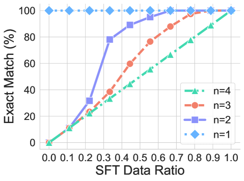
## Line Chart: Exact Match (%) vs. SFT Data Ratio for Different 'n' Values
### Overview
This is a line chart with markers, plotting the relationship between the "SFT Data Ratio" (x-axis) and the "Exact Match (%)" performance (y-axis). The chart compares four distinct data series, each corresponding to a different value of a parameter labeled 'n' (n=1, n=2, n=3, n=4). The chart demonstrates how the exact match accuracy changes as the ratio of Supervised Fine-Tuning (SFT) data increases, with different performance trajectories for each 'n' value.
### Components/Axes
* **Chart Type:** Line chart with distinct markers for each data point.
* **Y-Axis:**
* **Label:** "Exact Match (%)"
* **Scale:** Linear scale from 0 to 100.
* **Major Ticks:** 0, 20, 40, 60, 80, 100.
* **X-Axis:**
* **Label:** "SFT Data Ratio"
* **Scale:** Linear scale from 0.0 to 1.0.
* **Major Ticks:** 0.0, 0.1, 0.2, 0.3, 0.4, 0.5, 0.6, 0.7, 0.8, 0.9, 1.0.
* **Legend:**
* **Position:** Bottom-right corner of the plot area.
* **Entries:**
1. `n=4`: Green line with upward-pointing triangle markers (▲).
2. `n=3`: Orange line with circle markers (●).
3. `n=2`: Purple line with square markers (■).
4. `n=1`: Blue dashed line with diamond markers (◆).
### Detailed Analysis
**Data Series Trends and Approximate Points:**
1. **Series n=1 (Blue Diamonds, Dashed Line):**
* **Trend:** Perfectly flat, horizontal line at the top of the chart.
* **Data Points:** The exact match percentage is **100%** for all SFT Data Ratio values from 0.0 to 1.0.
2. **Series n=2 (Purple Squares, Solid Line):**
* **Trend:** Steep, concave-down curve. It shows the fastest initial improvement among the non-constant series.
* **Data Points (Approximate):**
* (0.0, 0%)
* (0.1, ~10%)
* (0.2, ~30%)
* (0.3, ~78%)
* (0.4, ~88%)
* (0.5, ~95%)
* (0.6, ~98%)
* (0.7, 100%)
* (0.8, 100%)
* (0.9, 100%)
* (1.0, 100%)
3. **Series n=3 (Orange Circles, Solid Line):**
* **Trend:** A steady, slightly concave-down curve. Improves more slowly than n=2 but faster than n=4.
* **Data Points (Approximate):**
* (0.0, 0%)
* (0.1, ~10%)
* (0.2, ~22%)
* (0.3, ~38%)
* (0.4, ~50%)
* (0.5, ~60%)
* (0.6, ~75%)
* (0.7, ~88%)
* (0.8, ~95%)
* (0.9, 100%)
* (1.0, 100%)
4. **Series n=4 (Green Triangles, Solid Line):**
* **Trend:** The most gradual, nearly linear upward slope. It requires the most SFT data to achieve high performance.
* **Data Points (Approximate):**
* (0.0, 0%)
* (0.1, ~10%)
* (0.2, ~20%)
* (0.3, ~30%)
* (0.4, ~40%)
* (0.5, ~50%)
* (0.6, ~60%)
* (0.7, ~70%)
* (0.8, ~80%)
* (0.9, ~90%)
* (1.0, 100%)
### Key Observations
1. **Performance Hierarchy:** For any given SFT Data Ratio greater than 0, the exact match performance strictly follows: n=1 > n=2 > n=3 > n=4.
2. **Saturation Point:** All series eventually reach 100% exact match. The SFT Data Ratio required to reach 100% decreases as 'n' decreases: n=4 requires a ratio of 1.0, n=3 requires ~0.9, n=2 requires ~0.7, and n=1 requires 0.0.
3. **Initial Slope:** The initial rate of improvement (slope from x=0.0 to x=0.3) is steepest for n=2, followed by n=3, then n=4. n=1 has no slope.
4. **Convergence:** All lines converge at the top-right corner of the chart (SFT Data Ratio=1.0, Exact Match=100%).
### Interpretation
The chart illustrates a clear inverse relationship between the parameter 'n' and the model's data efficiency for achieving perfect exact match performance. 'n' likely represents a measure of task difficulty, output complexity, or the number of constraints the model must satisfy (e.g., number of required elements in a generated response).
* **n=1 (Simplest Task):** The model achieves perfect performance with zero SFT data, suggesting this task is either trivially easy for the base model or the evaluation metric is not sensitive enough to detect errors.
* **n=2, 3, 4 (Increasingly Complex Tasks):** As 'n' increases, the model requires progressively more SFT data to reach the same level of performance. The curves show diminishing returns; the last few percentage points of accuracy require a disproportionately large increase in data ratio.
* **Practical Implication:** The data suggests that for more complex tasks (higher 'n'), investing in a larger SFT dataset is crucial. However, for simpler tasks (lower 'n'), a smaller, high-quality dataset may suffice. The chart provides a quantitative guide for resource allocation in data collection for fine-tuning, based on the complexity ('n') of the target task.