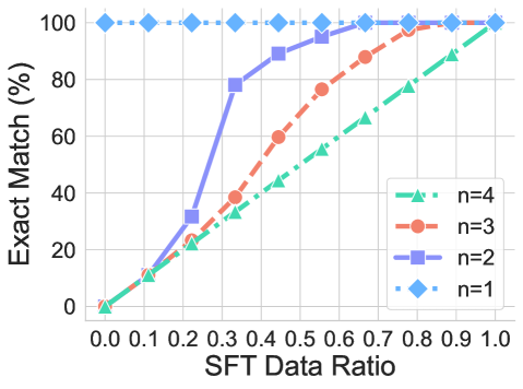
## Line Graph: Exact Match (%) vs SFT Data Ratio
### Overview
The graph illustrates the relationship between the SFT Data Ratio (x-axis) and Exact Match percentage (y-axis) for four distinct data series (n=1 to n=4). Each series is represented by a unique line style and marker, with trends showing how Exact Match improves as more data is utilized.
### Components/Axes
- **X-axis**: SFT Data Ratio (0.0 to 1.0 in increments of 0.1).
- **Y-axis**: Exact Match (%) (0% to 100% in increments of 20%).
- **Legend**: Located in the bottom-right corner, mapping:
- **n=4**: Green dashed line with triangle markers.
- **n=3**: Red dashed line with circle markers.
- **n=2**: Blue solid line with square markers.
- **n=1**: Blue dashed line with diamond markers.
### Detailed Analysis
1. **n=1 (Blue Diamonds)**:
- **Trend**: Horizontal line at 100% across all SFT Data Ratios.
- **Key Points**: Remains constant at 100% from 0.0 to 1.0.
2. **n=2 (Blue Squares)**:
- **Trend**: Steep upward slope, starting at 0% and reaching 100% at 1.0.
- **Key Points**:
- 0.3: ~80%
- 0.5: ~90%
- 0.7: ~95%
- 0.9: ~98%
3. **n=3 (Red Circles)**:
- **Trend**: Moderate upward slope, starting at 0% and reaching 100% at 1.0.
- **Key Points**:
- 0.3: ~20%
- 0.5: ~60%
- 0.7: ~85%
- 0.9: ~95%
4. **n=4 (Green Triangles)**:
- **Trend**: Gradual upward slope, starting at 0% and reaching 100% at 1.0.
- **Key Points**:
- 0.3: ~10%
- 0.5: ~40%
- 0.7: ~60%
- 0.9: ~85%
### Key Observations
- **Convergence at 1.0**: All lines intersect at 100% Exact Match when SFT Data Ratio = 1.0.
- **Growth Rates**:
- n=2 (blue squares) shows the steepest improvement.
- n=4 (green triangles) exhibits the slowest growth.
- **n=1 Anomaly**: The blue diamond line (n=1) remains at 100% regardless of data ratio, suggesting a baseline or theoretical maximum.
### Interpretation
The graph demonstrates that higher SFT Data Ratios correlate with improved Exact Match performance across all n values. However, the rate of improvement varies significantly with the number of data points (n):
- **n=1**: Implies perfect performance even with minimal data, possibly indicating an idealized or overfitted scenario.
- **n=2 vs. n=4**: Lower n values (e.g., n=2) achieve higher performance with less data, suggesting efficiency in smaller datasets. Higher n values (e.g., n=4) require near-complete data utilization to reach similar performance levels, highlighting diminishing returns with increased data complexity.
This trend may reflect trade-offs between data quantity and model efficiency, where smaller datasets (lower n) achieve optimal results faster, while larger datasets (higher n) demand more comprehensive data to mitigate variability or noise.