\n
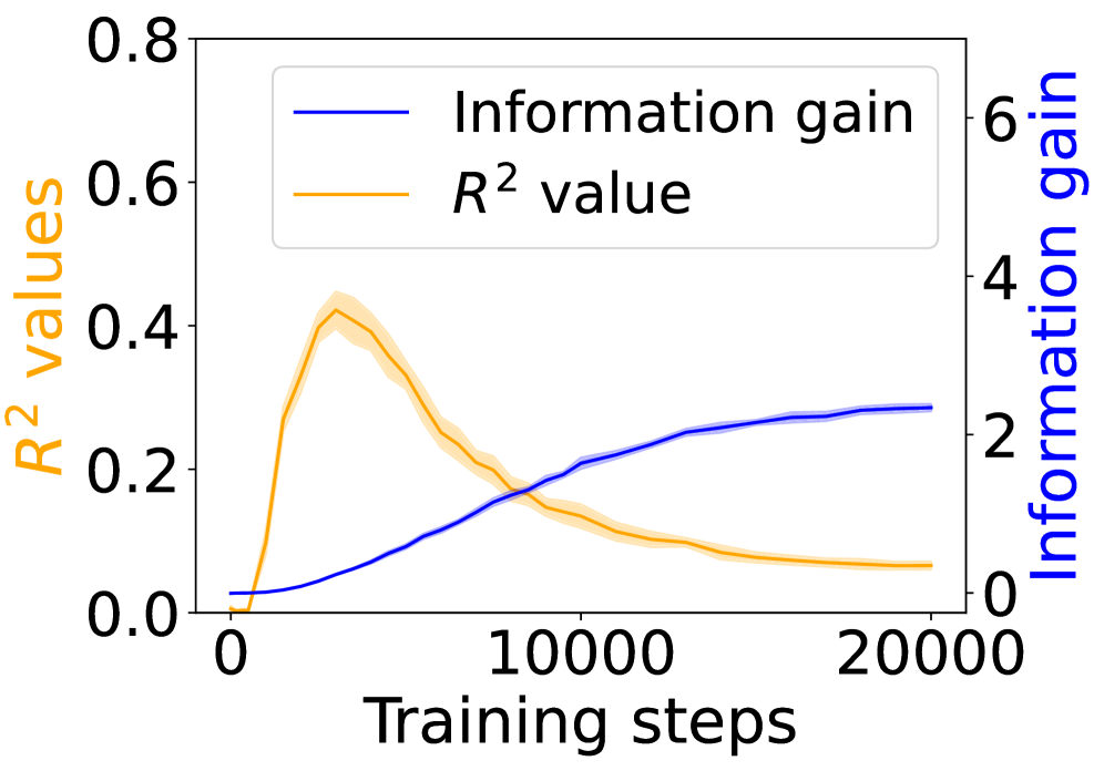
## Line Chart: Training Performance Metrics
### Overview
This image presents a line chart illustrating the relationship between training steps and two performance metrics: Information Gain and R² value. The chart displays how these metrics evolve during the training process, likely of a machine learning model. The x-axis represents "Training steps", while the left y-axis represents "R² values" and the right y-axis represents "Information gain".
### Components/Axes
* **X-axis:** "Training steps", ranging from approximately 0 to 20000.
* **Left Y-axis:** "R² values", ranging from 0.0 to 0.8.
* **Right Y-axis:** "Information gain", ranging from 0 to 6.
* **Legend:** Located in the top-left corner, containing two entries:
* "Information gain" - represented by a dark blue line.
* "R² value" - represented by a light orange line.
### Detailed Analysis
* **Information Gain (Blue Line):** The blue line representing Information Gain exhibits an upward trend throughout the training process. It starts at approximately 0 at 0 training steps, gradually increases, and plateaus around a value of approximately 2.5 at 20000 training steps. The slope of the line decreases as training progresses, indicating diminishing returns in information gain.
* **R² Value (Orange Line):** The orange line representing the R² value shows a more complex pattern. It begins at approximately 0 at 0 training steps, rapidly increases to a peak of around 0.45 at approximately 5000 training steps, and then gradually decreases to approximately 0.25 at 20000 training steps. This suggests an initial period of rapid model improvement followed by a potential overfitting or stabilization phase.
Here's a breakdown of approximate data points:
| Training Steps | Information Gain (approx.) | R² Value (approx.) |
|---|---|---|
| 0 | 0.0 | 0.0 |
| 2500 | 0.8 | 0.2 |
| 5000 | 1.5 | 0.45 |
| 10000 | 2.0 | 0.35 |
| 20000 | 2.5 | 0.25 |
### Key Observations
* The R² value peaks early in the training process and then declines, while the Information Gain continues to increase, albeit at a decreasing rate.
* The initial rapid increase in R² suggests a quick learning phase.
* The plateauing of Information Gain indicates that the model is extracting less and less new information from the training data as training progresses.
* The divergence between the two metrics after the initial phase suggests a potential trade-off between model fit (R²) and information gain.
### Interpretation
The chart suggests that the model initially learns quickly, as evidenced by the rapid increase in the R² value. However, this improvement plateaus and even declines, potentially indicating overfitting or reaching a point of diminishing returns. The continuous increase in Information Gain suggests that the model is still processing and incorporating information from the training data, even as its ability to fit the data (as measured by R²) decreases.
This could indicate that the model is becoming more complex and potentially memorizing the training data rather than generalizing to unseen data. Further investigation might involve techniques to prevent overfitting, such as regularization or early stopping. The relationship between Information Gain and R² is not necessarily causal, but their contrasting trends provide valuable insights into the model's learning dynamics. The chart highlights the importance of monitoring multiple metrics during training to gain a comprehensive understanding of model performance.