## Bar Chart: Accuracy by Pass@1 of q_T
### Overview
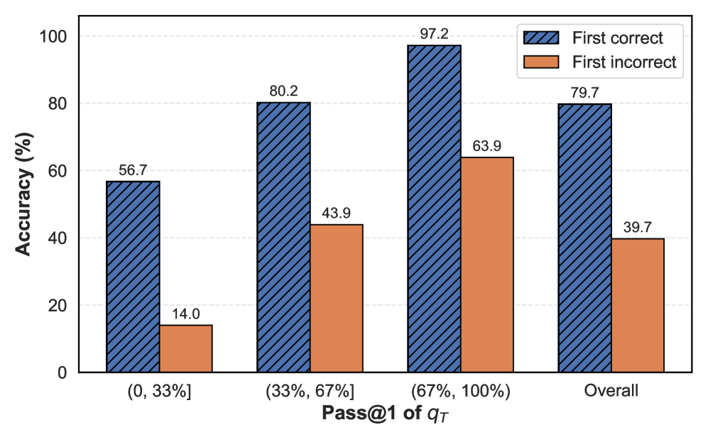
The chart compares accuracy percentages for two categories ("First correct" and "First incorrect") across four Pass@1 of q_T ranges: (0, 33%], (33%, 67%], (67%, 100%], and Overall. Accuracy is measured on a y-axis from 0% to 100%, with grouped bars for each category.
### Components/Axes
- **X-axis**: Labeled "Pass@1 of q_T" with four categories:
- (0, 33%]
- (33%, 67%]
- (67%, 100%]
- Overall
- **Y-axis**: Labeled "Accuracy (%)" with a scale from 0 to 100.
- **Legend**: Located in the top-right corner, with two entries:
- **First correct**: Blue with diagonal stripes.
- **First incorrect**: Orange.
### Detailed Analysis
- **First correct (blue)**:
- (0, 33%]: 56.7%
- (33%, 67%]: 80.2%
- (67%, 100%]: 97.2%
- Overall: 79.7%
- **Trend**: Accuracy increases steadily from (0, 33%] to (67%, 100%], then drops slightly in the "Overall" category.
- **First incorrect (orange)**:
- (0, 33%]: 14.0%
- (33%, 67%]: 43.9%
- (67%, 100%]: 63.9%
- Overall: 39.7%
- **Trend**: Accuracy rises from (0, 33%] to (67%, 100%], then decreases in the "Overall" category.
### Key Observations
1. **Highest accuracy for "First correct"** occurs in the (67%, 100%] range (97.2%), but the "Overall" metric (79.7%) is lower, suggesting potential weighting or averaging effects.
2. **"First incorrect" accuracy** peaks in the (67%, 100%] range (63.9%) but drops to 39.7% overall, indicating a possible inverse relationship with the "First correct" trend.
3. The "Overall" category deviates from the pattern of the other ranges, implying a different calculation method (e.g., weighted average).
### Interpretation
The data suggests that higher Pass@1 thresholds (e.g., 67%+) correlate with improved accuracy for "First correct" responses, likely due to stricter filtering of relevant data. However, the "Overall" metric for "First correct" (79.7%) is lower than the (67%, 100%] range, hinting at either:
- A normalization process that reduces extreme values.
- A broader dataset in the "Overall" category that includes lower-performing segments.
For "First incorrect," the peak in the (67%, 100%] range (63.9%) contrasts with the "Overall" value (39.7%), suggesting that while high thresholds increase incorrect answers in specific ranges, the overall metric balances this with lower thresholds. This could reflect a trade-off between precision and recall in the system being measured.
The chart emphasizes the importance of threshold selection in accuracy metrics, with higher thresholds favoring correctness but potentially reducing overall performance due to excluded data.