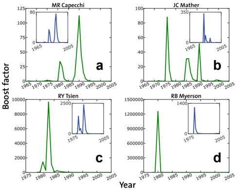
## Chart: Boost Factor vs. Year for Four Individuals
### Overview
The image presents four separate line graphs (a, b, c, d), each displaying a "Boost factor" over time (Year) for a different individual: MR Capecchi, JC Mather, RY Tsien, and RB Myerson. Each graph also includes a smaller inset graph showing a zoomed-in view of a specific time period. The main graphs show a spike in the boost factor around the 1980s for all individuals, with varying magnitudes.
### Components/Axes
* **Main Graphs:**
* **Y-axis (Boost factor):**
* Graph a (MR Capecchi): Scale from 0 to 125.
* Graph b (JC Mather): Scale from 0 to 100.
* Graph c (RY Tsien): Scale from 0 to 10000.
* Graph d (RB Myerson): Scale from 0 to 1500000.
* **X-axis (Year):** All main graphs share the same x-axis scale, ranging from approximately 1965/1975 to 2005.
* **Titles:**
* Graph a: "MR Capecchi"
* Graph b: "JC Mather"
* Graph c: "RY Tsien"
* Graph d: "RB Myerson"
* **Labels:** Each graph is labeled with a lowercase letter: a, b, c, and d, located in the bottom right corner of each graph.
* **Inset Graphs:**
* All inset graphs have the same X-axis (Year) ranging from 1965/1975 to 2005.
* Y-axis scales vary.
* Graph a (MR Capecchi): Scale from 0 to 80.
* Graph b (JC Mather): Scale from 0 to 350.
* Graph c (RY Tsien): Scale from 0 to 2500.
* Graph d (RB Myerson): Scale from 0 to 1400.
* **Data Series:** Each graph contains one data series represented by a green line in the main graphs and a blue line in the inset graphs.
### Detailed Analysis
* **Graph a (MR Capecchi):**
* **Trend:** The green line shows a small peak around 1980, followed by a larger peak around 1990, then decreases.
* **Data Points:**
* Approximately 0 around 1970.
* Approximately 30 around 1980.
* Peak of approximately 110 around 1990.
* Decreases to approximately 0 by 2000.
* **Inset Graph:** Shows two peaks, one around 1995 and another around 2000.
* **Graph b (JC Mather):**
* **Trend:** The green line shows a peak around 1975, followed by a smaller peak around 1990, then decreases.
* **Data Points:**
* Approximately 0 around 1970.
* Peak of approximately 90 around 1975.
* Approximately 40 around 1990.
* Decreases to approximately 0 by 2000.
* **Inset Graph:** Shows two peaks, one around 1995 and another around 2000.
* **Graph c (RY Tsien):**
* **Trend:** The green line shows a large peak around 1980, then decreases.
* **Data Points:**
* Approximately 0 around 1975.
* Peak of approximately 8000 around 1980.
* Decreases to approximately 0 by 1990.
* **Inset Graph:** Shows two peaks, one around 1995 and another around 2000.
* **Graph d (RB Myerson):**
* **Trend:** The green line shows a very large peak around 1980, then decreases.
* **Data Points:**
* Approximately 0 around 1975.
* Peak of approximately 1200000 around 1980.
* Decreases to approximately 0 by 1990.
* **Inset Graph:** Shows a single peak around 1995.
### Key Observations
* All four individuals show a significant spike in the "Boost factor" around the 1975-1990 period.
* The magnitude of the "Boost factor" varies greatly between individuals, with RB Myerson having a significantly higher peak value than the others.
* The inset graphs show activity in the later years (1995-2005), which is not as prominent in the main graphs.
### Interpretation
The graphs likely represent some form of impact or recognition (indicated by the "Boost factor") over time for each individual. The peak around the 1980s could indicate a period of significant achievement or influence. The varying magnitudes suggest different levels of impact for each individual. The inset graphs might represent a secondary period of recognition or a different type of impact that is less pronounced than the initial peak. The data suggests that each individual experienced a period of heightened activity or recognition, with the timing and magnitude varying across individuals.