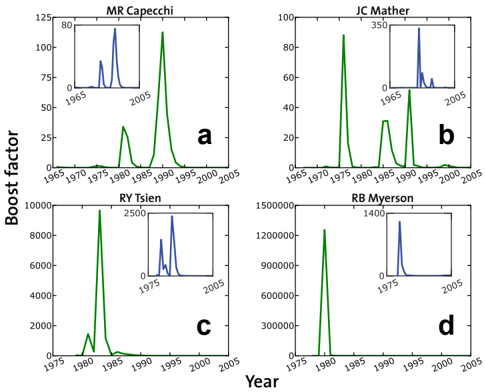
## Chart: Boost Factor vs. Year for Four Researchers
### Overview
The image presents four separate line charts, arranged in a 2x2 grid. Each chart displays the "Boost Factor" over "Year" for a different researcher: MR Capecci, JC Mather, RY Tsien, and RB Myerson. Each chart also includes an inset plot showing a zoomed-in view of the Boost Factor over the same year range. The y-axis scales differ significantly between the charts, indicating varying magnitudes of Boost Factor for each researcher.
### Components/Axes
* **X-axis:** "Year", ranging from approximately 1965 to 2005.
* **Y-axis:** "Boost factor". The scale varies for each chart:
* Chart a (MR Capecci): 0 to approximately 100.
* Chart b (JC Mather): 0 to approximately 100.
* Chart c (RY Tsien): 0 to approximately 10000.
* Chart d (RB Myerson): 0 to approximately 1500000.
* **Lines:** Each chart contains two lines:
* A green line representing the primary Boost Factor trend.
* A blue line representing a secondary Boost Factor trend, displayed in an inset plot.
* **Inset Plots:** Each chart has a smaller plot in the top-right corner, showing a zoomed-in view of the blue line's data. The y-axis scale of the inset plots are:
* Chart a: 0 to approximately 80.
* Chart b: 0 to approximately 350.
* Chart c: 0 to approximately 2500.
* Chart d: 0 to approximately 1400.
* **Labels:** Each chart is labeled with the researcher's name: MR Capecci (a), JC Mather (b), RY Tsien (c), and RB Myerson (d).
### Detailed Analysis or Content Details
**Chart a (MR Capecci):**
* The green line shows a Boost Factor that starts at approximately 5 in 1965, rises to a peak of around 25-30 around 1985-1990, and then declines to approximately 10 by 2005.
* The blue line (inset) shows a series of peaks between 1965 and 2005, with the highest peak around 1995 at approximately 70-80.
**Chart b (JC Mather):**
* The green line starts at approximately 5 in 1965, rises to a peak of around 60-70 around 1985-1990, and then declines to approximately 10 by 2005.
* The blue line (inset) shows a single, prominent peak around 1990 at approximately 300-350.
**Chart c (RY Tsien):**
* The green line starts at approximately 500 in 1965, rises dramatically to a peak of around 8000-9000 around 1990, and then declines to approximately 2000 by 2005.
* The blue line (inset) shows a series of peaks between 1965 and 2005, with the highest peak around 1995 at approximately 2000-2500.
**Chart d (RB Myerson):**
* The green line starts at approximately 300000 in 1965, rises to a peak of around 1300000-1400000 around 1985-1990, and then declines to approximately 400000 by 2005.
* The blue line (inset) shows a series of peaks between 1965 and 2005, with the highest peak around 1995 at approximately 1200-1400.
### Key Observations
* All four researchers exhibit a similar trend: a rise in Boost Factor peaking around 1985-1990, followed by a decline.
* The magnitude of the Boost Factor varies significantly between researchers, with RB Myerson having the highest values and MR Capecci having the lowest.
* The blue lines (inset plots) represent more sporadic or secondary Boost Factor events, showing multiple peaks over the time period.
* The inset plots provide a more detailed view of the blue line's fluctuations, which are less visible on the main charts due to the different y-axis scales.
### Interpretation
The charts likely represent the impact or recognition (Boost Factor) of research contributions made by each scientist over time. The peak around 1985-1990 could correspond to a period of significant breakthroughs or publications for all four researchers. The differing magnitudes of Boost Factor suggest varying levels of impact or recognition. The inset plots, representing secondary Boost Factor events, could indicate specific publications, awards, or collaborations that generated additional recognition. The overall pattern suggests that scientific impact tends to rise with experience and then decline as researchers move later in their careers or as their fields evolve. The large difference in scale between the researchers suggests that the "Boost Factor" is a relative measure, and the absolute values are not directly comparable. The data suggests that RB Myerson's work had a significantly larger impact (as measured by Boost Factor) than the work of the other three researchers.