## Line Charts: FEM Kernel and Target Function
### Overview
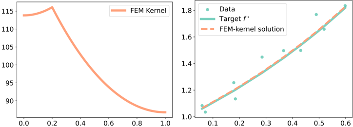
The image presents two line charts side-by-side. The left chart displays the "FEM Kernel" function, while the right chart compares "Data", "Target f*", and "FEM-kernel solution". Both charts have similar visual styles and are likely related in their context.
### Components/Axes
**Left Chart:**
* **Title:** Implicit, but the chart represents the "FEM Kernel".
* **X-axis:** Ranges from 0.0 to 1.0, with increments of 0.2.
* **Y-axis:** Ranges from 90 to 115, with increments of 5.
* **Legend:** "FEM Kernel" (represented by a solid light orange line).
**Right Chart:**
* **Title:** Implicit, but the chart compares "Data", "Target f*", and "FEM-kernel solution".
* **X-axis:** Ranges from 0.1 to 0.6, with increments of 0.1.
* **Y-axis:** Ranges from 1.0 to 1.8, with increments of 0.2.
* **Legend:**
* "Data" (represented by light blue dots).
* "Target f*" (represented by a solid light blue line).
* "FEM-kernel solution" (represented by a dashed light orange line).
### Detailed Analysis
**Left Chart (FEM Kernel):**
* **Trend:** The "FEM Kernel" line starts at approximately 114 at x=0.0, slightly increases to approximately 116 at x=0.3, and then decreases non-linearly to approximately 88 at x=1.0.
* **Data Points:**
* x=0.0, y ≈ 114
* x=0.2, y ≈ 115
* x=0.3, y ≈ 116
* x=0.4, y ≈ 112
* x=0.6, y ≈ 98
* x=0.8, y ≈ 91
* x=1.0, y ≈ 88
**Right Chart (Data, Target f*, FEM-kernel solution):**
* **Data (Light Blue Dots):** Scattered points representing the data. The data points generally increase as x increases.
* x=0.08, y ≈ 1.05
* x=0.15, y ≈ 1.03
* x=0.2, y ≈ 1.15
* x=0.25, y ≈ 1.3
* x=0.3, y ≈ 1.2
* x=0.35, y ≈ 1.15
* x=0.4, y ≈ 1.2
* x=0.45, y ≈ 1.5
* x=0.5, y ≈ 1.3
* x=0.55, y ≈ 1.7
* x=0.6, y ≈ 1.8
* **Target f* (Solid Light Blue Line):** A straight line that increases linearly from approximately 1.05 at x=0.1 to approximately 1.7 at x=0.6.
* x=0.1, y ≈ 1.05
* x=0.2, y ≈ 1.15
* x=0.3, y ≈ 1.25
* x=0.4, y ≈ 1.4
* x=0.5, y ≈ 1.55
* x=0.6, y ≈ 1.7
* **FEM-kernel solution (Dashed Light Orange Line):** A straight line that closely follows the "Target f*" line.
* x=0.1, y ≈ 1.05
* x=0.2, y ≈ 1.15
* x=0.3, y ≈ 1.25
* x=0.4, y ≈ 1.35
* x=0.5, y ≈ 1.5
* x=0.6, y ≈ 1.65
### Key Observations
* The "FEM Kernel" function decreases significantly as x increases from 0.3 to 1.0.
* The "Target f*" and "FEM-kernel solution" lines in the right chart are very close, indicating that the FEM-kernel solution is a good approximation of the target function.
* The "Data" points are scattered around the "Target f*" line, suggesting that the target function is a reasonable model for the data.
### Interpretation
The charts likely represent a comparison of a Finite Element Method (FEM) kernel solution to a target function and some observed data. The left chart shows the shape of the FEM kernel itself. The right chart demonstrates how well the FEM-kernel solution approximates the target function, given some noisy data. The close agreement between the "Target f*" and "FEM-kernel solution" suggests that the FEM is effective in this context. The scatter of the "Data" points around the "Target f*" indicates the presence of noise or variability in the data.