## Stacked Bar Chart: Tool Choice Correctness Analysis
### Overview
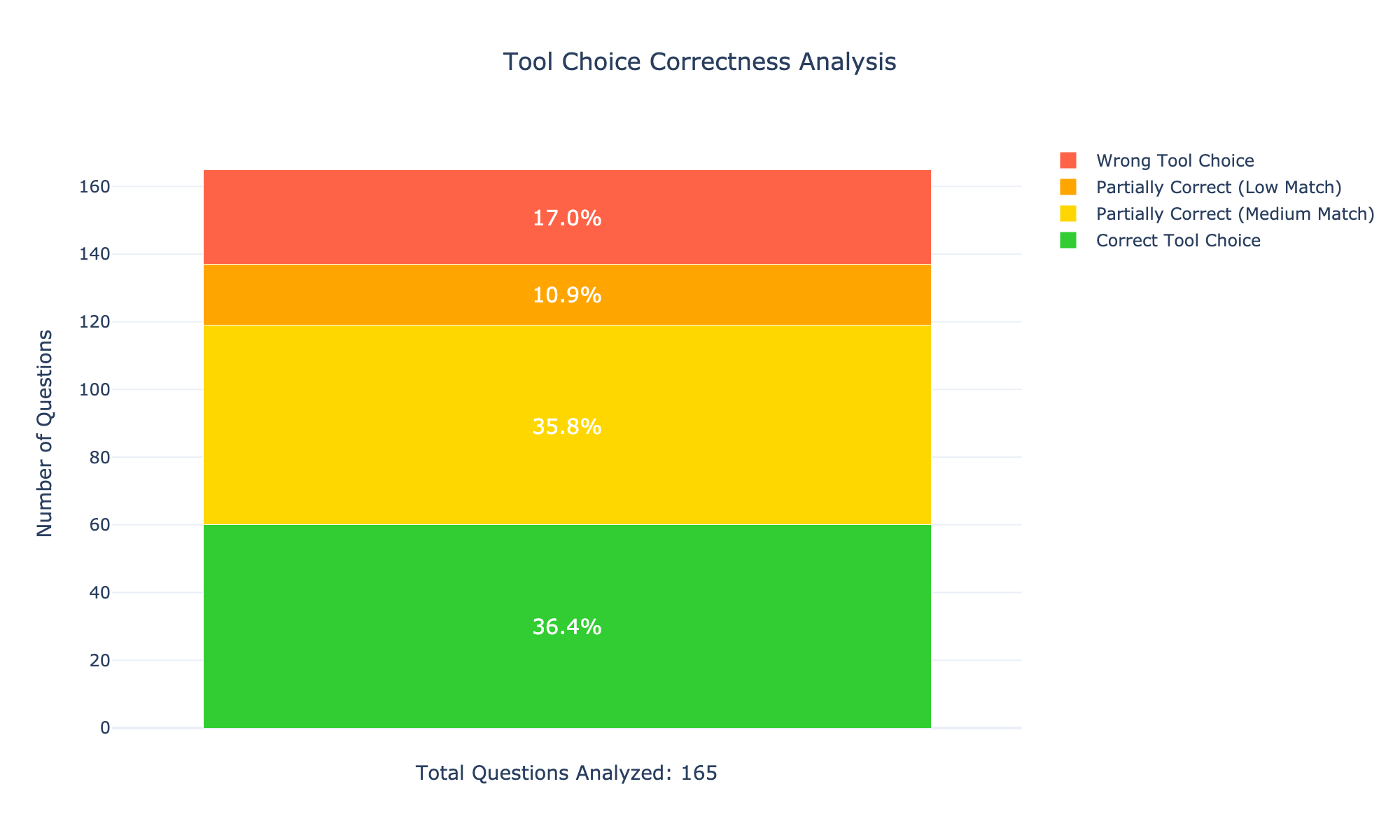
The image is a stacked bar chart that analyzes the correctness of tool choices. The chart displays the distribution of correct, partially correct (medium and low match), and wrong tool choices. The y-axis represents the number of questions, and the x-axis represents the total questions analyzed. The chart provides percentage values for each category within the stacked bar.
### Components/Axes
* **Title:** Tool Choice Correctness Analysis
* **Y-axis Title:** Number of Questions
* Y-axis scale ranges from 0 to 160, with tick marks at intervals of 20 (0, 20, 40, 60, 80, 100, 120, 140, 160).
* **X-axis Title:** Total Questions Analyzed: 165
* **Legend:** Located on the top-right of the chart.
* Red: Wrong Tool Choice
* Orange: Partially Correct (Low Match)
* Yellow: Partially Correct (Medium Match)
* Green: Correct Tool Choice
### Detailed Analysis
The stacked bar is composed of four colored segments, each representing a different level of tool choice correctness.
* **Green (Correct Tool Choice):** The bottom segment of the bar is green, representing the number of questions with the correct tool choice. It accounts for 36.4% of the total. The green bar extends to approximately 60 on the y-axis.
* **Yellow (Partially Correct - Medium Match):** The next segment is yellow, representing partially correct tool choices with a medium match. It accounts for 35.8% of the total. The yellow bar extends to approximately 120 on the y-axis.
* **Orange (Partially Correct - Low Match):** Above the yellow segment is an orange segment, representing partially correct tool choices with a low match. It accounts for 10.9% of the total. The orange bar extends to approximately 140 on the y-axis.
* **Red (Wrong Tool Choice):** The top segment is red, representing the number of questions with the wrong tool choice. It accounts for 17.0% of the total. The red bar extends to approximately 165 on the y-axis.
### Key Observations
* The "Correct Tool Choice" and "Partially Correct (Medium Match)" categories have the highest percentages, at 36.4% and 35.8% respectively.
* The "Wrong Tool Choice" and "Partially Correct (Low Match)" categories have the lowest percentages, at 17.0% and 10.9% respectively.
* The total number of questions analyzed is 165.
### Interpretation
The chart indicates that in the analyzed dataset, the tool choices were either correct or partially correct (medium match) in the majority of cases. The percentage of wrong tool choices is relatively low. This suggests that the tool selection process is generally effective, but there is still room for improvement, particularly in reducing the number of "Wrong Tool Choice" and "Partially Correct (Low Match)" selections. The data highlights the distribution of tool choice correctness, providing insights into areas where users may need additional guidance or training to improve their tool selection skills.