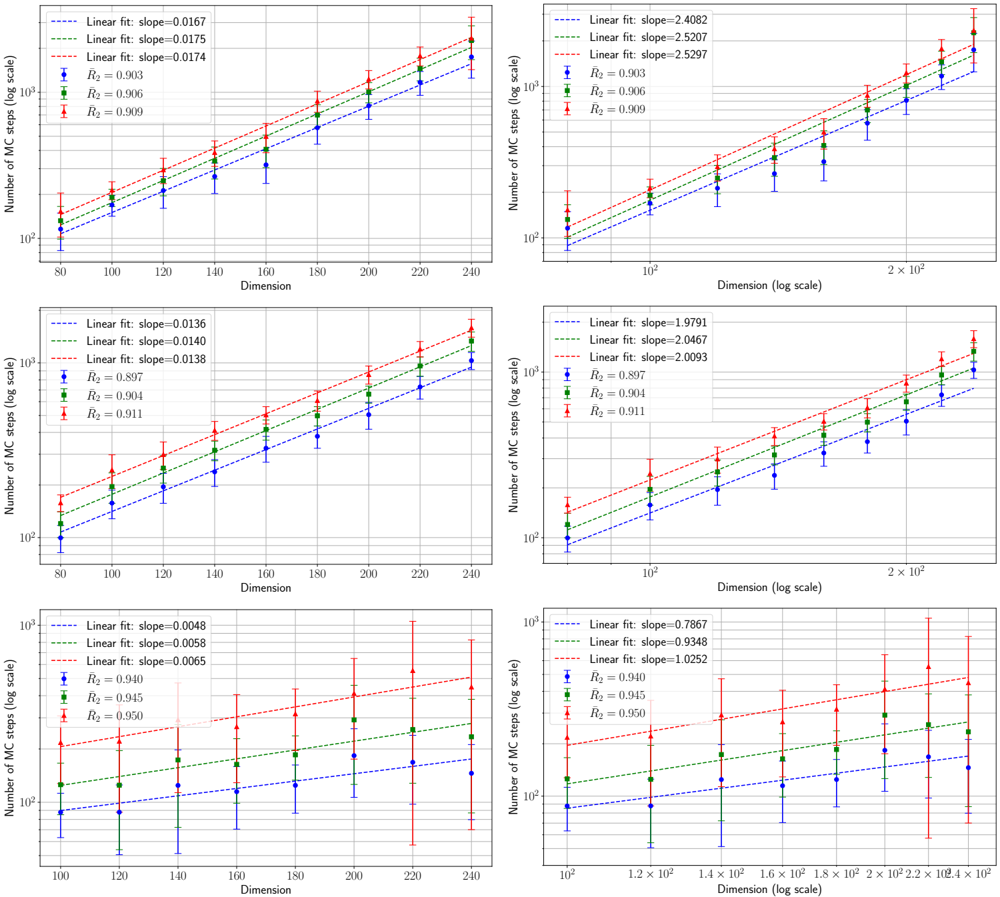
## Charts: Monte Carlo Steps vs. Dimension
### Overview
The image contains six separate charts, each depicting the relationship between the number of Monte Carlo (MC) steps (on a logarithmic scale) and the dimension of a problem. Each chart displays three linear regression lines with associated R-squared values and slope information. The x-axis represents dimension, and the y-axis represents the number of MC steps. All x-axes are on a logarithmic scale.
### Components/Axes
* **Y-axis Label (all charts):** "Number of MC steps (log scale)"
* **X-axis Label (all charts):** "Dimension (log scale)"
* **Lines (all charts):** Three lines, each representing a linear fit to data points. The lines are colored red, blue, and green.
* **Data Points (all charts):** Small triangular markers representing the data used for the linear fit. These are also colored red, blue, and green, corresponding to the lines.
* **Text Annotations (all charts):** Each chart includes text displaying the slope of each linear fit and the corresponding R-squared value.
### Detailed Analysis
**Chart 1 (Top-Left):**
* **Red Line:** Slopes upward. Linear fit: slope = 0.0167, R² = 0.903
* **Blue Line:** Slopes upward. Linear fit: slope = 0.0175, R² = 0.906
* **Green Line:** Slopes upward. Linear fit: slope = 0.0174, R² = 0.900
* X-axis range: approximately 80 to 240
* Y-axis range: approximately 10² to 10⁴
**Chart 2 (Top-Right):**
* **Red Line:** Slopes upward. Linear fit: slope = 2.4082, R² = 0.903
* **Blue Line:** Slopes upward. Linear fit: slope = 2.5207, R² = 0.926
* **Green Line:** Slopes upward. Linear fit: slope = 2.5097, R² = 0.909
* X-axis range: approximately 10² to 2 x 10⁵
* Y-axis range: approximately 10² to 10⁴
**Chart 3 (Middle-Left):**
* **Red Line:** Slopes upward. Linear fit: slope = 0.0136, R² = 0.807
* **Blue Line:** Slopes upward. Linear fit: slope = 0.0140, R² = 0.904
* **Green Line:** Slopes upward. Linear fit: slope = 0.0138, R² = 0.911
* X-axis range: approximately 80 to 240
* Y-axis range: approximately 10² to 10⁴
**Chart 4 (Middle-Right):**
* **Red Line:** Slopes upward. Linear fit: slope = 1.9791, R² = 0.807
* **Blue Line:** Slopes upward. Linear fit: slope = 2.0467, R² = 0.911
* **Green Line:** Slopes upward. Linear fit: slope = 2.0093, R² = 0.904
* X-axis range: approximately 10² to 2 x 10⁵
* Y-axis range: approximately 10² to 10⁴
**Chart 5 (Bottom-Left):**
* **Red Line:** Slopes upward. Linear fit: slope = 0.0048, R² = 0.940
* **Blue Line:** Slopes upward. Linear fit: slope = 0.0055, R² = 0.947
* **Green Line:** Slopes upward. Linear fit: slope = 0.0045, R² = 0.913
* X-axis range: approximately 80 to 240
* Y-axis range: approximately 10² to 10⁴
**Chart 6 (Bottom-Right):**
* **Red Line:** Slopes upward. Linear fit: slope = 0.7887, R² = 0.9348
* **Blue Line:** Slopes upward. Linear fit: slope = 0.8022, R² = 0.945
* **Green Line:** Slopes upward. Linear fit: slope = 0.7952, R² = 0.913
* X-axis range: approximately 10² to 2 x 10⁵
* Y-axis range: approximately 10² to 10⁴
### Key Observations
* All charts show a positive correlation between dimension and the number of MC steps.
* The R-squared values are generally high (above 0.8), indicating a good fit of the linear model to the data.
* The slopes of the lines vary significantly between charts, suggesting that the relationship between dimension and MC steps is dependent on some other factor not explicitly shown.
* The charts on the right (larger dimension ranges) have steeper slopes than the charts on the left.
### Interpretation
The data suggests that the computational cost of Monte Carlo simulations (as measured by the number of steps required) increases with the dimensionality of the problem. The linear fits indicate that this increase is approximately linear on the log-log scale, which implies an exponential relationship between the number of MC steps and the dimension. The variation in slopes across the charts suggests that the specific rate of increase depends on the nature of the problem being solved. The higher R-squared values indicate that the linear model is a reasonable approximation of the true relationship within the observed data ranges. The steeper slopes in the charts with larger dimension ranges suggest that the computational cost grows more rapidly as the dimension increases. This is a common phenomenon in high-dimensional problems, often referred to as the "curse of dimensionality." The data provides empirical evidence supporting this theoretical concept.