TECHNICAL ASSET FINGERPRINT
96b5b88dc0ddfd1e2732d843
Click to view fullscreen
Press ESC or click to close
FOUND IN PAPERS
EXPERT: healer-alpha-free VERSION 1
RUNTIME: free/openrouter/healer-alpha
INTEL_VERIFIED
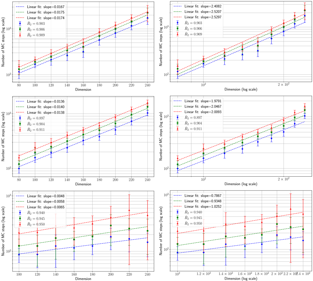
## Scatter Plots with Linear Fits: Dimension vs. Number of Monte Carlo Steps
### Overview
The image contains six scatter plots arranged in a 3x2 grid. Each plot displays the relationship between "Dimension" (x-axis) and "Number of MC steps (log scale)" (y-axis). The plots compare three distinct data series, each represented by a different color and marker shape, with associated linear regression fits. The left column of plots uses a linear scale for the x-axis, while the right column uses a logarithmic scale for the x-axis. The y-axis is logarithmic in all plots.
### Components/Axes
* **Y-axis (All Plots):** Label: "Number of MC steps (log scale)". Scale is logarithmic, with major ticks at 10² and 10³.
* **X-axis (Left Column Plots):** Label: "Dimension". Scale is linear. Ticks and ranges vary per row.
* **X-axis (Right Column Plots):** Label: "Dimension (log scale)". Scale is logarithmic. Ticks and ranges vary per row.
* **Data Series & Legend (All Plots):** A legend is present in the top-left corner of each plot. It defines three series:
1. **Blue Circles (●):** Associated with a blue dashed linear fit line.
2. **Green Squares (■):** Associated with a green dashed linear fit line.
3. **Red Triangles (▲):** Associated with a red dashed linear fit line.
* **Error Bars:** All data points include vertical error bars.
### Detailed Analysis
The plots are organized into three rows, each representing a different dataset or experimental condition.
**Row 1 (Top):**
* **Left Plot (Linear X):**
* X-axis Range: 80 to 240.
* Linear Fit Slopes: Blue=0.0167, Green=0.0175, Red=0.0174.
* R² Values: Blue=0.903, Green=0.906, Red=0.909.
* Trend: All three series show a strong, positive, linear increase. The slopes are very similar, with Green and Red nearly identical and slightly higher than Blue.
* **Right Plot (Log X):**
* X-axis Range: ~80 to ~240 (log scale).
* Linear Fit Slopes: Blue=2.4082, Green=2.5207, Red=2.5297.
* R² Values: Blue=0.903, Green=0.906, Red=0.909.
* Trend: The same data plotted on a log-log scale. The linear fits indicate a power-law relationship. The slopes (exponents) are >2, with Red > Green > Blue.
**Row 2 (Middle):**
* **Left Plot (Linear X):**
* X-axis Range: 80 to 240.
* Linear Fit Slopes: Blue=0.0136, Green=0.0140, Red=0.0138.
* R² Values: Blue=0.897, Green=0.904, Red=0.911.
* Trend: Positive linear increase. Slopes are lower than in Row 1. Green has the highest slope, followed by Red, then Blue.
* **Right Plot (Log X):**
* X-axis Range: ~80 to ~240 (log scale).
* Linear Fit Slopes: Blue=1.9791, Green=2.0467, Red=2.0093.
* R² Values: Blue=0.897, Green=0.904, Red=0.911.
* Trend: Power-law relationship on log-log scale. Slopes (exponents) are around 2. Green has the highest exponent.
**Row 3 (Bottom):**
* **Left Plot (Linear X):**
* X-axis Range: 100 to 240.
* Linear Fit Slopes: Blue=0.0048, Green=0.0058, Red=0.0065.
* R² Values: Blue=0.940, Green=0.945, Red=0.950.
* Trend: Positive linear increase, but with much shallower slopes than Rows 1 & 2. Red has the steepest slope, followed by Green, then Blue. Error bars, especially for the Red series, are notably larger.
* **Right Plot (Log X):**
* X-axis Range: 100 to 240 (log scale).
* Linear Fit Slopes: Blue=0.7867, Green=0.9348, Red=1.0252.
* R² Values: Blue=0.940, Green=0.945, Red=0.950.
* Trend: Power-law relationship on log-log scale. Slopes (exponents) are around or below 1, significantly lower than in the rows above. Red has an exponent >1.
### Key Observations
1. **Consistent Positive Correlation:** In all six plots, the number of Monte Carlo (MC) steps increases with Dimension.
2. **Series Hierarchy:** The Red series (▲) consistently requires the highest number of MC steps for a given dimension, followed by Green (■), and then Blue (●). This hierarchy is visually clear from the vertical ordering of the data points and fit lines.
3. **Slope Progression:** The slopes of the linear fits (both on linear-linear and log-log scales) decrease from the top row to the bottom row. Row 1 has the steepest relationships, Row 3 the shallowest.
4. **Power-Law Indication:** The linear fits on the log-log plots (right column) suggest the relationship between Dimension (D) and MC steps (N) follows a power law of the form N ∝ D^k, where k is the slope of the log-log fit.
5. **Variance:** The error bars, representing uncertainty or variance in the MC step count, appear generally larger in the bottom row, particularly for the Red series.
### Interpretation
This set of plots likely comes from a computational physics or chemistry study analyzing the scaling behavior of a Monte Carlo simulation algorithm. The "Dimension" probably refers to the size or complexity of the system being simulated (e.g., number of particles, degrees of freedom).
* **What the data suggests:** The number of computational steps (MC steps) required for the simulation scales polynomially with system dimension (N ∝ D^k). The exponent `k` varies between approximately 0.79 and 2.53 across the different conditions represented by the three rows.
* **How elements relate:** The three colored series (Blue, Green, Red) likely represent different algorithmic variants, parameters, or system types being compared. The consistent hierarchy (Red > Green > Blue in step count) indicates that the condition represented by Red is the most computationally expensive, while Blue is the most efficient, across all dimensions tested.
* **Notable trends/anomalies:**
* The dramatic decrease in scaling exponent `k` from Row 1 (~2.5) to Row 3 (~0.8-1.0) is the most significant finding. This suggests a fundamental change in the algorithm's performance or the system's behavior between these experimental setups. Row 3 demonstrates a much more favorable, near-linear (k≈1) or sub-linear (k<1) scaling.
* The high R² values (mostly >0.9) indicate that the power-law model is a good fit for the data in the log-log representation.
* The larger error bars in Row 3, especially for the Red series, imply greater stochastic variability or less deterministic behavior in that particular experimental condition, even though its average scaling is better.
**In summary, the image provides a technical comparison of how computational cost scales with problem size for three different methods or scenarios. The key takeaway is the identification of a condition (Row 3) where the scaling exponent is significantly reduced, pointing to a more efficient approach for high-dimensional problems.**
DECODING INTELLIGENCE...