## Scatter Plot: Output Token Position Index vs Decoding Steps
### Overview
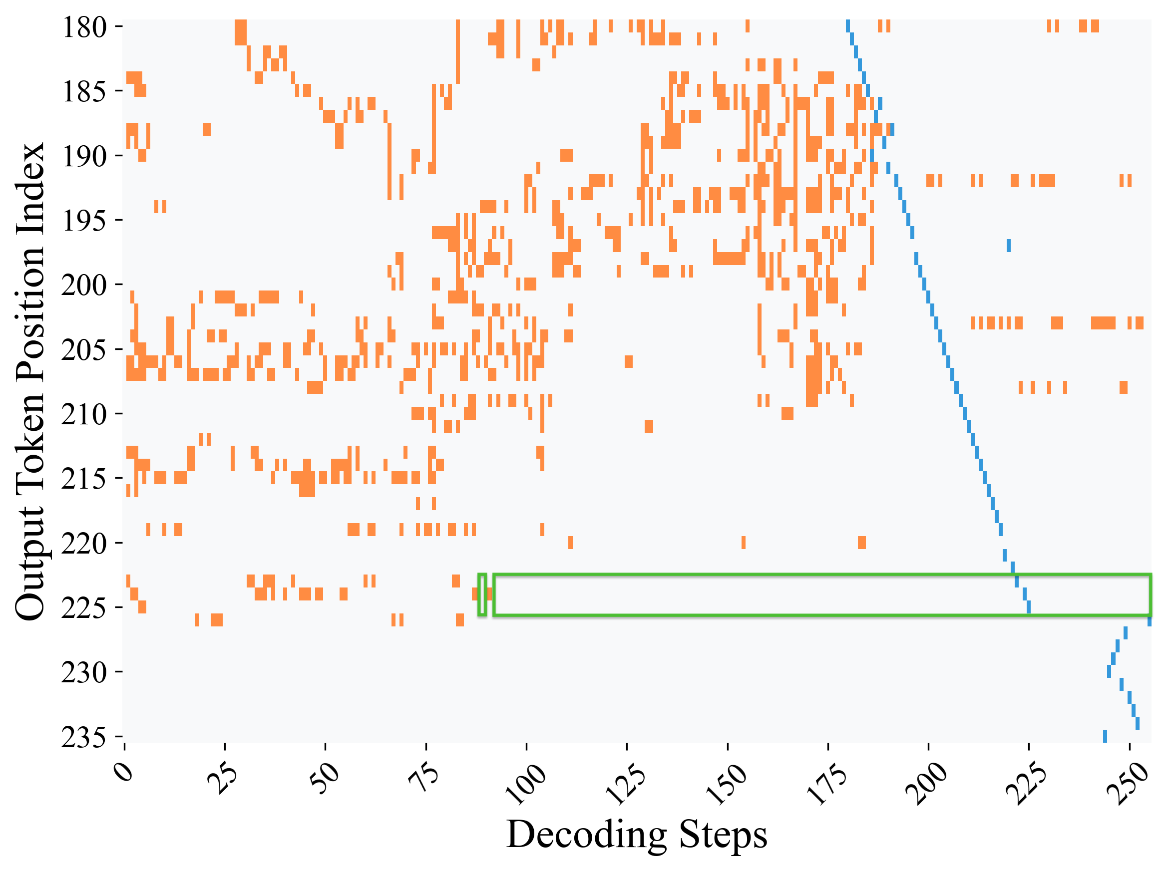
The image is a scatter plot visualizing the relationship between **Decoding Steps** (x-axis) and **Output Token Position Index** (y-axis). Orange data points represent individual observations, while a blue diagonal line and a green rectangular highlight indicate specific trends or regions of interest. The plot suggests a dynamic interaction between decoding steps and token positions, with notable patterns in data distribution.
---
### Components/Axes
- **X-axis (Decoding Steps)**: Ranges from 0 to 250, with increments of 25.
- **Y-axis (Output Token Position Index)**: Ranges from 180 to 235, with increments of 5.
- **Data Points**:
- **Orange**: Scattered across the plot, with higher density in the mid-range (Decoding Steps: 50–150; Token Positions: 190–210).
- **Blue**: Forms a diagonal line from top-left (Decoding Steps ~0, Token Positions ~235) to bottom-right (Decoding Steps ~250, Token Positions ~180).
- **Green Rectangle**: Highlights a region spanning Decoding Steps 75–100 and Token Positions 225–230.
---
### Detailed Analysis
1. **Orange Data Points**:
- Distributed unevenly, with clusters in the mid-range of both axes.
- Notable outliers: A few points near Decoding Steps 200–250 and Token Positions 180–190.
- No clear trend, but density decreases as Decoding Steps approach 250.
2. **Blue Diagonal Line**:
- Slope: Negative (Token Position Index decreases as Decoding Steps increase).
- Equation: Approximately **Token Position = -0.25 × Decoding Steps + 235** (estimated from endpoints).
- Aligns with the blue data points, suggesting a modeled or theoretical trend.
3. **Green Rectangle**:
- Positioned in the upper-middle range of the plot.
- Covers Decoding Steps 75–100 and Token Positions 225–230.
- Contains ~10–15 orange data points, indicating a localized concentration.
---
### Key Observations
- **Inverse Relationship**: The blue line and points suggest that higher decoding steps correlate with lower token position indices.
- **Regional Focus**: The green rectangle highlights a critical area where decoding steps and token positions intersect, possibly indicating a threshold or anomaly.
- **Data Variability**: Orange points show significant spread, especially in the lower Token Position Index range (180–190), suggesting heterogeneity in the dataset.
---
### Interpretation
The plot likely represents a machine learning or NLP model's behavior during decoding, where:
- **Decoding Steps** correspond to iterative processing steps (e.g., in autoregressive models).
- **Token Position Index** reflects the model's confidence or adjustment in token placement.
- The **blue line** may represent an idealized or expected trend, while the **orange points** reflect real-world variability.
- The **green rectangle** could denote a region of interest (e.g., a specific task or error threshold).
The negative slope of the blue line implies that as the model processes more steps, it refines token positions downward, possibly optimizing for accuracy or coherence. The green rectangle’s concentration of points might indicate a critical phase in decoding where adjustments are most impactful.
---
### Notes on Uncertainty
- Exact values for the blue line’s equation are approximate due to the absence of a legend or explicit formula.
- The green rectangle’s boundaries are defined by visual estimation, with potential ±5 units in both axes.
- Outliers in the orange data points are inferred from sparse distribution patterns.