## Line Graphs: Frequency Response of Microphones 1-4
### Overview
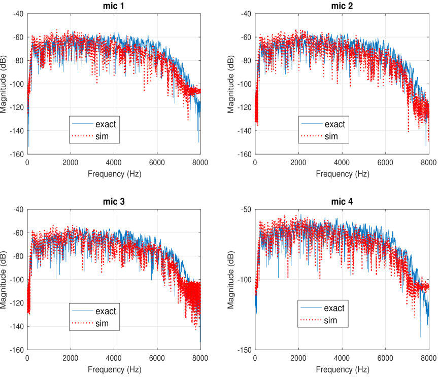
The image contains four line graphs labeled "mic 1" to "mic 4," each plotting frequency response data. The graphs compare two datasets: "exact" (solid blue line) and "sim" (red dotted line) across a frequency range of 0–8000 Hz. Magnitude is measured in decibels (dB) on the y-axis, ranging from -160 dB to -40 dB. All graphs show similar trends, with minor deviations between the datasets.
### Components/Axes
- **X-axis**: Frequency (Hz), labeled "Frequency (Hz)" at the bottom of each graph. Scale ranges from 0 to 8000 Hz in increments of 2000 Hz.
- **Y-axis**: Magnitude (dB), labeled "Magnitude (dB)" on the left side of each graph. Scale ranges from -160 dB to -40 dB in increments of 20 dB.
- **Legend**: Located in the bottom-left corner of each graph, with:
- Solid blue line labeled "exact"
- Red dotted line labeled "sim"
- **Graph Titles**: Positioned at the top of each graph, labeled "mic 1" to "mic 4" respectively.
### Detailed Analysis
#### mic 1
- **Exact (blue)**: Starts at -160 dB at 0 Hz, rises sharply to -40 dB at ~2000 Hz, then gradually declines to -160 dB at 8000 Hz.
- **Sim (red)**: Mirrors the exact trend but with minor fluctuations (e.g., ~-50 dB at 4000 Hz instead of -40 dB). Peaks at ~-45 dB at 2000 Hz.
#### mic 2
- **Exact (blue)**: Similar to mic 1, with a peak of -40 dB at ~2000 Hz.
- **Sim (red)**: Slightly lower peak (~-45 dB at 2000 Hz) and more pronounced dips (e.g., -80 dB at 6000 Hz).
#### mic 3
- **Exact (blue)**: Peak at -40 dB at ~2000 Hz, with a smoother decline.
- **Sim (red)**: Peaks at ~-45 dB at 2000 Hz, with sharper drops (e.g., -100 dB at 6000 Hz).
#### mic 4
- **Exact (blue)**: Peak at -40 dB at ~2000 Hz, with a gradual decline.
- **Sim (red)**: Peaks at ~-45 dB at 2000 Hz, with irregular fluctuations (e.g., -120 dB at 6000 Hz).
### Key Observations
1. **Consistent Trends**: All mics show a sharp rise in magnitude (~-160 dB to -40 dB) around 2000 Hz, followed by a gradual decline.
2. **Simulation Deviations**: The "sim" line consistently lags slightly behind the "exact" line in magnitude, with more variability at higher frequencies (4000–8000 Hz).
3. **Outliers**: The "sim" line exhibits irregular spikes (e.g., -120 dB at 6000 Hz for mic 4), suggesting potential noise or model inaccuracies.
### Interpretation
The graphs demonstrate the frequency response of four microphones, comparing measured ("exact") and simulated ("sim") data. The close alignment of the "exact" and "sim" lines indicates the simulation model is generally accurate, though minor discrepancies suggest:
- **Model Limitations**: The simulation may underestimate sensitivity at peak frequencies (2000 Hz) and overestimate attenuation at higher frequencies (6000–8000 Hz).
- **Practical Implications**: The sharp peak at 2000 Hz across all mics implies a resonant frequency or design feature common to these microphones. The gradual decline at higher frequencies aligns with typical microphone roll-off characteristics.
- **Technical Relevance**: These plots could be used to validate simulation tools for acoustic modeling or to identify calibration needs for the microphones.
*Note: All values are approximate due to the absence of gridlines or numerical markers beyond axis labels.*