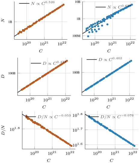
## Chart: Relationships between N, D, and C
### Overview
The image presents six scatter plots arranged in a 3x2 grid. Each plot illustrates the relationship between two variables, with a power-law fit overlaid. The plots on the left are in a brownish-orange color, while the plots on the right are in blue. The x-axis represents 'C' in all plots, while the y-axes represent 'N', 'D', and 'D/N' from top to bottom.
### Components/Axes
* **X-axis (C):** The x-axis is labeled 'C' and uses a logarithmic scale ranging from approximately 10^20 to 10^22 in all six plots.
* **Y-axis (Left Column):**
* Top plot: Labeled 'N', logarithmic scale from approximately 1B.
* Middle plot: Labeled 'D', logarithmic scale from approximately 100B.
* Bottom plot: Labeled 'D/N', linear scale from approximately 10^1.6 to 10^1.8.
* **Y-axis (Right Column):**
* Top plot: Labeled 'N', logarithmic scale from approximately 100M to 10B.
* Middle plot: Labeled 'D', logarithmic scale from approximately 100B.
* Bottom plot: Labeled 'D/N', linear scale from approximately 10^1.6 to 10^1.8.
* **Data Points:** The data points are represented as circles. The left column uses brownish-orange circles, and the right column uses blue circles.
* **Power-Law Fit:** Each plot includes a black line representing a power-law fit to the data. The equations for these fits are displayed on each plot.
### Detailed Analysis
**Top Row: N vs. C**
* **Left Plot (Brownish-Orange):**
* Equation: N ∝ C^0.526
* Trend: The data points show a clear upward trend, closely following the power-law fit.
* Y-axis ranges from 1B
* **Right Plot (Blue):**
* Equation: N ∝ C^0.626
* Trend: The data points show an upward trend, but with more scatter compared to the left plot.
* Y-axis ranges from 100M to 10B.
**Middle Row: D vs. C**
* **Left Plot (Brownish-Orange):**
* Equation: D ∝ C^0.472
* Trend: The data points show a strong upward trend, closely aligned with the power-law fit.
* Y-axis ranges from 100B
* **Right Plot (Blue):**
* Equation: D ∝ C^0.462
* Trend: The data points show a strong upward trend, closely aligned with the power-law fit.
* Y-axis ranges from 100B
**Bottom Row: D/N vs. C**
* **Left Plot (Brownish-Orange):**
* Equation: D/N ∝ C^-0.053
* Trend: The data points show a slight downward trend, following the power-law fit.
* Y-axis ranges from 10^1.6 to 10^1.8
* **Right Plot (Blue):**
* Equation: D/N ∝ C^-0.076
* Trend: The data points show a slight downward trend, following the power-law fit.
* Y-axis ranges from 10^1.6 to 10^1.8
### Key Observations
* The relationships between N, D, and C are well-approximated by power laws.
* The exponents in the power-law fits vary slightly between the left and right columns.
* The plots of D/N vs. C show a negative exponent, indicating an inverse relationship.
* The scatter in the N vs. C plot (right column) is more pronounced than in the other plots.
### Interpretation
The plots suggest that N and D both increase with C, following power-law relationships. The exponents indicate the rate at which they increase. The negative exponents in the D/N vs. C plots suggest that as C increases, the ratio of D to N decreases. The difference in exponents and scatter between the left and right columns might indicate different underlying conditions or datasets. The data demonstrates the relationships between these variables and provides a basis for further analysis and modeling.