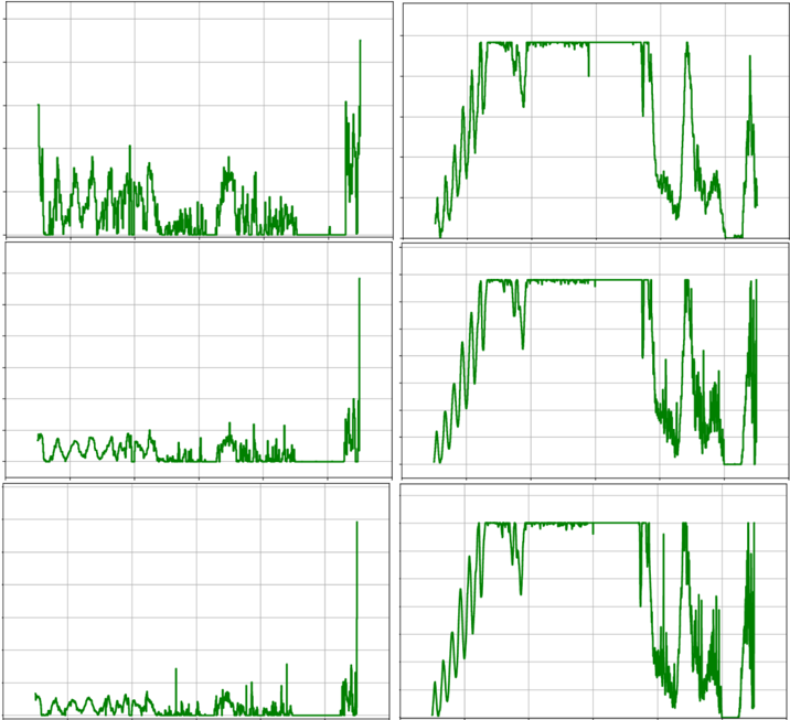
## Chart: Six Time Series Plots
### Overview
The image contains six time series plots arranged in a 2x3 grid. Each plot displays a green line representing a variable's value over time. The plots share a similar vertical scale, but the horizontal scale is not explicitly defined. The plots on the left show more erratic behavior, while the plots on the right show a rise to a plateau, followed by a decline.
### Components/Axes
* **X-axis:** Time (unspecified units)
* **Y-axis:** Value (unspecified units), with gridlines at regular intervals. The Y-axis appears to range from approximately 0 to a maximum value, which is consistent across all plots.
* **Data:** Green lines representing the time series data.
### Detailed Analysis
**Plot 1 (Top-Left):**
* Trend: Highly variable, fluctuating between approximately 0 and 0.4 of the maximum Y-axis value.
* Notable Features: Frequent spikes and dips, indicating rapid changes in the variable. A large spike at the end.
**Plot 2 (Top-Right):**
* Trend: Starts low, rises steadily to a plateau near the maximum Y-axis value, remains there for a period, and then declines.
* Notable Features: The rise is relatively smooth, the plateau is maintained with some minor fluctuations, and the decline is also relatively smooth.
**Plot 3 (Middle-Left):**
* Trend: Oscillating behavior at the beginning, followed by a period of relative stability near 0, and then a large spike at the end.
* Notable Features: The oscillations are regular and have a small amplitude.
**Plot 4 (Middle-Right):**
* Trend: Similar to Plot 2, starts low, rises to a plateau, remains there, and then declines.
* Notable Features: The plateau is less stable than in Plot 2, with more frequent and larger fluctuations.
**Plot 5 (Bottom-Left):**
* Trend: Similar to Plot 3, oscillating behavior at the beginning, followed by a period of relative stability near 0, and then a large spike at the end.
* Notable Features: The oscillations are similar to Plot 3.
**Plot 6 (Bottom-Right):**
* Trend: Similar to Plots 2 and 4, starts low, rises to a plateau, remains there, and then declines.
* Notable Features: The plateau is the least stable of the three plots, with significant fluctuations.
### Key Observations
* The plots on the left (1, 3, and 5) show distinctly different behavior from the plots on the right (2, 4, and 6).
* The plots on the left are characterized by erratic fluctuations or oscillations, while the plots on the right show a rise-plateau-decline pattern.
* The plots on the right differ in the stability of their plateaus, with Plot 2 being the most stable and Plot 6 being the least stable.
* Plots 3 and 5 are very similar.
### Interpretation
The data suggests that the six time series represent different types of processes or variables. The plots on the left might represent noisy or intermittent signals, while the plots on the right might represent processes that have a clear start, peak, and end. The differences in the stability of the plateaus on the right could indicate variations in the duration or intensity of the peak period. The similarity between plots 3 and 5 suggests that they might be related or influenced by the same underlying factors. Without further context or labels, it is difficult to determine the specific meaning of these time series.