\n
## Line Charts: Multiple Time Series Data
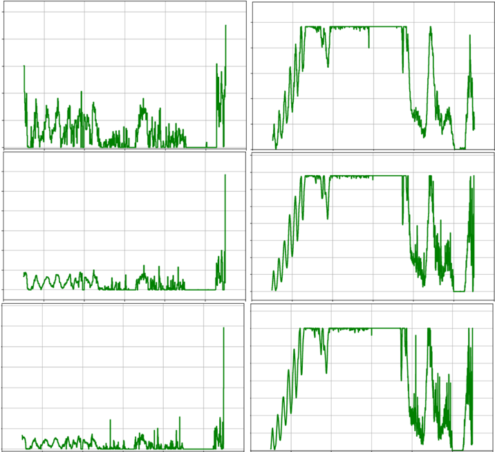
### Overview
The image presents six separate line charts arranged in a 2x3 grid. Each chart displays a time series, with the y-axis representing an unspecified value and the x-axis representing time. All lines are green. There are no axis labels, legends, or other identifying information. The charts appear to show fluctuating data with varying degrees of volatility.
### Components/Axes
* **Charts:** Six individual line charts.
* **X-axis:** Present in all charts, representing time. The scale is not visible.
* **Y-axis:** Present in all charts, representing an unspecified value. The scale is not visible.
* **Lines:** Each chart contains a single green line representing a time series.
* **Grid:** A faint grid is visible in the background of each chart, aiding in visual estimation of values.
### Detailed Analysis or Content Details
**Chart 1 (Top-Left):**
The line fluctuates moderately, with several peaks and troughs. It starts at approximately y=0.5, rises to around y=1.5, then falls back to y=0.5, and ends with a sharp spike to approximately y=2.5.
**Chart 2 (Top-Right):**
This line exhibits a step-like pattern with periods of constant value followed by abrupt changes. It begins at approximately y=0.8, rises to y=1.8, remains constant for a period, then drops to y=0.5, and ends with a series of rapid fluctuations.
**Chart 3 (Middle-Left):**
The line shows relatively small fluctuations around a central value. It starts at approximately y=0.3, oscillates between y=0.5 and y=0.7, and ends with a sharp spike to approximately y=2.0.
**Chart 4 (Middle-Right):**
Similar to Chart 2, this line displays a step-like pattern. It begins at approximately y=0.5, rises to y=1.5, remains constant, then drops to y=0.2, and ends with a series of fluctuations.
**Chart 5 (Bottom-Left):**
This line exhibits fluctuations similar to Chart 1, but with a lower overall amplitude. It starts at approximately y=0.2, oscillates between y=0.4 and y=0.6, and ends with a sharp spike to approximately y=1.8.
**Chart 6 (Bottom-Right):**
This line also displays a step-like pattern, similar to Charts 2 and 4. It begins at approximately y=0.4, rises to y=1.4, remains constant, then drops to y=0.1, and ends with a series of fluctuations.
### Key Observations
* All charts show fluctuating data, but the nature of the fluctuations varies.
* Charts 2, 4, and 6 exhibit step-like patterns, suggesting discrete changes in the underlying process.
* Charts 1, 3, and 5 show more continuous fluctuations, suggesting a more gradual process.
* All charts end with a sharp spike, which could indicate an event or anomaly.
* The lack of axis labels and legends makes it difficult to interpret the data definitively.
### Interpretation
The image presents six time series, potentially representing different measurements or observations of the same phenomenon. The step-like patterns in some charts suggest that the underlying process is subject to discrete changes or control mechanisms. The sharp spikes at the end of each chart could indicate a common event or disturbance affecting all time series. Without axis labels or context, it is impossible to determine the specific meaning of the data. The data suggests a system with varying degrees of stability and responsiveness, with some series exhibiting more abrupt changes than others. The consistent spike at the end of each series is a notable feature that warrants further investigation. The lack of information makes it difficult to draw firm conclusions, but the data suggests a dynamic system with potential for both gradual and abrupt changes.