\n
## Line Chart Grid: Unlabeled Time-Series Data
### Overview
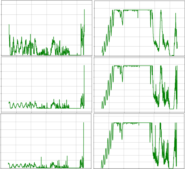
The image displays a 3x2 grid of six individual line charts. Each chart plots a single, continuous green line against a white background with a light gray grid. There are no visible axis labels, titles, legends, or numerical markers on any of the charts. The data appears to represent time-series signals, with the left column showing lower-amplitude, noisier signals and the right column showing higher-amplitude signals with distinct plateaus and sharp drops.
### Components/Axes
* **Layout:** A grid with three rows and two columns.
* **Chart Elements:** Each of the six charts contains:
* A single green line plot.
* A background grid composed of light gray horizontal and vertical lines.
* No axis titles, tick labels, or numerical scales.
* No legend or chart title.
* **Spatial Grounding:**
* **Top-Left Chart:** Shows a noisy signal with moderate peaks.
* **Top-Right Chart:** Shows a high-amplitude signal with a sustained plateau.
* **Middle-Left Chart:** Shows a lower-amplitude, noisy signal.
* **Middle-Right Chart:** Shows a high-amplitude signal similar to the top-right.
* **Bottom-Left Chart:** Shows the lowest-amplitude, noisiest signal.
* **Bottom-Right Chart:** Shows a high-amplitude signal with more volatility in the latter half.
### Detailed Analysis
**Left Column Charts (Top to Bottom):**
1. **Top-Left:** The line exhibits frequent, sharp oscillations. It starts with a moderate peak, followed by a series of jagged peaks and troughs. There is a notable cluster of higher peaks in the middle-right section, followed by a sharp drop and then a final, very high spike at the far right edge.
2. **Middle-Left:** The signal amplitude is lower than the chart above. It shows a similar pattern of oscillation but with less pronounced peaks. The final spike on the right is present but less dramatic relative to the preceding data.
3. **Bottom-Left:** This chart shows the lowest baseline activity. The line has small, frequent oscillations. There are a few minor peaks in the middle, and the characteristic final spike on the right is present but appears as a sharp, isolated event from a very low baseline.
**Right Column Charts (Top to Bottom):**
1. **Top-Right:** The line rises sharply to a high plateau, which it maintains with minor fluctuations for a significant portion of the chart (approximately the middle 40%). It then drops sharply, enters a period of high volatility with deep troughs and high peaks, and ends with a final sharp drop.
2. **Middle-Right:** The pattern is very similar to the top-right chart: a sharp rise to a sustained plateau, a sharp drop, a volatile period, and a final drop. The plateau appears slightly more stable with fewer dips.
3. **Bottom-Right:** Follows the same general pattern as the two charts above it. The initial rise and plateau are present. The volatile period after the plateau drop appears more chaotic, with deeper and more frequent troughs compared to the charts above.
### Key Observations
* **Column Dichotomy:** There is a stark contrast between the left and right columns. The left column charts depict low-to-moderate amplitude, noisy signals. The right column charts depict high-amplitude signals characterized by a distinct "rise-plateau-drop-volatility" pattern.
* **Vertical Progression:** Within each column, there is a subtle progression from top to bottom. In the left column, the overall signal amplitude and peak intensity appear to decrease. In the right column, the volatility in the final segment appears to increase.
* **Common Temporal Features:** All six charts share a common temporal structure: a distinct event or change in behavior occurs at the far right of the x-axis (a spike in the left column, a drop in the right column). This suggests the charts may be aligned to the same time scale or event trigger.
* **Missing Context:** The complete absence of labels, scales, and legends makes it impossible to determine the units, time frame, or subject matter of the data (e.g., CPU usage, network traffic, sensor readings, financial data).
### Interpretation
The data suggests a comparative analysis of six related signals or processes. The clear dichotomy between the left and right columns implies two distinct categories or states being monitored. For example:
* The **right column** could represent a system under high load or in an "active" state, characterized by a rapid ramp-up, sustained high activity, and a chaotic shutdown or failure phase.
* The **left column** could represent the same system in a "baseline," "idle," or "error" state, characterized by low-level noise and occasional spikes.
The vertical progression within columns might indicate different trials, increasing severity of a condition, or measurements from different sensors/locations. The synchronized final event across all charts is the most critical feature, strongly indicating that the x-axis represents time leading up to a common, significant system event (e.g., a crash, a reset, a user action). Without labels, this remains a hypothesis based purely on pattern recognition. To be useful for technical documentation, these charts require immediate annotation with axis titles (e.g., "Time (s)", "CPU Load (%)"), a legend identifying each chart (e.g., "Server 1 - Core Temp", "Network Port A - Throughput"), and a main title describing the overall experiment or monitoring session.