\n
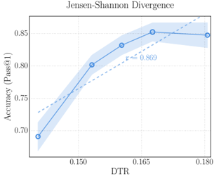
## Line Chart: Jensen-Shannon Divergence vs. Accuracy (Pass@1)
### Overview
The image is a line chart titled "Jensen-Shannon Divergence." It plots a metric called "Accuracy (Pass@1)" against a variable labeled "DTR." The chart displays a primary data series as a solid blue line with circular markers, accompanied by a shaded blue region representing a confidence interval or variance. A secondary, dashed gray line represents a linear trend or baseline.
### Components/Axes
* **Title:** "Jensen-Shannon Divergence" (centered at the top).
* **Y-Axis (Vertical):**
* **Label:** "Accuracy (Pass@1)" (rotated 90 degrees).
* **Scale:** Linear scale ranging from approximately 0.70 to 0.85.
* **Major Tick Marks:** Labeled at 0.70, 0.80, and 0.85.
* **X-Axis (Horizontal):**
* **Label:** "DTR".
* **Scale:** Linear scale.
* **Major Tick Marks:** Labeled at 0.150, 0.165, and 0.180.
* **Data Series 1 (Solid Blue Line):**
* **Visual:** A solid blue line connecting circular data points, with a semi-transparent blue shaded area surrounding it.
* **Legend/Label:** Not explicitly labeled in a separate legend box. The line and its shaded area are the primary visual element.
* **Data Series 2 (Dashed Gray Line):**
* **Visual:** A dashed gray line that appears to be a linear fit or trend line.
* **Annotation:** The text "y = 0.869" is placed near the upper-right end of this line, inside the chart area.
* **Spatial Layout:** The chart area is bounded by a light gray box. The title is above this box. The y-axis label is to the left of the box, and the x-axis label is below it. The dashed line's equation is positioned in the upper-right quadrant of the plot area.
### Detailed Analysis
**Data Series 1 (Blue Line with Shaded Region):**
* **Trend Verification:** The blue line shows a clear upward trend from left to right, increasing sharply initially and then plateauing.
* **Data Points (Approximate):**
* At DTR ≈ 0.150, Accuracy ≈ 0.80.
* At DTR ≈ 0.165, Accuracy ≈ 0.85.
* At DTR ≈ 0.180, Accuracy ≈ 0.85.
* **Shaded Region:** The blue shaded area is widest at the lowest DTR value (around 0.150), suggesting greater uncertainty or variance in the accuracy measurement at that point. The band narrows as DTR increases, indicating more consistent results at higher DTR values.
**Data Series 2 (Dashed Gray Line):**
* **Trend Verification:** This is a straight, upward-sloping line.
* **Equation:** Annotated as "y = 0.869". This is likely a simplified representation of a linear model (e.g., y = mx + b), but the full equation is not provided. The line passes near the final data point of the blue series.
### Key Observations
1. **Positive Correlation:** There is a strong positive correlation between DTR and Accuracy (Pass@1). As DTR increases from ~0.150 to ~0.165, accuracy improves significantly from ~0.80 to ~0.85.
2. **Diminishing Returns/Plateau:** The accuracy gain plateaus between DTR values of 0.165 and 0.180, holding steady at approximately 0.85. This suggests a point of saturation or optimal performance within the measured range.
3. **Reduced Variance with Higher DTR:** The narrowing of the shaded confidence interval indicates that measurements become more precise or consistent as DTR increases.
4. **Trend Line Comparison:** The dashed trend line (y = 0.869) appears to model the general upward trajectory but does not capture the plateauing behavior of the actual data (blue line). It may represent a theoretical maximum or a different modeling approach.
### Interpretation
This chart demonstrates the relationship between a parameter called "DTR" and the performance metric "Accuracy (Pass@1)" in the context of Jensen-Shannon Divergence, a measure of similarity between probability distributions.
The data suggests that increasing DTR is beneficial for improving model accuracy, but only up to a certain threshold (around DTR = 0.165). Beyond this point, further increases in DTR yield no additional accuracy benefit, indicating an optimal operating point. The decreasing variance with higher DTR implies that the system's performance becomes more reliable and predictable as this parameter increases.
The dashed line labeled "y = 0.869" might represent a target accuracy, a baseline from a different method, or the output of a simplified predictive model. Its deviation from the plateauing blue line highlights that the actual system behavior is non-linear and subject to diminishing returns, which a simple linear model does not fully capture. For a technical document, this chart provides evidence for selecting a DTR value near 0.165 to maximize accuracy while potentially minimizing computational cost or other resources associated with higher DTR values.