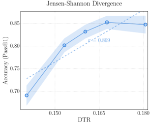
## Chart: Jensen-Shannon Divergence
### Overview
The image is a scatter plot showing the relationship between DTR (x-axis) and Accuracy (Pass@1) (y-axis). The plot includes a data series with error bands, a dashed trend line, and an 'r' value indicating correlation.
### Components/Axes
* **Title:** Jensen-Shannon Divergence
* **X-axis:** DTR (values: 0.150, 0.165, 0.180)
* **Y-axis:** Accuracy (Pass@1) (values: 0.70, 0.75, 0.80, 0.85)
* **Data Series:** A blue line with circular markers, surrounded by a light blue error band.
* **Trend Line:** A dashed gray line.
* **Correlation:** "r = 0.869" is displayed near the data series.
### Detailed Analysis
* **DTR Values:** The x-axis has tick marks at approximately 0.135, 0.150, 0.165, and 0.180.
* **Accuracy Values:** The y-axis has tick marks at 0.70, 0.75, 0.80, and 0.85.
* **Data Points:**
* At DTR ~0.135, Accuracy is approximately 0.69 +/- 0.02.
* At DTR ~0.150, Accuracy is approximately 0.80 +/- 0.02.
* At DTR ~0.165, Accuracy is approximately 0.85 +/- 0.02.
* At DTR ~0.180, Accuracy is approximately 0.84 +/- 0.02.
* **Trend:** The blue line initially slopes upward, then flattens out.
* **Error Bands:** The light blue shaded region around the blue line indicates the uncertainty or variability in the accuracy values.
* **Trend Line:** The dashed gray line shows a general upward trend.
### Key Observations
* Accuracy increases with DTR up to a point, then plateaus or slightly decreases.
* The correlation coefficient 'r = 0.869' suggests a strong positive correlation between DTR and Accuracy.
* The error bands are relatively small, indicating consistent results.
### Interpretation
The chart suggests that increasing the DTR value initially leads to a significant improvement in accuracy. However, beyond a certain DTR value (around 0.165), further increases in DTR do not result in a substantial increase in accuracy, and may even lead to a slight decrease. The strong positive correlation (r = 0.869) supports this relationship. The error bands indicate that the observed trend is relatively consistent. The Jensen-Shannon Divergence is likely being used as a measure of the difference between probability distributions, and the chart is showing how this divergence relates to the accuracy of a model or system.