\n
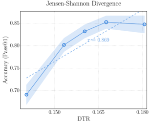
## Line Chart: Jensen-Shannon Divergence
### Overview
The image presents a line chart illustrating the relationship between DTR (likely a measure of data transfer rate or similar) and Accuracy (Pass@1). The chart shows a trend of increasing accuracy with increasing DTR, up to a certain point, followed by a slight decrease. A shaded region represents the uncertainty or variance around the central trend line. A Pearson correlation coefficient (r) is also displayed.
### Components/Axes
* **Title:** Jensen-Shannon Divergence
* **X-axis:** DTR (ranging approximately from 0.145 to 0.180)
* **Y-axis:** Accuracy (Pass@1) (ranging approximately from 0.70 to 0.85)
* **Data Series:** A single blue line with circular data points, representing the accuracy trend.
* **Shaded Region:** A light blue area surrounding the line, indicating the confidence interval or standard deviation.
* **Correlation Coefficient:** r = 0.869, positioned near the peak of the curve.
* **Trend Line:** A dashed grey line representing a linear trend.
### Detailed Analysis
The line representing Accuracy (Pass@1) starts at approximately 0.70 when DTR is around 0.145. The line then slopes upward, reaching a peak accuracy of approximately 0.845 at a DTR of around 0.165. After this peak, the line slightly declines to an accuracy of approximately 0.835 at a DTR of 0.180.
Here's a breakdown of approximate data points:
* DTR = 0.145, Accuracy ≈ 0.70
* DTR = 0.150, Accuracy ≈ 0.74
* DTR = 0.155, Accuracy ≈ 0.80
* DTR = 0.160, Accuracy ≈ 0.83
* DTR = 0.165, Accuracy ≈ 0.845
* DTR = 0.170, Accuracy ≈ 0.84
* DTR = 0.175, Accuracy ≈ 0.835
* DTR = 0.180, Accuracy ≈ 0.83
The shaded region around the line is wider at the lower DTR values (around 0.145-0.155), indicating greater uncertainty in the accuracy measurement at those points. The shaded region narrows as DTR increases, suggesting more consistent accuracy measurements at higher DTR values.
### Key Observations
* The correlation coefficient of 0.869 indicates a strong positive correlation between DTR and Accuracy.
* Accuracy increases with DTR, but the relationship is not strictly linear. There's a point of diminishing returns around DTR = 0.165, where further increases in DTR lead to a slight decrease in accuracy.
* The uncertainty (represented by the shaded region) is higher at lower DTR values.
### Interpretation
The chart suggests that increasing the DTR generally improves accuracy (Pass@1), but there's an optimal DTR value beyond which further increases don't provide significant benefits and may even slightly reduce accuracy. This could be due to factors such as noise or limitations in the system's ability to process data at very high rates. The strong positive correlation (r = 0.869) confirms that DTR is a significant factor influencing accuracy. The diminishing returns observed at higher DTR values suggest that other factors may become more important in determining accuracy once DTR reaches a certain threshold. The wider confidence intervals at lower DTR values indicate that the accuracy measurements are less reliable in that region, potentially due to a smaller sample size or greater variability in the data. The dashed grey line suggests a linear approximation of the trend, which is a reasonable fit but doesn't fully capture the non-linear behavior observed in the data.