## Horizontal Bar Chart: Content vs. Function Word Ratios by Percentile Group
### Overview
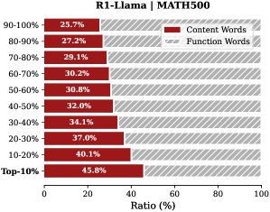
The image is a horizontal bar chart titled "R1-Llama | MATH500". It displays the percentage ratio of "Content Words" versus "Function Words" across ten distinct percentile groups, likely representing performance tiers on a dataset or evaluation named MATH500. The chart compares two linguistic categories across these groups.
### Components/Axes
* **Title:** "R1-Llama | MATH500" (Top-center).
* **Y-Axis (Vertical):** Lists ten percentile groups, ordered from highest to lowest: "90-100%", "80-90%", "70-80%", "60-70%", "50-60%", "40-50%", "30-40%", "20-30%", "10-20%", "Top-10%".
* **X-Axis (Horizontal):** Labeled "Ratio (%)". The scale runs from 0 to 100, with major tick marks at 0, 20, 40, 60, 80, and 100.
* **Legend:** Located in the top-right corner.
* **Red Solid Bar:** Labeled "Content Words".
* **Gray Hatched Bar:** Labeled "Function Words".
* **Data Labels:** Each bar segment has its percentage value printed directly on it.
### Detailed Analysis
The chart presents a stacked horizontal bar for each percentile group, where the total length of each bar represents 100%. The red segment (Content Words) starts from the left (0%), and the gray hatched segment (Function Words) continues to the right (100%).
**Data Points (Content Words %, Function Words %):**
* **90-100%:** 25.7%, 74.3%
* **80-90%:** 27.2%, 72.8%
* **70-80%:** 29.1%, 70.9%
* **60-70%:** 30.2%, 69.8%
* **50-60%:** 30.8%, 69.2%
* **40-50%:** 32.0%, 68.0%
* **30-40%:** 34.1%, 65.9%
* **20-30%:** 37.0%, 63.0%
* **10-20%:** 40.1%, 59.9%
* **Top-10%:** 45.8%, 54.2%
**Trend Verification:**
* **Content Words (Red):** The red segment lengthens progressively as we move down the y-axis from the "90-100%" group to the "Top-10%" group. The trend is a clear, monotonic increase.
* **Function Words (Gray):** The gray hatched segment shortens correspondingly as we move down the y-axis. The trend is a clear, monotonic decrease.
### Key Observations
1. **Inverse Relationship:** There is a perfect inverse relationship between the two word categories within each group; they sum to 100%.
2. **Performance Correlation:** The proportion of "Content Words" increases as the percentile group performance decreases (moving from the top-performing "90-100%" group to the "Top-10%" group). The highest proportion of Content Words (45.8%) is found in the "Top-10%" group, while the lowest (25.7%) is in the "90-100%" group.
3. **Magnitude of Change:** The shift is substantial. The "Top-10%" group uses nearly twice the ratio of Content Words (45.8%) compared to the "90-100%" group (25.7%).
4. **No Outliers:** The progression of values is smooth and consistent across all ten groups, with no sudden jumps or deviations from the overall trend.
### Interpretation
This chart likely analyzes the linguistic composition of outputs from a model named "R1-Llama" on the "MATH500" benchmark. The percentile groups probably rank model responses by quality or correctness, with "90-100%" being the highest-performing tier.
The data suggests a strong correlation between **lower performance** and a **higher density of content words** (nouns, verbs, adjectives carrying substantive meaning). Conversely, **higher performance** is associated with a **higher density of function words** (articles, prepositions, conjunctions that provide grammatical structure).
This could imply that top-tier responses on this math-focused task are characterized by more precise, structured, and logically connective language (function words), potentially indicating clearer reasoning steps. Lower-performing responses might rely more on listing substantive terms (content words) without the same degree of syntactic scaffolding, which could point to less coherent or incomplete explanations. The chart provides a quantitative linguistic fingerprint that distinguishes performance levels in model-generated text.