## Bar Chart: Distribution of True and False Answers Across Different Metrics
### Overview
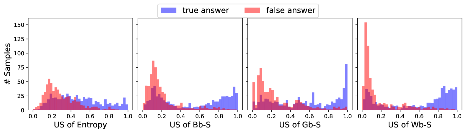
The image contains four grouped bar charts comparing the distribution of "true answer" (blue) and "false answer" (red) samples across four metrics: "US of Entropy," "US of Bb-S," "US of Gb-S," and "US of Wb-S." Each chart uses a y-axis labeled "# Samples" (ranging from 0 to 150) and an x-axis labeled with the metric name, divided into 0.0 to 1.0 increments. The legend is positioned at the top, with blue representing "true answer" and red representing "false answer."
---
### Components/Axes
- **X-Axes**:
- Labeled with the metric names: "US of Entropy," "US of Bb-S," "US of Gb-S," and "US of Wb-S."
- Divided into 0.0 to 1.0 increments (likely representing normalized values).
- **Y-Axes**:
- Labeled "# Samples" with a range of 0 to 150.
- **Legend**:
- Positioned at the top-center.
- Blue = "true answer," Red = "false answer."
---
### Detailed Analysis
#### 1. **US of Entropy**
- **True Answers (Blue)**:
- Peaks at ~0.2–0.3, with a gradual decline toward 0.0 and 1.0.
- Approximately 50–75 samples in the peak range.
- **False Answers (Red)**:
- Peaks at ~0.4–0.5, with a sharper decline toward 1.0.
- Approximately 30–50 samples in the peak range.
#### 2. **US of Bb-S**
- **True Answers (Blue)**:
- Peaks at ~0.1–0.2, with a long tail toward 0.0.
- Approximately 40–60 samples in the peak range.
- **False Answers (Red)**:
- Peaks at ~0.3–0.4, with a bimodal distribution (secondary peak near 0.7).
- Approximately 60–80 samples in the primary peak range.
#### 3. **US of Gb-S**
- **True Answers (Blue)**:
- Peaks at ~0.2–0.3, with a gradual decline toward 0.0.
- Approximately 30–50 samples in the peak range.
- **False Answers (Red)**:
- Peaks at ~0.5–0.6, with a sharp drop toward 1.0.
- Approximately 70–90 samples in the peak range.
#### 4. **US of Wb-S**
- **True Answers (Blue)**:
- Peaks at ~0.1–0.2, with a long tail toward 0.0.
- Approximately 20–40 samples in the peak range.
- **False Answers (Red)**:
- Dominates at ~0.0, with a massive spike (over 100 samples).
- Secondary peak at ~0.8–0.9 with ~30–50 samples.
---
### Key Observations
1. **General Trend**:
- False answers consistently exhibit higher US values than true answers across all metrics, except in "US of Wb-S," where false answers cluster near 0.0.
2. **Outliers**:
- The "US of Wb-S" metric shows an extreme outlier for false answers at 0.0, suggesting a potential data anomaly or misclassification.
3. **Distribution Patterns**:
- True answers tend to have broader, flatter distributions, while false answers show sharper peaks, indicating higher variability or confidence in false responses.
---
### Interpretation
- **Model Behavior**:
- The higher US values for false answers may indicate that the model assigns greater uncertainty or confidence to incorrect responses, possibly due to ambiguous input or overfitting to specific patterns.
- **Metric-Specific Insights**:
- The "US of Wb-S" metric’s extreme outlier for false answers suggests a critical issue, such as data leakage, mislabeled samples, or a flaw in the metric’s calculation.
- **Practical Implications**:
- Metrics like "US of Entropy" and "US of Gb-S" show more balanced distributions, which could be prioritized for evaluating model reliability. The "US of Bb-S" and "US of Wb-S" metrics may require further investigation due to their skewed distributions.
---
### Notes on Data Extraction
- All values are approximate, as the chart lacks explicit numerical annotations. Ranges were inferred from bar heights and axis scaling.
- No textual content beyond axis labels and legend was present in the image.