\n
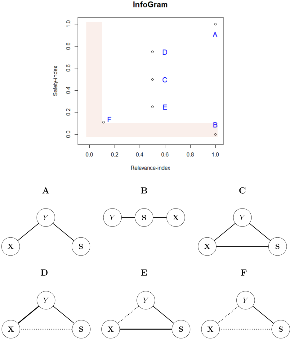
## InfoGram: Scatter Plot with Corresponding Network Diagrams
### Overview
The image consists of two primary sections. The top section is a scatter plot titled "InfoGram" that plots six data points (labeled A-F) on a 2D plane defined by "Relevance-index" and "Safety-index." The bottom section displays six corresponding network diagrams, each labeled A through F, illustrating different connection topologies between three nodes: X, Y, and S.
### Components/Axes
**Scatter Plot (Top Section):**
* **Title:** "InfoGram" (centered at the top).
* **X-axis:** Labeled "Relevance-index." Scale ranges from 0.0 to 1.0, with major tick marks at 0.0, 0.2, 0.4, 0.6, 0.8, and 1.0.
* **Y-axis:** Labeled "Safety-index." Scale ranges from 0.0 to 1.0, with major tick marks at 0.0, 0.2, 0.4, 0.6, 0.8, and 1.0.
* **Data Points:** Six points, each marked with a small open circle and labeled with a blue capital letter (A, B, C, D, E, F) placed near the point.
* **Shaded Region:** A light pink, L-shaped shaded area covers the region where Relevance-index is approximately ≤ 0.1 and Safety-index is approximately ≤ 0.1.
**Network Diagrams (Bottom Section):**
Six diagrams are arranged in two rows of three. Each diagram is labeled with a black capital letter (A-F) centered above it. All diagrams contain three circular nodes labeled "X", "Y", and "S". The connections between nodes vary:
* **Diagram A:** Y is connected to X and S via solid lines. X and S are not directly connected.
* **Diagram B:** Y is connected to S via a solid line. S is connected to X via a solid line. Y and X are not directly connected.
* **Diagram C:** X, Y, and S are all connected to each other via solid lines, forming a triangle.
* **Diagram D:** Y is connected to X and S via solid lines. X and S are connected via a dotted line.
* **Diagram E:** Y is connected to S via a solid line. X is connected to S via a solid line. Y is connected to X via a dotted line.
* **Diagram F:** Y is connected to S via a solid line. Y is connected to X via a dotted line. X is connected to S via a dotted line.
### Detailed Analysis
**Scatter Plot Data Points (Approximate Coordinates):**
* **Point A:** Relevance-index ≈ 1.0, Safety-index ≈ 1.0. (Top-right corner)
* **Point B:** Relevance-index ≈ 1.0, Safety-index ≈ 0.0. (Bottom-right corner)
* **Point C:** Relevance-index ≈ 0.5, Safety-index ≈ 0.5. (Center)
* **Point D:** Relevance-index ≈ 0.5, Safety-index ≈ 0.75. (Center, above C)
* **Point E:** Relevance-index ≈ 0.5, Safety-index ≈ 0.25. (Center, below C)
* **Point F:** Relevance-index ≈ 0.1, Safety-index ≈ 0.1. (Bottom-left, within the shaded L-shaped region)
**Trend Verification:**
The data points do not form a single continuous line or curve. They are discrete points representing distinct configurations. The highest combined relevance and safety is achieved by configuration A. Configurations C, D, and E share the same moderate relevance (~0.5) but vary in safety. Configuration B has high relevance but minimal safety. Configuration F scores low on both metrics.
### Key Observations
1. **Extreme Points:** Configurations A and B represent opposite extremes on the Safety-index while sharing the highest Relevance-index (1.0).
2. **Central Cluster:** Configurations C, D, and E form a vertical cluster at a Relevance-index of ~0.5, demonstrating that similar relevance can yield different safety outcomes.
3. **Low-Performance Region:** Configuration F is isolated in the bottom-left quadrant, indicating poor performance on both indices. The shaded L-shaped region visually emphasizes this low-relevance, low-safety zone.
4. **Topology vs. Performance:** There is a clear correlation between the network topology shown in the diagrams and the plotted indices. For example, the fully connected triangle (Diagram C) maps to the central point (C), while the chain structure (Diagram B) maps to the high-relevance, low-safety point (B).
### Interpretation
This InfoGram visualizes a trade-off or relationship between the "Relevance" and "Safety" of different information network structures (A-F). The diagrams model how three entities (X, Y, S) can be connected, with solid lines likely representing strong/direct links and dotted lines representing weak/indirect links.
* **What the data suggests:** The plot demonstrates that network topology significantly impacts both relevance and safety. The most "relevant" structure (A, B) is not necessarily the "safest." The safest structure (A) maintains direct connections from a central node (Y) to the others without creating a direct link between the peripheral nodes (X and S). The structure with the most connections (C) achieves only moderate scores, suggesting that over-connectivity may dilute safety without maximizing relevance.
* **Relationships:** The central vertical cluster (C, D, E) is particularly insightful. It shows that by altering the strength of one connection (changing a solid line to a dotted line between X and S, or between Y and X), the safety of the network can be modulated while keeping its relevance constant. This implies safety can be tuned independently of relevance within certain topological constraints.
* **Anomalies/Notable Points:** Point B is a critical outlier: it achieves maximum relevance with near-zero safety. This could represent a highly efficient but dangerously exposed information flow (e.g., a direct, unfiltered pipeline). Point F represents a poorly connected, ineffective network. The shaded region acts as a "danger zone" to be avoided.
In essence, the image serves as a design or analysis tool for evaluating information systems, arguing that both relevance and safety are critical, competing metrics that depend fundamentally on the underlying connection architecture.