## Scatter Plot and Network Diagrams: Safety vs. Relevance
### Overview
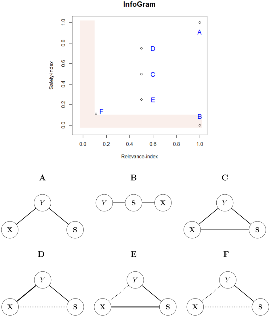
The image presents a scatter plot titled "InfoGram" showing the relationship between "Safety-index" and "Relevance-index" for six data points labeled A through F. Below the scatter plot are six network diagrams, also labeled A through F, each depicting a different network structure involving nodes labeled X, Y, and S.
### Components/Axes
**Scatter Plot:**
* **Title:** InfoGram
* **X-axis:** Relevance-index, ranging from 0.0 to 1.0 in increments of 0.2.
* **Y-axis:** Safety-index, ranging from 0.0 to 1.0 in increments of 0.2.
* **Data Points:** Six data points labeled A, B, C, D, E, and F. All labels are in blue.
* **Highlighted Region:** A shaded rectangular region in the bottom-left corner, extending from approximately (0,0) to (0.2, 1.0) and (1.0, 0.2).
**Network Diagrams:**
* Six separate diagrams labeled A, B, C, D, E, and F.
* Each diagram consists of nodes labeled X, Y, and S, connected by lines.
* Lines can be solid or dotted, representing different types of relationships.
### Detailed Analysis
**Scatter Plot Data Points:**
* **A:** Relevance-index ≈ 0.95, Safety-index ≈ 0.95
* **B:** Relevance-index ≈ 0.95, Safety-index ≈ 0.05
* **C:** Relevance-index ≈ 0.55, Safety-index ≈ 0.50
* **D:** Relevance-index ≈ 0.55, Safety-index ≈ 0.75
* **E:** Relevance-index ≈ 0.60, Safety-index ≈ 0.25
* **F:** Relevance-index ≈ 0.15, Safety-index ≈ 0.10
**Network Diagrams:**
* **A:** Y is connected to both X and S.
* **B:** Y, S, and X are connected linearly in that order.
* **C:** X, Y, and S are connected in a triangle.
* **D:** Y is connected to both X and S with solid lines. X and S are connected with a dotted line.
* **E:** Y is connected to X with a dotted line and to S with a solid line. X and S are connected with a solid line.
* **F:** Y is connected to X with a dotted line and to S with a solid line. X and S are connected with a dotted line.
### Key Observations
* Data points A and B are located at the extreme right of the scatter plot, indicating high relevance.
* Data point A also has a high safety index, while B has a low safety index.
* Data point F is located in the bottom-left corner, indicating low relevance and low safety.
* The shaded region highlights the area of low relevance and low safety.
* The network diagrams show varying connectivity patterns between the nodes X, Y, and S.
### Interpretation
The scatter plot visualizes the relationship between the safety and relevance indices of six entities (A-F). The network diagrams likely represent the underlying structure or relationships associated with each entity.
The placement of points in the scatter plot suggests a trade-off between safety and relevance. For example, entity A is both highly safe and highly relevant, while entity B is highly relevant but not safe. Entity F is neither safe nor relevant. The shaded region likely represents an undesirable zone where both safety and relevance are low.
The network diagrams provide additional information about the nature of each entity. The different connectivity patterns between nodes X, Y, and S could represent different types of relationships or interactions within each entity.
By combining the information from the scatter plot and the network diagrams, one can gain a more comprehensive understanding of the characteristics and relationships of the entities A through F.