## Scatter Plot & Diagram: InfoGram - Relevance vs. Safety & Associated Tree Structures
### Overview
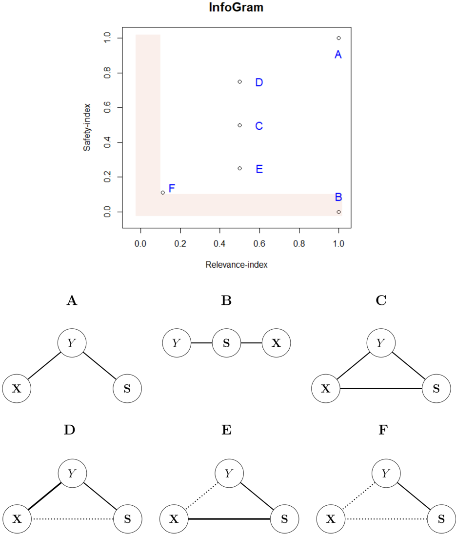
The image presents a scatter plot showing the relationship between "Relevance-index" and "Safety-index" for six data points labeled A through F. Below the scatter plot are six corresponding tree diagrams, one for each data point. The tree diagrams appear to represent relationships between variables X, Y, and S.
### Components/Axes
* **Scatter Plot:**
* **X-axis:** Relevance-index, ranging from approximately 0.0 to 1.0.
* **Y-axis:** Safety-index, ranging from approximately 0.0 to 1.0.
* **Data Points:** Labeled A, B, C, D, E, and F.
* **Background:** A light orange gradient, darker at the top-left and lighter at the bottom-right.
* **Tree Diagrams:** Six diagrams, labeled A through F, each depicting a tree-like structure with nodes X, Y, and S.
* **Nodes:** X, Y, and S are represented as circles.
* **Edges:** Solid lines and dotted lines connect the nodes, indicating relationships.
### Detailed Analysis or Content Details
* **Scatter Plot Data Points:**
* **A:** Relevance-index ≈ 1.0, Safety-index ≈ 0.95.
* **B:** Relevance-index ≈ 1.0, Safety-index ≈ 0.05.
* **C:** Relevance-index ≈ 0.7, Safety-index ≈ 0.55.
* **D:** Relevance-index ≈ 0.6, Safety-index ≈ 0.75.
* **E:** Relevance-index ≈ 0.5, Safety-index ≈ 0.25.
* **F:** Relevance-index ≈ 0.2, Safety-index ≈ 0.1.
* **Tree Diagram Details:**
* **A:** Y is connected to X and S with solid lines.
* **B:** Y is connected to X and S with solid lines.
* **C:** Y is connected to X and S with solid lines.
* **D:** Y is connected to S with a solid line, and X is connected to Y with a dotted line.
* **E:** Y is connected to S with a solid line, and X is connected to Y with a dotted line.
* **F:** Y is connected to S with a dotted line, and X is connected to Y with a dotted line.
### Key Observations
* **Scatter Plot Trend:** There is no strong linear correlation between Relevance-index and Safety-index. Points A and B have high Relevance-index values but differ significantly in Safety-index.
* **Tree Diagram Variation:** The tree diagrams show a consistent structure for A, B, and C, while D, E, and F exhibit a different structure with dotted lines indicating a weaker or different type of relationship between X and Y.
* **Dotted vs. Solid Lines:** The use of dotted lines in diagrams D, E, and F suggests a conditional or less direct relationship between X and Y compared to the solid lines in A, B, and C.
### Interpretation
The "InfoGram" appears to be visualizing a trade-off or relationship between relevance and safety, alongside a representation of the underlying relationships between variables X, Y, and S. The scatter plot suggests that high relevance does not necessarily guarantee high safety, and vice versa. The tree diagrams provide context for each data point, potentially indicating the factors influencing the relevance and safety scores.
The distinction between the tree structures (solid vs. dotted lines) is crucial. A, B, and C represent scenarios where X and Y are strongly linked, contributing to a certain level of safety. D, E, and F, however, show a weaker link between X and Y, potentially explaining their lower safety scores despite varying relevance levels.
The use of the gradient background in the scatter plot might be intended to visually emphasize the trade-off – areas with high relevance and high safety are less common (darker orange), while areas with low relevance and low safety are more prevalent (lighter orange).
The diagrams suggest a system where Y and S are always directly related, but the relationship between X and Y can vary in strength, impacting the overall safety profile. This could represent a scenario where a core component (S) is always affected by a primary factor (Y), but the influence of a secondary factor (X) is conditional or indirect.