## Scatter Plot with Network Diagrams: Relevance vs. Safety Index
### Overview
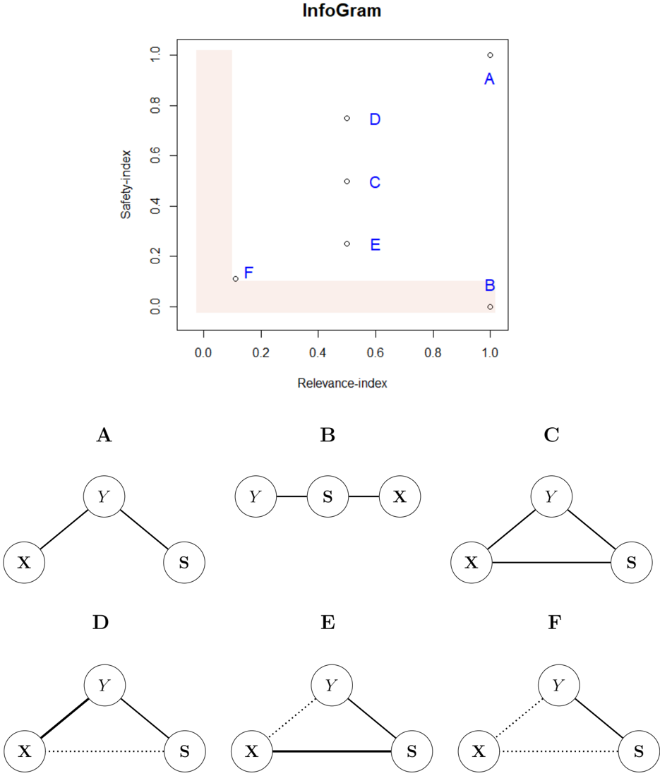
The image contains a scatter plot titled "InfoGram" with six labeled data points (A–F) plotted on a 2D grid. Below the plot, six network diagrams (A–F) are displayed, each representing different configurations of nodes X, Y, and S. The scatter plot uses a shaded lower-left triangular region to highlight a specific area of interest.
---
### Components/Axes
- **X-axis**: "Relevance-index" (ranges from 0.0 to 1.0).
- **Y-axis**: "Safety-index" (ranges from 0.0 to 1.0).
- **Shaded Region**: Lower-left triangular area (bounded by x=0, y=0, and the line x + y = 1).
- **Data Points**: Labeled A–F, positioned as follows:
- **A**: (1.0, 1.0) – Top-right corner.
- **B**: (1.0, 0.0) – Bottom-right corner.
- **C**: (0.5, 0.5) – Center of the plot.
- **D**: (0.5, 0.3) – Lower-middle region.
- **E**: (0.7, 0.4) – Upper-middle region.
- **F**: (0.0, 0.0) – Bottom-left corner (origin).
---
### Detailed Analysis
#### Scatter Plot
- **Point A**: Located at (1.0, 1.0), indicating maximum relevance and safety. No shaded region overlap.
- **Point B**: At (1.0, 0.0), high relevance but zero safety. Positioned on the x-axis boundary.
- **Point C**: At (0.5, 0.5), balanced relevance and safety. Centered in the plot.
- **Point D**: At (0.5, 0.3), moderate relevance and low safety. Within the shaded region.
- **Point E**: At (0.7, 0.4), high relevance and moderate safety. Outside the shaded region.
- **Point F**: At (0.0, 0.0), zero relevance and safety. Origin of the plot.
#### Network Diagrams
- **Diagram A**: Y connected to X and S (star topology). Matches Point A’s high relevance/safety.
- **Diagram B**: Linear chain Y–S–X. Matches Point B’s high relevance/low safety.
- **Diagram C**: Fully connected triangle (X–Y–S). Matches Point C’s balanced metrics.
- **Diagram D**: Y connected to X and S with a dotted line between X and S. Matches Point D’s moderate relevance/low safety.
- **Diagram E**: Y connected to X and S with a solid line between X and S. Matches Point E’s high relevance/moderate safety.
- **Diagram F**: Y connected to X and S with all lines dotted. Matches Point F’s zero relevance/safety.
---
### Key Observations
1. **Shaded Region**: Points D and F lie within or on the boundary of the shaded lower-left triangle, suggesting a focus on low relevance/safety configurations.
2. **Diagram-Safety Correlation**:
- Fully connected diagrams (C, A) align with higher safety metrics.
- Linear or sparse diagrams (B, D, F) align with lower safety metrics.
3. **Relevance Trends**:
- Points with high relevance (A, B, E) have varying safety levels, indicating relevance is not inherently tied to safety.
4. **Dotted vs. Solid Lines**: Dotted connections (D, F) may represent weaker or uncertain relationships, correlating with lower safety.
---
### Interpretation
The scatter plot and diagrams together suggest a framework for evaluating network configurations based on **relevance** (x-axis) and **safety** (y-axis).
- **Point A (Diagram A)**: A star topology (Y as a central hub) achieves maximum relevance and safety, possibly due to balanced connectivity.
- **Point B (Diagram B)**: A linear chain prioritizes relevance (high x-value) but sacrifices safety (zero y-value), likely due to single points of failure.
- **Point F (Diagram F)**: A fully dotted network (weak connections) results in zero relevance and safety, highlighting the importance of strong relationships.
- **Shaded Region**: Emphasizes configurations where both relevance and safety are low, possibly indicating risky or underdeveloped systems.
The diagrams act as visual proxies for the scatter plot’s data, with structural complexity (e.g., fully connected vs. linear) directly influencing the plotted metrics. This dual representation allows for intuitive analysis of how network design impacts performance and safety.