## Line Chart: Throughput vs. h
### Overview
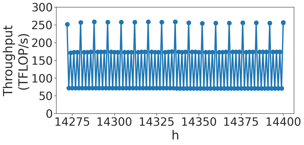
The image displays a line chart with markers representing "Throughput (TFLOP/s)" on the y-axis plotted against a variable "h" on the x-axis. The data exhibits a highly periodic, repeating pattern of throughput values over the range of approximately 14,275 to 14,400. The chart shows a deterministic, oscillating performance profile.
### Components/Axes
* **Y-Axis:** Labeled "Throughput (TFLOP/s)". The scale ranges from 0 to 300, with major grid lines marked at intervals of 50 (0, 50, 100, 150, 200, 250, 300).
* **X-Axis:** Labeled "h". The scale ranges from 14,275 to 14,400, with major grid lines marked at intervals of 25 (14275, 14300, 14325, 14350, 14375, 14400).
* **Data Series:** A single blue line connecting blue circular markers. The line creates a repeating, sawtooth-like wave pattern.
### Detailed Analysis
The data series displays a consistent, repeating cycle across the entire x-axis. The trend is not linear but oscillatory, characterized by three distinct throughput levels:
* **High Peaks:** The highest points in the cycle reach approximately **255–260 TFLOP/s**. These occur at regular intervals.
* **Mid-Level Points:** Following the high peaks, the throughput drops to a secondary plateau of approximately **170–175 TFLOP/s**.
* **Low Points:** The lowest points in the cycle drop to approximately **70–75 TFLOP/s**.
**Trend Verification:**
The visual pattern is a repeating sequence: [High Peak] -> [Mid-Level] -> [Low Point] -> [Mid-Level] -> [High Peak]. This sequence repeats consistently across the entire visible range of the x-axis. There is no visible drift, degradation, or increase in the throughput levels, indicating a highly stable system state.
### Key Observations
* **High Periodicity:** The system exhibits extremely consistent, rhythmic behavior.
* **Three-Tiered Structure:** The throughput does not fluctuate randomly; it strictly adheres to three distinct operational states (High, Mid, Low).
* **Stability:** The peaks and troughs are remarkably stable across the entire x-axis range shown. There is no visible noise or variance in the performance levels.
### Interpretation
* **What the data demonstrates:** This is likely a performance trace of a computing system (such as a GPU or TPU) executing a specific, repetitive kernel or workload. The extreme regularity suggests a deterministic process rather than a stochastic one.
* **How elements relate:** The "h" on the x-axis likely represents a time step, iteration count, or a specific hardware counter index. The throughput levels are tied directly to the execution of specific instructions within a loop.
* **Reading between the lines:**
* The **High Peak (~260 TFLOP/s)** likely represents a burst of heavy computation or a specific high-throughput instruction set being executed.
* The **Mid (~175 TFLOP/s)** and **Low (~75 TFLOP/s)** levels likely represent overhead, memory access, synchronization, or idle states within the execution loop.
* The lack of noise implies this is likely a micro-benchmark or a highly optimized, deterministic compute kernel, rather than a real-world application with variable data, which would typically show more variance. The chart captures a "steady state" of a repeating operation.