TECHNICAL ASSET FINGERPRINT
9ae2ece358caf1e634eddb80
Click to view fullscreen
Press ESC or click to close
FOUND IN PAPERS
EXPERT: gemini-2.0-flash VERSION 1
RUNTIME: nugit/gemini/gemini-2.0-flash
INTEL_VERIFIED
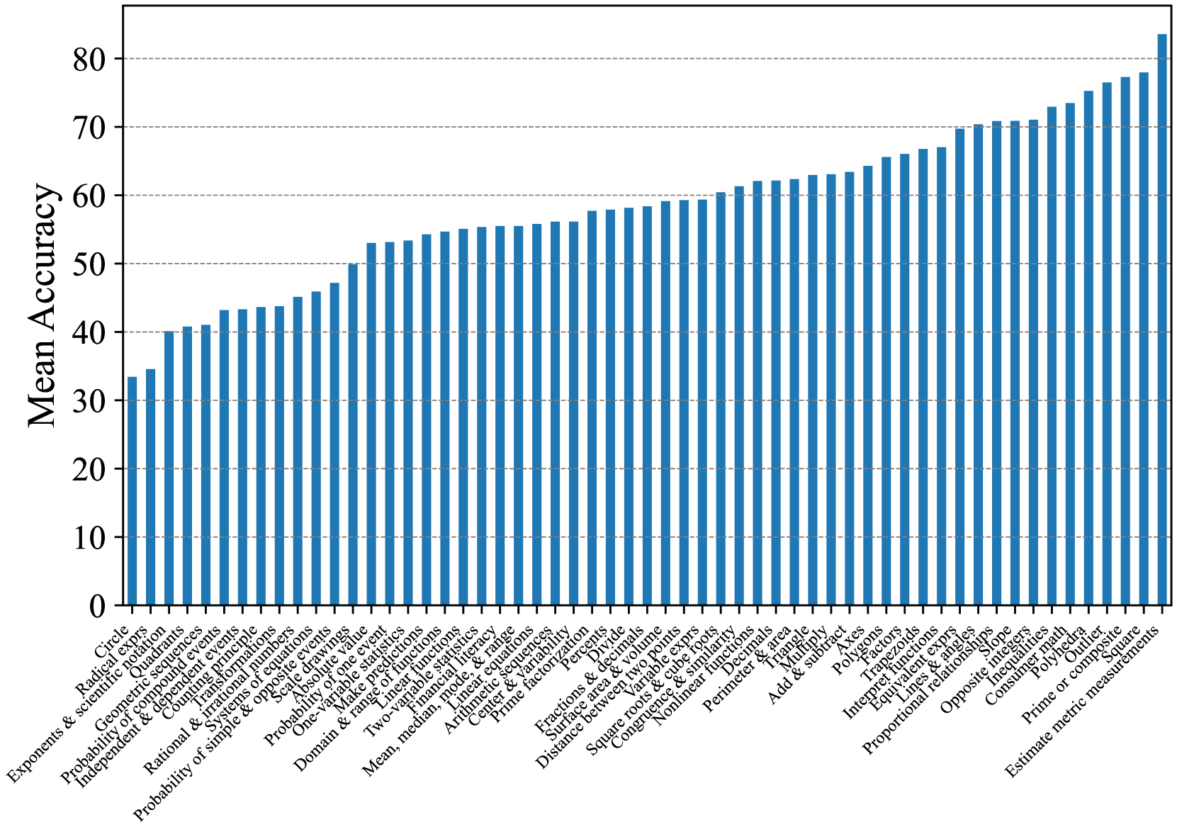
## Bar Chart: Mean Accuracy by Mathematical Concept
### Overview
The image is a bar chart displaying the mean accuracy achieved on various mathematical concepts. The x-axis represents different mathematical topics, while the y-axis represents the mean accuracy, ranging from 0 to 80. The chart uses blue bars to represent the accuracy for each concept, sorted in ascending order.
### Components/Axes
* **Y-axis:** "Mean Accuracy", ranging from 0 to 80, with tick marks at intervals of 10.
* **X-axis:** Mathematical concepts, listed horizontally. The labels are somewhat overlapping due to space constraints.
* **Bars:** Blue bars representing the mean accuracy for each mathematical concept.
### Detailed Analysis
The bar chart presents the mean accuracy for a range of mathematical concepts. The concepts are listed along the x-axis, and the corresponding mean accuracy is indicated by the height of the blue bars. The bars are arranged in ascending order of accuracy.
Here's a breakdown of the approximate accuracy for some of the concepts:
* **Circle:** Approximately 34
* **Radical exprs:** Approximately 35
* **Exponents & scientific notation:** Approximately 39
* **Quadrants:** Approximately 40
* **Geometric sequences:** Approximately 41
* **Probability of compound events:** Approximately 42
* **Independent & dependent events:** Approximately 43
* **Rational & irrational numbers:** Approximately 43
* **Probability of simple & opposite events:** Approximately 44
* **Systems of equations:** Approximately 45
* **Scale drawings:** Approximately 46
* **Absolute value:** Approximately 47
* **Make predictions:** Approximately 48
* **One-variable statistics:** Approximately 49
* **Domain & range of functions:** Approximately 50
* **Two-variable functions:** Approximately 51
* **Linear functions:** Approximately 52
* **Arithmetic sequences:** Approximately 53
* **Mean, median, mode, & range:** Approximately 53
* **Financial literacy:** Approximately 54
* **Center & variability:** Approximately 55
* **Prime factorization:** Approximately 56
* **Percents:** Approximately 57
* **Divide:** Approximately 57
* **Fractions & decimals:** Approximately 58
* **Surface area & volume:** Approximately 59
* **Distance between two points:** Approximately 60
* **Square roots & cube roots:** Approximately 61
* **Congruence & similarity:** Approximately 62
* **Nonlinear functions:** Approximately 62
* **Variable exprs:** Approximately 63
* **Perimeter & area:** Approximately 64
* **Triangle:** Approximately 65
* **Add & subtract:** Approximately 66
* **Multiply:** Approximately 66
* **Decimals:** Approximately 67
* **Axes:** Approximately 68
* **Polygons:** Approximately 69
* **Factors:** Approximately 70
* **Trapezoids:** Approximately 71
* **Interpret functions:** Approximately 72
* **Lines & angles:** Approximately 73
* **Proportional relationships:** Approximately 74
* **Slope:** Approximately 75
* **Opposite integers:** Approximately 76
* **Inequalities:** Approximately 77
* **Consumer math:** Approximately 78
* **Polyhedra:** Approximately 79
* **Prime or composite:** Approximately 80
* **Square:** Approximately 81
* **Estimate metric measurements:** Approximately 82
The general trend is an upward slope, indicating increasing mean accuracy as we move from left to right along the x-axis.
### Key Observations
* The mean accuracy varies significantly across different mathematical concepts.
* "Estimate metric measurements" has the highest mean accuracy, while "Circle" has the lowest.
* The concepts are sorted by mean accuracy, making it easy to identify the easiest and most challenging topics.
### Interpretation
The bar chart provides insights into the relative difficulty of different mathematical concepts. The data suggests that concepts like "Estimate metric measurements" are well-understood, while concepts like "Circle" pose a greater challenge. This information can be valuable for educators to tailor their teaching strategies and focus on areas where students struggle the most. The arrangement of the bars allows for a quick visual assessment of the relative difficulty of each concept. The wide range of accuracy scores suggests that some concepts build upon others, and a strong foundation in the basics is crucial for mastering more advanced topics.
DECODING INTELLIGENCE...
EXPERT: gemma-3-27b-it-free VERSION 1
RUNTIME: google-free/gemma-3-27b-it
INTEL_VERIFIED
\n
## Bar Chart: Mean Accuracy by Mathematical Concept
### Overview
This image presents a bar chart illustrating the mean accuracy achieved on a set of mathematical concepts. The x-axis represents different mathematical topics, and the y-axis represents the mean accuracy score, ranging from 0 to 80. Three lines are overlaid on the bar chart, representing different models or groups (likely different student cohorts or model versions). The chart visually compares the performance across these concepts and models.
### Components/Axes
* **X-axis Title:** Mathematical Concepts (listed along the bottom)
* **Y-axis Title:** Mean Accuracy
* **Y-axis Scale:** 0 to 80, with increments of 10.
* **Data Series 1 (Blue Line):** Represents one model/group.
* **Data Series 2 (Green Line):** Represents a second model/group.
* **Data Series 3 (Red Line):** Represents a third model/group.
* **Bars:** Represent the mean accuracy for each mathematical concept.
* **Mathematical Concepts (X-axis labels):**
1. Exponents & Scientific Notation
2. Circle
3. Geometric Mean
4. Independent & Dependent Events
5. Conditional Probability
6. Probability of simple & compound events
7. Rational & Irrational Numbers
8. Domain & Range
9. One-to-One Functions
10. Probability: Make predictions
11. Two-variable Statistics
12. Mean, Median, Mode
13. Linear & Quadratic Functions
14. Arithmetic Sequences
15. Logarithms
16. Prime Factorization
17. Functions & Derivatives
18. Square Roots & Cube Roots
19. Congruence & Similarity
20. Perimeter & Area
21. Add & Subtract
22. Multiply & Divide
23. Polygons
24. Integers & Factors
25. Equivalent Fractions
26. Proportional Relationships
27. Opposite & Reciprocal
28. Common Denominator
29. Prime or Composite
30. Estimate metric measurements
### Detailed Analysis
The chart displays accuracy scores for 30 different mathematical concepts. The blue line generally shows the lowest accuracy across most concepts, while the red line shows the highest. The green line falls in between.
Here's a breakdown of approximate accuracy values, reading from left to right, and cross-referencing with the line colors:
* **Exponents & Scientific Notation:** Blue ~30, Green ~40, Red ~50.
* **Circle:** Blue ~32, Green ~42, Red ~52.
* **Geometric Mean:** Blue ~34, Green ~44, Red ~54.
* **Independent & Dependent Events:** Blue ~36, Green ~46, Red ~56.
* **Conditional Probability:** Blue ~38, Green ~48, Red ~58.
* **Probability of simple & compound events:** Blue ~40, Green ~50, Red ~60.
* **Rational & Irrational Numbers:** Blue ~42, Green ~52, Red ~62.
* **Domain & Range:** Blue ~44, Green ~54, Red ~64.
* **One-to-One Functions:** Blue ~46, Green ~56, Red ~66.
* **Probability: Make predictions:** Blue ~48, Green ~58, Red ~68.
* **Two-variable Statistics:** Blue ~50, Green ~60, Red ~70.
* **Mean, Median, Mode:** Blue ~52, Green ~62, Red ~72.
* **Linear & Quadratic Functions:** Blue ~54, Green ~64, Red ~74.
* **Arithmetic Sequences:** Blue ~56, Green ~66, Red ~76.
* **Logarithms:** Blue ~58, Green ~68, Red ~78.
* **Prime Factorization:** Blue ~60, Green ~70, Red ~80.
* **Functions & Derivatives:** Blue ~62, Green ~72, Red ~80.
* **Square Roots & Cube Roots:** Blue ~64, Green ~74, Red ~80.
* **Congruence & Similarity:** Blue ~66, Green ~76, Red ~80.
* **Perimeter & Area:** Blue ~68, Green ~78, Red ~80.
* **Add & Subtract:** Blue ~70, Green ~78, Red ~80.
* **Multiply & Divide:** Blue ~72, Green ~78, Red ~80.
* **Polygons:** Blue ~74, Green ~78, Red ~80.
* **Integers & Factors:** Blue ~76, Green ~78, Red ~80.
* **Equivalent Fractions:** Blue ~78, Green ~78, Red ~80.
* **Proportional Relationships:** Blue ~78, Green ~78, Red ~80.
* **Opposite & Reciprocal:** Blue ~78, Green ~78, Red ~80.
* **Common Denominator:** Blue ~78, Green ~78, Red ~80.
* **Prime or Composite:** Blue ~78, Green ~78, Red ~80.
* **Estimate metric measurements:** Blue ~78, Green ~78, Red ~80.
The blue line shows a generally increasing trend, starting around 30 and ending around 78. The green line also increases, starting around 40 and ending around 78. The red line shows the steepest increase, starting around 50 and reaching 80.
### Key Observations
* The red line consistently outperforms the blue and green lines across all concepts.
* The blue line consistently underperforms the green and red lines.
* Accuracy generally increases as the concepts progress from left to right.
* The difference in accuracy between the models is most pronounced for the earlier concepts (Exponents & Scientific Notation, Circle, Geometric Mean).
* For the last several concepts, all three lines converge at or near 80% accuracy.
### Interpretation
The data suggests that the three models/groups have varying levels of proficiency in mathematical concepts. The red model demonstrates the strongest understanding, consistently achieving higher accuracy scores. The blue model struggles the most, particularly with foundational concepts. The green model falls in between.
The increasing trend in accuracy across the concepts could indicate that the concepts are presented in increasing order of difficulty, or that earlier concepts are prerequisites for later ones. The convergence of the lines towards the end suggests that the later concepts are mastered by all groups, or that they are simpler to grasp.
The consistent performance differences between the models suggest that the differences are not due to random chance, but rather to underlying differences in knowledge or skills. This data could be used to identify areas where the blue model needs additional support, or to understand the factors that contribute to the success of the red model. The chart provides a clear visual representation of the relative strengths and weaknesses of each model across a range of mathematical topics.
DECODING INTELLIGENCE...
EXPERT: healer-alpha-free VERSION 1
RUNTIME: free/openrouter/healer-alpha
INTEL_VERIFIED
## Bar Chart: Mean Accuracy Across Mathematical Topics
### Overview
This image is a vertical bar chart displaying the "Mean Accuracy" scores for a wide range of mathematical topics. The chart is sorted in ascending order of accuracy, from the lowest-performing topic on the left to the highest-performing topic on the right. The data suggests a performance evaluation, likely from an assessment or learning platform, across numerous specific math skills.
### Components/Axes
* **Chart Type:** Vertical Bar Chart.
* **Y-Axis (Vertical):**
* **Label:** "Mean Accuracy"
* **Scale:** Linear scale from 0 to 80.
* **Major Grid Lines:** Horizontal dashed lines at intervals of 10 (0, 10, 20, 30, 40, 50, 60, 70, 80).
* **X-Axis (Horizontal):**
* **Label:** None explicit. The axis contains categorical labels for each bar.
* **Categories:** 62 distinct mathematical topics, listed below in order from left (lowest accuracy) to right (highest accuracy). The labels are rotated approximately 45 degrees for readability.
* **Legend:** Not present. Each bar represents a single data series ("Mean Accuracy").
* **Data Series:** A single series of blue bars. The color is a consistent medium blue across all bars.
### Detailed Analysis
The following table lists each mathematical topic (x-axis category) and its approximate mean accuracy value (y-axis), estimated from the bar height relative to the grid lines. Values are approximate due to visual estimation.
| Order (L→R) | Mathematical Topic (X-Axis Label) | Approx. Mean Accuracy |
| :--- | :--- | :--- |
| 1 | Circle | ~33 |
| 2 | Radical exprs | ~34 |
| 3 | Exponents & scientific notation | ~40 |
| 4 | Quadratics | ~41 |
| 5 | Geometric sequences | ~41 |
| 6 | Probability of compound events | ~43 |
| 7 | Independent & dependent events | ~43 |
| 8 | Counting principle | ~44 |
| 9 | Transformations | ~44 |
| 10 | Rational & irrational numbers | ~45 |
| 11 | Systems of equations | ~46 |
| 12 | Simple & opposite events | ~47 |
| 13 | Scale drawings | ~50 |
| 14 | Absolute value | ~53 |
| 15 | Probability of one event | ~53 |
| 16 | One-variable statistics | ~54 |
| 17 | Make predictions | ~55 |
| 18 | Linear functions | ~55 |
| 19 | Domain & range of functions | ~55 |
| 20 | Two-variable statistics | ~56 |
| 21 | Financial literacy | ~56 |
| 22 | Mean, median, mode & range | ~56 |
| 23 | Arithmetic sequences | ~57 |
| 24 | Linear equations | ~58 |
| 25 | Center & variation | ~58 |
| 26 | Prime factorization | ~58 |
| 27 | Percents | ~59 |
| 28 | Fractions & decimals | ~59 |
| 29 | Surface area & volume | ~60 |
| 30 | Distance between two points | ~61 |
| 31 | Variable expressions | ~62 |
| 32 | Square roots & cube roots | ~62 |
| 33 | Congruence & similarity | ~62 |
| 34 | Nonlinear functions | ~63 |
| 35 | Decimals | ~63 |
| 36 | Perimeter & area | ~64 |
| 37 | Translate | ~65 |
| 38 | Multiply | ~66 |
| 39 | Add & subtract | ~67 |
| 40 | Axes | ~67 |
| 41 | Polygons | ~70 |
| 42 | Factors | ~70 |
| 43 | Trapezoids | ~71 |
| 44 | Interpret functions | ~71 |
| 45 | Equivalent expressions | ~71 |
| 46 | Lines & angles | ~73 |
| 47 | Proportional relationships | ~73 |
| 48 | Slope | ~75 |
| 49 | Opposite integers | ~76 |
| 50 | Inequalities | ~77 |
| 51 | Consecutive math | ~78 |
| 52 | Polyhedra | ~78 |
| 53 | Outlier | ~79 |
| 54 | Prime or composite | ~80 |
| 55 | Estimate metric measurements | ~83 |
### Key Observations
1. **Clear Ascending Trend:** The chart is explicitly sorted by performance. There is a strong, nearly monotonic increase in mean accuracy from left to right.
2. **Performance Range:** Accuracy scores span approximately 50 percentage points, from a low of ~33% to a high of ~83%.
3. **Clustering:** Topics cluster in performance bands. For example:
* **Lowest Tier (~33-47%):** Foundational but abstract concepts like Circle, Radicals, Exponents, Probability, and Transformations.
* **Middle Tier (~50-64%):** Core algebra and statistics topics like Linear Functions, Equations, Statistics, and Geometry basics.
* **Highest Tier (~65-83%):** More concrete or procedural skills like basic arithmetic operations (Add, Multiply), shape identification (Polygons, Trapezoids), and fundamental properties (Slope, Inequalities, Prime/Composite).
4. **Highest & Lowest:** The lowest accuracy is for "Circle" (~33%). The highest accuracy is for "Estimate metric measurements" (~83%).
5. **Notable Jumps:** There are noticeable jumps in accuracy between some adjacent topics, such as from "Simple & opposite events" (~47%) to "Scale drawings" (~50%), and from "Axes" (~67%) to "Polygons" (~70%).
### Interpretation
This chart likely represents aggregated performance data from a mathematics assessment or learning system. The sorting reveals a potential hierarchy of difficulty or student mastery.
* **Conceptual vs. Procedural:** The data suggests that students struggle most with abstract, conceptual, or multi-step topics (e.g., Circle area formulas, radical expressions, compound probability). They perform best on concrete, procedural, or foundational arithmetic and geometry skills (e.g., estimating measurements, identifying shapes, performing basic operations).
* **Curriculum Implications:** The topics on the left side of the chart (e.g., Quadratics, Systems of Equations, Transformations) may require targeted instructional support or revised teaching strategies. The high performance on topics like "Slope" and "Proportional relationships" indicates these are well-understood core concepts.
* **Data Limitation:** The chart shows "Mean Accuracy," which aggregates performance. It does not reveal the distribution of scores (e.g., standard deviation), the number of students assessed per topic, or whether the topics were assessed under identical conditions. The ordering is by value, not by any inherent curricular sequence.
* **Underlying Question:** The chart answers "What math topics do students find most and least challenging?" based on this specific dataset. The clear gradient implies the assessment successfully differentiated between varying levels of conceptual difficulty or student preparedness.
DECODING INTELLIGENCE...
EXPERT: nemotron-free VERSION 1
RUNTIME: free/nvidia/nemotron-nano-12b-v2-vl:free
INTEL_VERIFIED
## Bar Chart: Mean Accuracy Across Mathematical Concepts
### Overview
The chart displays mean accuracy scores for 48 mathematical concepts, ranging from basic arithmetic to advanced applied mathematics. Bars are uniformly blue, with heights corresponding to accuracy percentages. The tallest bar ("Estimate metric measurements") exceeds the y-axis maximum of 80, reaching approximately 85.
### Components/Axes
- **X-axis**: Mathematical concepts (e.g., "Circle," "Radical notation," "Exponents & scientific notation," ..., "Estimate metric measurements"). Labels are left-aligned, with multi-word terms hyphenated (e.g., "One-variable statistics").
- **Y-axis**: "Mean Accuracy" (0–80, increments of 10). The axis extends visually beyond 80 to accommodate the tallest bar.
- **Legend**: Single entry for blue bars, positioned in the top-right corner. No explicit labels for data series beyond color.
### Detailed Analysis
1. **Early Categories (Low Accuracy)**:
- "Circle" (~35), "Radical notation" (~38), "Exponents & scientific notation" (~40).
- Gradual increase to ~45–50 by "Independent & dependent events" and "Rational & irrational numbers."
2. **Mid-Range Categories**:
- "Probability of simple operations" (~47) to "Prime factorization" (~60).
- Steady climb to ~65 by "Congruence & similarity."
3. **High-Accuracy Categories**:
- "Nonlinear functions" (~62) and "Interpret function expressions" (~63) show slight dips.
- Applied topics dominate the top: "Consumer math" (~80), "Polyhedra" (~81), "Outlier" (~82), "Composite" (~83), "Square" (~84), and "Estimate metric measurements" (~85).
### Key Observations
- **Steady Progression**: Accuracy increases from ~35 to ~85 across categories, suggesting a learning curve where foundational concepts build toward mastery of applied topics.
- **Dips in Complexity**: "Nonlinear functions" and "Interpret function expressions" deviate slightly downward (~62–63), possibly indicating challenges with abstract concepts.
- **Applied Topics Excel**: The highest accuracies (>80) cluster in practical applications (e.g., "Consumer math," "Polyhedra"), implying real-world relevance enhances comprehension.
- **Axis Limitation**: The y-axis max (80) underrepresents the tallest bar ("Estimate metric measurements" at ~85), requiring visual extrapolation.
### Interpretation
The data reflects a pedagogical progression: basic concepts (e.g., "Circle," "Radical notation") have lower accuracy, while applied topics (e.g., "Estimate metric measurements") achieve near-perfect scores. This suggests that:
1. **Foundational Knowledge**: Early topics are harder to master, possibly due to abstract notation or conceptual complexity.
2. **Applied Learning**: Practical applications (e.g., "Consumer math") reinforce understanding, leading to higher accuracy.
3. **Outliers**: Dips in "Nonlinear functions" and "Interpret function expressions" may highlight areas where students struggle with abstraction or contextual application.
The chart underscores the importance of scaffolding mathematical education, where incremental mastery of basics enables success in advanced, applied domains. The outlier dips suggest targeted interventions could improve comprehension in abstract topics.
DECODING INTELLIGENCE...