## Chart Type: 2D Scatter Plot with Region Overlays: Output Set Estimation and Unsafe Region
### Overview
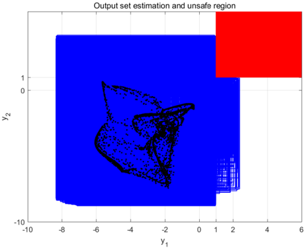
This image displays a two-dimensional plot illustrating the estimated output set of a system, an explicitly defined unsafe region, and a system trajectory. The plot uses `y_1` as the horizontal axis and `y_2` as the vertical axis. A large blue region represents the "Output set estimation," a red rectangular area denotes the "unsafe region," and a dense collection of black points within the blue region depicts a complex system trajectory.
### Components/Axes
* **Chart Title**: "Output set estimation and unsafe region"
* **X-axis (Horizontal)**: Labeled "y_1".
* **Range**: Approximately from -10 to 6.
* **Major Tick Marks**: -10, -8, -6, -4, -2, 0, 1, 2, 4, 6.
* **Y-axis (Vertical)**: Labeled "y_2".
* **Range**: Approximately from -10 to 2.
* **Major Tick Marks**: -10, -8, -6, -4, -2, 0, 1.
* **Legend (Implicit)**:
* **Blue Region**: Represents the "Output set estimation."
* **Red Region**: Represents the "unsafe region."
* **Black Points**: Represent the system's trajectory or a set of reachable states within the estimated output set.
### Detailed Analysis
The plot is divided into several distinct visual components:
1. **Output Set Estimation (Blue Region)**:
* This region occupies the majority of the left and bottom-central area of the plot.
* **Spatial Grounding**: It starts from approximately `y_1 = -8.5` on the left and extends to `y_1 = 1.5` on the right at its widest point. Vertically, it spans from approximately `y_2 = -9.5` at the bottom to `y_2 = 1.5` at the top.
* **Shape**: The region is generally rectangular but exhibits a complex, jagged boundary on its right side, particularly for `y_2` values above approximately -1.0. The top-right corner of this blue region is truncated by the red unsafe region. The bottom-left corner is slightly rounded or tapered.
* **Trend**: This region defines the estimated boundaries within which the system's output is expected to remain.
2. **Unsafe Region (Red Rectangle)**:
* This is a solid red rectangular area located in the top-right corner of the plot.
* **Spatial Grounding**: Its left edge is approximately at `y_1 = 1.0`. Its bottom edge is approximately at `y_2 = 0.5`. It extends horizontally to the right edge of the plot (approximately `y_1 = 6`) and vertically to the top edge of the plot (approximately `y_2 = 2`).
* **Shape**: It is a perfect rectangle, indicating a simple, clearly defined boundary for unsafe states.
* **Trend**: This region represents states that the system should avoid.
3. **System Trajectory (Black Points)**:
* A dense cluster of black points forms a complex, intricate pattern, characteristic of a strange attractor in dynamical systems.
* **Spatial Grounding**: This pattern is entirely contained within the blue "Output set estimation" region. It is roughly centered in the left-central part of the blue region.
* **Approximate Bounds**: The black points span `y_1` from approximately -6.5 to -1.5 and `y_2` from approximately -7.0 to 1.0.
* **Trend**: The points form multiple intertwined lobes and curves, suggesting a non-linear or chaotic system behavior. There are no black points observed outside the blue region or within the red region.
### Key Observations
* The black system trajectory is completely enclosed within the blue "Output set estimation" region.
* There is no overlap between the blue "Output set estimation" region and the red "unsafe region." The blue region's boundary precisely abuts the red region's boundary on its top-right side.
* The "unsafe region" is a simple, axis-aligned rectangle, while the "Output set estimation" has a more complex, irregular boundary, especially on its right side.
* The black points form a visually distinct, complex pattern, indicating a potentially chaotic or high-dimensional system behavior projected onto two dimensions.
### Interpretation
This plot effectively visualizes the safety analysis of a dynamic system.
The "Output set estimation" (blue region) represents the predicted set of all possible states the system's output can reach under given conditions. This is often derived from reachability analysis or robust control techniques. The fact that the black system trajectory (likely actual or simulated system behavior) is entirely contained within this blue region suggests that the estimation is accurate and robust.
The "unsafe region" (red rectangle) defines a set of states that are undesirable or critical for the system to enter. The primary goal of such an analysis is often to ensure that the system's output never enters this unsafe region.
The most critical finding from this plot is that **the estimated output set (blue) does not intersect with the unsafe region (red)**. This implies that, according to the estimation, the system is guaranteed to remain safe and will not reach any of the unsafe states. Furthermore, the observed system trajectory (black points) also confirms this, as it stays well within the estimated safe region and far from the unsafe zone.
The complex, fractal-like nature of the black points suggests that the underlying system might be non-linear or chaotic, making the accurate estimation of its reachable set a challenging but crucial task for safety assurance. The jagged boundary of the blue region on the right side, particularly where it approaches the unsafe region, indicates that the estimation method is precisely defining the boundary of safety, potentially constrained by the proximity to the unsafe zone. This plot serves as strong evidence that the system, as modeled and analyzed, operates within safe bounds.