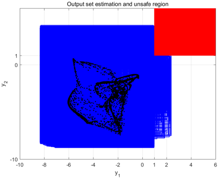
## Chart: Output Set Estimation and Unsafe Region
### Overview
The image is a 2D plot illustrating an output set estimation and an unsafe region. The plot features two axes, y1 and y2, and displays a complex, swirling pattern in black, surrounded by a blue region. A red rectangular area represents the unsafe region.
### Components/Axes
* **Title:** "Output set estimation and unsafe region"
* **X-axis:** y1, ranging from -10 to 6. Axis markers are present at -10, -8, -6, -4, -2, 0, 2, 4, and 6.
* **Y-axis:** y2, ranging from -10 to 1. Axis markers are present at -10, 0, and 1.
* **Regions:**
* Blue region: Represents the estimated output set.
* Red region: Represents the unsafe region, located in the top-right corner of the plot.
* Black region: Represents the output set.
### Detailed Analysis
* **Output Set (Black):** A complex, swirling pattern is concentrated in the approximate range of y1 = -6 to 2 and y2 = -8 to 1. The density of points varies within this region, with some areas showing a higher concentration than others.
* **Estimated Output Set (Blue):** The blue region encompasses the black output set and extends to the boundaries of the plot, except for the unsafe region. It covers the area from approximately y1 = -10 to 2 and y2 = -10 to 1.
* **Unsafe Region (Red):** A rectangular area in the top-right corner, starting at approximately y1 = 2 and y2 = 1, and extending to y1 = 6 and y2 = 3.
### Key Observations
* The black output set is entirely contained within the blue estimated output set.
* The red unsafe region does not overlap with the densest parts of the black output set, but it is adjacent to the blue region.
* The plot suggests a system where the output is estimated to be within the blue region, but a specific area (red) is considered unsafe.
### Interpretation
The plot visualizes the estimation of a system's output and identifies a region where the system's state is considered unsafe. The black swirling pattern represents the actual output set of the system. The blue area represents the estimated output set, which is a broader region intended to contain the actual output. The red rectangle represents an "unsafe region," likely indicating a range of output values that should be avoided. The fact that the black output set is contained within the blue estimated output set suggests that the estimation is conservative. The placement of the red unsafe region indicates a potential risk area that the system's output should not enter.