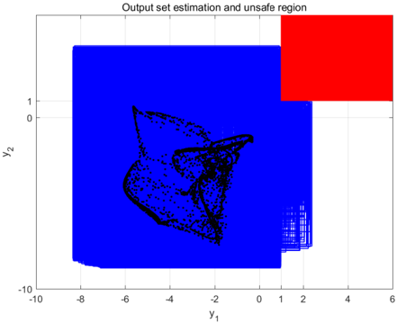
## 2D Plot: Output set estimation and unsafe region
### Overview
This image is a 2D Cartesian plot used in control theory or dynamical systems analysis. It visualizes the relationship between a system's actual trajectory (black), a computed estimation of all possible outputs (blue), and a defined region where the system would fail or be considered unsafe (red). The primary visual narrative is demonstrating that the estimated boundaries of the system's behavior do not intersect with the danger zone.
### Components/Axes
**Header:**
* **Title:** "Output set estimation and unsafe region" (Located at the top center).
**Axes:**
* **X-axis (Horizontal):**
* **Label:** $y_1$ (Located at the bottom center).
* **Scale:** Linear.
* **Tick Marks:** -10, -8, -6, -4, -2, 0, 1, 2, 4, 6.
* *Note:* The inclusion of the '1' tick mark breaks the even-number pattern, specifically to align with the boundary of the red region.
* **Y-axis (Vertical):**
* **Label:** $y_2$ (Rotated 90 degrees, located on the left center).
* **Scale:** Linear.
* **Tick Marks:** -10, 0, 1.
* *Note:* The y-axis is sparsely labeled. The distance between 0 and -10 establishes the scale. The '1' tick mark is explicitly placed just above the '0' to align with the bottom boundary of the red region. The top of the axis extends to approximately +10 based on grid proportions.
**Grid:**
* Light gray grid lines correspond to the major tick marks on both axes.
### Detailed Analysis
The plot contains three distinct data representations, analyzed by spatial positioning and color:
**1. The Unsafe Region (Red Area)**
* **Visual Trend:** A solid, uniform rectangle occupying the top-right quadrant of the plot.
* **Spatial Grounding & Values:**
* The bottom edge aligns perfectly with the $y_2 = 1$ tick mark.
* The left edge aligns perfectly with the $y_1 = 1$ tick mark.
* It extends outward to the right edge ($y_1 = 6$) and the top edge (approx $y_2 = 10$) of the graph area.
* **Mathematical Definition:** The region is defined by the inequalities $y_1 \ge 1$ and $y_2 \ge 1$.
**2. The Output Set Estimation (Blue Area)**
* **Visual Trend:** A large, predominantly solid blue mass occupying the left and central portions of the graph. Upon close inspection of its bottom-right boundary, it is composed of many overlapping, slightly offset rectangles, creating a "staircase" or jagged edge effect.
* **Spatial Grounding & Values:**
* **Left boundary:** Approximately $y_1 = -8.2$.
* **Top boundary:** Approximately $y_2 = 8$.
* **Bottom boundary:** Approximately $y_2 = -9$.
* **Right boundary:** The main vertical edge is at $y_1 = 1$. However, below $y_2 = 1$, the blue area extends further right in a stepped pattern, reaching a maximum of approximately $y_1 = 2.5$ at the bottom right corner (around $y_2 = -8$).
* *Crucial Observation:* The blue area shares a boundary with the red area at $y_1 = 1$ (for $y_2 \ge 1$), but it **does not overlap** the red area.
**3. The Actual Output / Trajectory (Black Pattern)**
* **Visual Trend:** A dense, complex, and seemingly chaotic scatter plot or continuous trajectory line. It features distinct folds, sharp turns, and "wings," resembling a strange attractor from a non-linear dynamical system.
* **Spatial Grounding & Values:**
* It is located entirely within the left-center of the plot.
* **X-bounds:** Spans roughly from $y_1 = -6$ to $y_1 = -0.5$.
* **Y-bounds:** Spans roughly from $y_2 = -7$ to $y_2 = 4$.
* *Crucial Observation:* The black pattern is completely encapsulated by the blue area. It is far away from the red area.
### Key Observations
1. **Encapsulation:** The blue region acts as a strict bounding box (or bounding volume) for the black trajectory. There are no black data points outside the blue area.
2. **Clearance:** There is a distinct visual separation between the actual system behavior (black) and the unsafe region (red).
3. **Algorithmic Artifacts:** The stepped, rectangular nature of the blue region's bottom-right edge strongly suggests it was generated by a computational algorithm that uses interval arithmetic, grid-based reachability, or zonotopes to calculate bounds over time.
### Interpretation
This chart is a visual proof of safety for a dynamical system or control algorithm.
* **The Black Pattern** represents the actual, simulated, or observed states of the system over time. Its complex shape indicates a highly non-linear system.
* **The Red Region** represents a failure state. If the system's output ($y_1, y_2$) enters this zone, the system crashes, breaks, or violates a critical constraint.
* **The Blue Region** represents "Reachability Analysis" or "Output Set Estimation." Because calculating the *exact* future of a complex non-linear system is often computationally impossible, engineers calculate an "over-approximation." The blue area represents *every possible state* the system could theoretically reach, accounting for uncertainties and worst-case scenarios.
**Conclusion drawn from the data:** The system is mathematically proven to be safe. Even though the actual trajectory (black) is complex, the absolute worst-case calculated boundaries (blue) never intersect the failure state (red). The explicit labeling of '1' on both axes serves to highlight the exact mathematical threshold of the unsafe region, proving that the estimation algorithm successfully constrained the system just outside of it.