\n
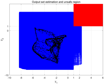
## Scatter Plot: Output Set Estimation and Unsafe Region
### Overview
The image displays a scatter plot visualizing an output set estimation alongside an identified "unsafe region". The plot uses two axes, y1 and y2, to represent the data points. The majority of the plot area is filled with a dense cluster of black points, while a significant portion of the top-right quadrant is colored red, indicating the unsafe region. A blue background fills the remaining area.
### Components/Axes
* **Title:** "Output set estimation and unsafe region" (positioned at the top-center)
* **X-axis:** Labeled "y1", ranging approximately from -10 to 6. The scale appears linear.
* **Y-axis:** Labeled "y2", ranging approximately from -10 to 1. The scale appears linear.
* **Data Points:** A dense collection of black points scattered primarily in the lower-left portion of the plot.
* **Unsafe Region:** A rectangular area colored red, located in the top-right quadrant.
* **Background:** The remaining area is filled with a solid blue color.
### Detailed Analysis
The scatter plot shows a concentration of data points clustered around the origin, with a more complex distribution extending towards negative values of y1 and a limited range of y2 values.
* **Data Point Distribution:** The black points are densely packed between y1 = -8 and y1 = 0, and y2 = -10 and y2 = 0. There is a noticeable gap in data points in the upper-left quadrant.
* **Unsafe Region:** The red rectangle spans approximately from y1 = 1 to y1 = 6, and y2 = 0 to y2 = 1. This region is devoid of black data points.
* **Data Density:** The density of black points decreases as y1 increases beyond -2 and as y2 approaches 0.
* **Vertical Lines:** There are several vertical lines of points at y1 = 0, y1 = 1, y1 = 2, y1 = 3, and y1 = 4.
### Key Observations
* The data points are largely confined to the lower-left portion of the plot.
* The "unsafe region" (red rectangle) is clearly demarcated and contains no data points.
* The vertical lines of points suggest a discrete or quantized behavior in the data generation process.
* The data distribution appears non-uniform, with higher density in certain areas and gaps in others.
### Interpretation
This plot likely represents the output space of a system or model, where each point corresponds to a possible output. The "unsafe region" indicates a set of outputs that are undesirable or unacceptable. The concentration of data points in the lower-left quadrant suggests that the system tends to produce outputs within that range. The absence of data points in the unsafe region implies that the system is designed or constrained to avoid those outputs. The vertical lines could indicate specific operating conditions or parameter settings that lead to distinct output patterns.
The plot suggests a successful constraint or design that keeps the system's output away from the "unsafe region". Further investigation would be needed to understand the meaning of the axes (y1 and y2) and the nature of the system being modeled. The non-uniform distribution of data points might indicate biases or limitations in the system's behavior.