## 2D Plot: Output Set Estimation and Unsafe Region
### Overview
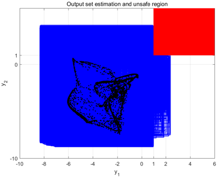
The image is a 2D scatter plot with filled regions, titled "Output set estimation and unsafe region." It visualizes the estimated safe operating space (blue region) of a system against a defined unsafe region (red rectangle) within a two-dimensional output space defined by variables `y₁` and `y₂`. A dense cluster of black data points is overlaid, representing specific estimated or sampled system outputs.
### Components/Axes
* **Title:** "Output set estimation and unsafe region" (centered at the top).
* **X-Axis:** Labeled `y₁`. The scale runs from -10 to 6, with major tick marks at intervals of 2 (-10, -8, -6, -4, -2, 0, 2, 4, 6).
* **Y-Axis:** Labeled `y₂`. The scale runs from -10 to 2, with major tick marks at intervals of 2 (-10, -8, -6, -4, -2, 0, 2).
* **Blue Region:** A large, irregularly shaped filled area representing the "output set estimation." It occupies the majority of the plot area, extending from approximately `y₁ = -9` to `y₁ = 2.5` and `y₂ = -9.5` to `y₂ = 1.8`. Its boundary is jagged, particularly on the right side.
* **Red Region:** A solid red rectangle located in the top-right corner of the plot. It represents the "unsafe region." Its approximate bounds are `y₁` from 1 to 6 and `y₂` from 1 to 2.
* **Black Data Points:** A dense cloud of small black dots scattered within the blue region. They are not present in the red region.
### Detailed Analysis
* **Spatial Relationship:** The red "unsafe region" is positioned at the top-right extreme of the plotted space. The blue "output set" region overlaps with the bottom-left corner of this red rectangle, indicating a potential intersection where estimated outputs could be unsafe.
* **Data Point Distribution:** The black dots are heavily concentrated in a central cluster. The densest part of this cluster is located approximately between `y₁ = -6` and `y₁ = 0`, and `y₂ = -6` and `y₂ = 0`. The points form a complex, somewhat star-like or branching shape within this core area. The density of points decreases significantly towards the outer edges of the blue region.
* **Boundary Analysis:** The blue region's boundary is not smooth. It has a notable "step" or indentation on its right side, near `y₁ = 2`. The top boundary is relatively flat near `y₂ = 1.8`, while the bottom boundary is also flat near `y₂ = -9.5`.
### Key Observations
1. **Safety Margin:** The vast majority of the black data points (estimated outputs) are located well within the blue region and far from the red unsafe region. This suggests the system's estimated outputs are predominantly safe.
2. **Potential Hazard Zone:** The overlap between the blue and red regions (approximately `y₁` from 1 to 2.5 and `y₂` from 1 to 1.8) is a critical area. While no black data points are visible in this overlap zone in this specific visualization, its existence indicates a theoretical or estimated possibility of unsafe outputs.
3. **Output Clustering:** The system's outputs are not uniformly distributed. They exhibit strong clustering in a specific sub-region of the safe space, suggesting the system operates most frequently or stably within that particular range of `y₁` and `y₂` values.
4. **Asymmetry:** The safe operating space (blue) is heavily skewed towards negative values for both `y₁` and `y₂`. The unsafe region is defined only for positive values.
### Interpretation
This plot is a safety verification or reachability analysis result for a dynamical system. The blue region represents the *estimated* set of all possible outputs (`y₁`, `y₂`) the system can produce, given its inputs and dynamics. The red rectangle is a *forbidden* or unsafe output specification.
The key takeaway is that the system's estimated behavior (blue set and black sample points) is almost entirely contained within the safe region. The critical finding is the small overlap between the estimated safe set and the predefined unsafe set. This overlap signifies a **potential safety violation**. It means that under some conditions, the system's outputs could theoretically enter the unsafe zone, even if sampled points (black dots) have not yet done so. This would typically trigger further investigation, such as refining the estimation algorithm, adding safety constraints, or performing more rigorous analysis to prove whether actual trajectories can cross into the red zone. The clustering of points indicates the system's nominal or most probable operating regime.