\n
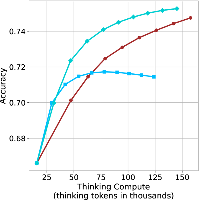
## Line Chart: Accuracy vs. Thinking Compute
### Overview
The image is a line chart plotting model accuracy against computational resources allocated for "thinking." It displays the performance of three distinct models or methods, represented by three colored lines with markers, as the amount of thinking compute increases.
### Components/Axes
* **X-Axis (Horizontal):** Labeled "Thinking Compute (thinking tokens in thousands)". The scale runs from 0 to 150, with major tick marks at 25, 50, 75, 100, 125, and 150.
* **Y-Axis (Vertical):** Labeled "Accuracy". The scale runs from approximately 0.68 to 0.75, with major tick marks at 0.68, 0.70, 0.72, and 0.74.
* **Legend:** Positioned in the top-left corner of the chart area. It contains three entries:
1. A cyan line with diamond markers.
2. A red line with circle markers.
3. A blue line with square markers.
* **Grid:** A light gray grid is present, aligning with the major tick marks on both axes.
### Detailed Analysis
**Data Series 1: Cyan Line with Diamond Markers**
* **Trend:** Shows a steep, concave-downward increase that begins to plateau at higher compute values. It is the top-performing series across the entire range.
* **Approximate Data Points:**
* At ~15k tokens: Accuracy ≈ 0.665
* At 25k tokens: Accuracy ≈ 0.700
* At 50k tokens: Accuracy ≈ 0.723
* At 75k tokens: Accuracy ≈ 0.740
* At 100k tokens: Accuracy ≈ 0.748
* At 125k tokens: Accuracy ≈ 0.752
* At 150k tokens: Accuracy ≈ 0.755
**Data Series 2: Red Line with Circle Markers**
* **Trend:** Shows a steady, nearly linear increase across the entire range. It starts as the lowest-performing series but surpasses the blue series around 65k tokens.
* **Approximate Data Points:**
* At ~15k tokens: Accuracy ≈ 0.665 (starts at the same point as cyan)
* At 25k tokens: Accuracy ≈ 0.680
* At 50k tokens: Accuracy ≈ 0.701
* At 75k tokens: Accuracy ≈ 0.724
* At 100k tokens: Accuracy ≈ 0.736
* At 125k tokens: Accuracy ≈ 0.744
* At 150k tokens: Accuracy ≈ 0.748
**Data Series 3: Blue Line with Square Markers**
* **Trend:** Shows an initial increase, peaks, and then exhibits a slight decline. It is the only series that does not show continuous improvement with more compute.
* **Approximate Data Points:**
* At ~15k tokens: Accuracy ≈ 0.665 (starts at the same point as others)
* At 25k tokens: Accuracy ≈ 0.700
* At 50k tokens: Accuracy ≈ 0.715
* At 75k tokens: Accuracy ≈ 0.717 (appears to be the peak)
* At 100k tokens: Accuracy ≈ 0.716
* At 125k tokens: Accuracy ≈ 0.714
### Key Observations
1. **Performance Hierarchy:** The cyan (diamond) model is consistently the most accurate, followed by the red (circle) model after ~65k tokens. The blue (square) model is the least accurate for compute values above ~65k.
2. **Diminishing Returns:** All models show diminishing returns; the accuracy gain per additional thousand thinking tokens decreases as compute increases. This is most pronounced for the cyan model.
3. **Performance Degradation:** The blue model is unique in that its accuracy slightly decreases after peaking at approximately 75k thinking tokens, suggesting a potential overfitting or capacity limit.
4. **Convergence at Low Compute:** All three models start at nearly the same accuracy point (~0.665) when thinking compute is very low (~15k tokens).
### Interpretation
This chart demonstrates the relationship between computational investment in a model's "thinking" process and its resulting accuracy on a task. The data suggests:
* **Model Architecture Matters:** The significant performance gap between the cyan and blue lines, especially at higher compute, indicates fundamental differences in model architecture, training, or efficiency. The cyan model is far more effective at leveraging additional compute.
* **The "Thinking" Paradigm is Effective but Bounded:** For the top two models, allocating more tokens for internal reasoning ("thinking") reliably improves performance, but with clear diminishing returns. There is a practical limit to the benefits of simply throwing more compute at the problem.
* **Potential for Over-Optimization:** The blue model's decline after a peak is a critical anomaly. It implies that for some systems, there is an optimal compute budget, beyond which performance may degrade—possibly due to the model generating irrelevant or confusing internal reasoning that harms its final output.
* **Strategic Implications:** For resource-constrained applications, the red model might offer a better cost-benefit ratio at very high compute levels, as its improvement is more linear. However, for maximum accuracy regardless of cost, the cyan model is the clear choice. The blue model appears unsuitable for high-compute scenarios.
**Language:** The chart text is in English. No other languages are present.