\n
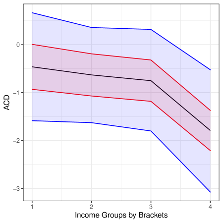
## Line Chart: ACD Across Income Groups
### Overview
The image is a line chart displaying the relationship between "ACD" (y-axis) and "Income Groups by Brackets" (x-axis). It features three distinct data series represented by blue, red, and black lines, each accompanied by a shaded confidence interval of the corresponding color. The chart demonstrates a consistent downward trend for all series as income group increases.
### Components/Axes
* **X-Axis:** Labeled "Income Groups by Brackets". It has four discrete, evenly spaced tick marks labeled "1", "2", "3", and "4".
* **Y-Axis:** Labeled "ACD". It has a linear scale with major tick marks at -3, -2, -1, and 0.
* **Data Series & Legend:** There are three lines with associated shaded confidence bands.
* **Blue Line & Band:** The uppermost series.
* **Red Line & Band:** The middle series.
* **Black Line & Band:** The lowest series.
* **Note:** No explicit legend is present in the image to define what the blue, red, and black colors represent (e.g., different models, populations, or metrics).
### Detailed Analysis
**Trend Verification:** All three lines exhibit a negative slope, indicating that the ACD value decreases as the income group bracket number increases from 1 to 4.
**Data Point Extraction (Approximate Values):**
The following table reconstructs the approximate central line values and the range of the shaded confidence intervals at each income group.
| Income Group | Blue Series (Line & CI Range) | Red Series (Line & CI Range) | Black Series (Line & CI Range) |
| :--- | :--- | :--- | :--- |
| **1** | Line: ~0.5<br>CI: ~ -0.1 to ~1.1 | Line: ~0.0<br>CI: ~ -0.9 to ~0.9 | Line: ~ -0.5<br>CI: ~ -1.6 to ~0.6 |
| **2** | Line: ~0.3<br>CI: ~ -0.2 to ~0.8 | Line: ~ -0.2<br>CI: ~ -1.1 to ~0.7 | Line: ~ -0.7<br>CI: ~ -1.7 to ~0.3 |
| **3** | Line: ~0.3<br>CI: ~ -0.2 to ~0.8 | Line: ~ -0.3<br>CI: ~ -1.2 to ~0.6 | Line: ~ -0.8<br>CI: ~ -1.8 to ~0.2 |
| **4** | Line: ~ -0.5<br>CI: ~ -3.1 to ~2.1 | Line: ~ -1.3<br>CI: ~ -2.2 to ~ -0.4 | Line: ~ -1.8<br>CI: ~ -3.1 to ~ -0.5 |
**Spatial Grounding & Confidence Intervals:**
* The shaded confidence intervals are widest at Income Group 4 for all series, indicating greater uncertainty in the estimate for the highest bracket.
* The blue confidence interval is the widest overall, spanning a range of approximately 5.2 units at Group 4.
* The red and black confidence intervals overlap significantly across all groups, while the blue interval overlaps with the red interval at Groups 1-3 but is largely distinct at Group 4.
### Key Observations
1. **Consistent Negative Trend:** ACD decreases monotonically for all three series across the four income brackets.
2. **Hierarchy of Values:** The blue series consistently has the highest ACD values, followed by red, then black, at every income group.
3. **Divergence at Highest Bracket:** The rate of decrease appears to accelerate between Income Groups 3 and 4 for all series, with the blue line showing the most dramatic drop.
4. **Increasing Uncertainty:** The precision of the estimates decreases (confidence intervals widen) as the income group number increases, most severely for the blue series.
### Interpretation
The chart suggests a strong inverse relationship between the measured "ACD" metric and income group bracket. Whatever ACD represents, it tends to be lower (more negative) for higher-numbered income groups.
* **Relative Performance:** The blue series maintains a higher ACD than the red and black series across the income spectrum, though it converges toward the others in the highest bracket. Without a legend, we cannot determine if this represents a more favorable outcome, a different demographic, or an alternative model.
* **Significance of Overlap:** The overlapping confidence intervals of the red and black series suggest that the difference between them may not be statistically significant at any income level. The blue series, however, appears significantly different from the black series at all points and from the red series at the highest income bracket.
* **Data Quality Implication:** The widening confidence intervals, especially for the blue series at Income Group 4, imply that the data for the highest income bracket is either more variable or based on a smaller sample size, making the estimate less reliable. The sharp drop in the central estimate for the blue line at Group 4 should be interpreted with caution due to this high uncertainty.
**In summary, the data demonstrates that ACD is negatively associated with income group, with distinct but potentially non-significant differences between the red and black series, and a uniquely high but highly uncertain value for the blue series in the lowest income groups.**