## Line Chart: ACD vs. Income Groups by Brackets
### Overview
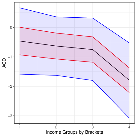
The image is a line chart showing the relationship between ACD (likely an acronym for a measured variable) and Income Groups by Brackets. The x-axis represents income groups, and the y-axis represents the ACD value. The chart displays a central tendency line (black) with upper and lower bounds indicated by red lines, and an overall uncertainty range indicated by blue lines.
### Components/Axes
* **X-axis:** "Income Groups by Brackets" with markers at 1, 2, 3, and 4.
* **Y-axis:** "ACD" with markers at -3, -2, -1, 0, and 1.
* **Data Series:**
* Black line: Represents the central tendency of ACD for each income group.
* Red lines: Represent the upper and lower bounds of a confidence interval around the central tendency.
* Blue lines: Represent the upper and lower bounds of a wider uncertainty range.
### Detailed Analysis
* **Income Group 1:**
* Black line (central tendency): Approximately -0.6
* Red lines (confidence interval): Approximately -0.9 and 0.0
* Blue lines (uncertainty range): Approximately -1.7 and 0.4
* **Income Group 2:**
* Black line (central tendency): Approximately -0.7
* Red lines (confidence interval): Approximately -1.1 and -0.1
* Blue lines (uncertainty range): Approximately -1.7 and 0.3
* **Income Group 3:**
* Black line (central tendency): Approximately -0.7
* Red lines (confidence interval): Approximately -1.2 and -0.2
* Blue lines (uncertainty range): Approximately -1.8 and 0.3
* **Income Group 4:**
* Black line (central tendency): Approximately -1.5
* Red lines (confidence interval): Approximately -2.2 and -0.9
* Blue lines (uncertainty range): Approximately -3.1 and -0.2
**Trends:**
* **Black Line (Central Tendency):** Relatively flat from Income Group 1 to 3, then decreases noticeably from Income Group 3 to 4.
* **Red Lines (Confidence Interval):** Both the upper and lower red lines are relatively flat from Income Group 1 to 3, then decrease from Income Group 3 to 4.
* **Blue Lines (Uncertainty Range):** The upper blue line is relatively flat from Income Group 1 to 3, then decreases from Income Group 3 to 4. The lower blue line is relatively flat from Income Group 1 to 2, then decreases sharply from Income Group 2 to 4.
### Key Observations
* The ACD value tends to decrease as the income group increases, particularly between groups 3 and 4.
* The uncertainty range (blue lines) is wider than the confidence interval (red lines), as expected.
* The confidence interval and uncertainty range appear to narrow slightly as income group increases.
### Interpretation
The chart suggests that there is a negative correlation between ACD and Income Groups by Brackets, especially at higher income brackets. The ACD value tends to be lower for higher income groups. The confidence interval and uncertainty range provide an indication of the variability in the data. The narrowing of the confidence interval and uncertainty range at higher income groups might suggest that the ACD value is more consistent within those groups. It is important to note that this is just a visual interpretation, and statistical analysis would be needed to confirm these observations.