\n
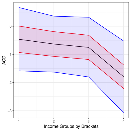
## Line Chart: ACD vs. Income Groups
### Overview
The image presents a line chart illustrating the relationship between "ACD" (likely a metric or score) and "Income Groups by Brackets". Three lines are plotted, each representing a different trend, with shaded regions indicating confidence intervals or standard deviations around each line. The x-axis represents income groups, numbered 1 through 4, while the y-axis represents the ACD value, ranging from approximately -3 to 0.
### Components/Axes
* **X-axis:** "Income Groups by Brackets" with markers at 1, 2, 3, and 4.
* **Y-axis:** "ACD" with a scale ranging from approximately -3 to 0. The scale is linear.
* **Lines:** Three lines are present:
* Blue Line: Represents the highest trend.
* Red Line: Represents the middle trend.
* Black Line: Represents the lowest trend.
* **Shaded Regions:** Each line has a corresponding shaded region, likely representing a confidence interval or standard deviation. The blue line has a light blue shaded region, the red line has a light red shaded region, and the black line has a light purple shaded region.
### Detailed Analysis
* **Blue Line:** This line starts at approximately -1.8 at Income Group 1, rises slightly to around -1.5 at Income Group 2, then increases to approximately -0.8 at Income Group 3, and finally slopes downward to approximately -2.7 at Income Group 4.
* **Red Line:** This line begins at approximately -1.1 at Income Group 1, remains relatively stable at around -0.8 to -1.0 through Income Groups 2 and 3, and then decreases sharply to approximately -1.8 at Income Group 4.
* **Black Line:** This line starts at approximately -1.3 at Income Group 1, remains relatively stable around -1.2 to -1.4 through Income Group 2, decreases to approximately -1.7 at Income Group 3, and then drops significantly to approximately -2.5 at Income Group 4.
* **Shaded Regions:** The shaded regions around each line indicate the variability or uncertainty associated with each trend. The width of the shaded regions appears to be relatively consistent across the income groups, suggesting a similar level of uncertainty for each group.
### Key Observations
* All three lines generally exhibit a downward trend from Income Group 3 to Income Group 4.
* The black line consistently represents the lowest ACD values across all income groups.
* The red line consistently represents the highest ACD values across income groups 1-3.
* The blue line shows the most significant decrease in ACD value from Income Group 3 to Income Group 4.
### Interpretation
The chart suggests a relationship between income groups and the ACD metric. As income groups increase (from 1 to 4), the ACD values generally decrease, indicating a potential negative correlation. The differences between the lines suggest that the relationship between income and ACD may vary depending on other factors or subgroups within the population. The shaded regions indicate the uncertainty associated with these trends, and it is important to consider this uncertainty when interpreting the results. The sharp decline in all lines at Income Group 4 could indicate a threshold effect or a change in the underlying relationship between income and ACD. The data suggests that higher income brackets are associated with lower ACD values, but the variability within each income bracket should be considered. Further investigation would be needed to understand the underlying reasons for these trends and to determine the significance of the observed differences.