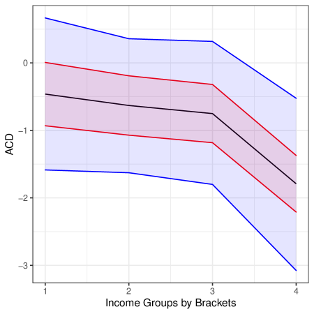
## Line Chart: ACD Trends Across Income Groups
### Overview
The image depicts a line chart illustrating the relationship between income groups (categorized as "Brackets") and a metric labeled "ACD" (y-axis). Three income groups are represented: High Income (blue), Middle Income (red), and Low Income (black). Each line includes a shaded region, likely indicating confidence intervals or variability. The x-axis ranges from 1 to 4, while the y-axis spans from -3 to 0.
### Components/Axes
- **X-Axis**: Labeled "Income Groups by Brackets" with discrete values 1, 2, 3, and 4.
- **Y-Axis**: Labeled "ACD" with a scale from -3 to 0.
- **Legend**: Positioned on the right side of the chart, associating:
- **Blue**: High Income
- **Red**: Middle Income
- **Black**: Low Income
- **Shaded Regions**: Each line has a corresponding shaded area (e.g., blue shading for High Income), suggesting uncertainty or variability.
### Detailed Analysis
1. **High Income (Blue Line)**:
- Starts at approximately **0.5** (y-axis) when x=1.
- Declines steadily to **-1.5** at x=4.
- Shaded region narrows slightly as x increases, indicating reduced variability at higher income brackets.
2. **Middle Income (Red Line)**:
- Begins at **-0.5** (y-axis) at x=1.
- Decreases to **-2.5** at x=4.
- Shaded region remains relatively consistent in width, suggesting stable variability.
3. **Low Income (Black Line)**:
- Starts at **-1** (y-axis) at x=1.
- Drops sharply to **-3** at x=4.
- Shaded region widens significantly, especially between x=3 and x=4, indicating increased uncertainty or variability in ACD values.
### Key Observations
- **Downward Trend**: All income groups show a consistent decline in ACD as income brackets increase (x-axis).
- **Income Gradient**: High Income consistently has the highest ACD values, while Low Income has the lowest.
- **Variability**: Low Income exhibits the widest shaded regions, particularly at higher income brackets (x=3–4), suggesting greater uncertainty in ACD measurements for this group.
### Interpretation
The chart implies that **ACD decreases with increasing income**, potentially reflecting improved performance, efficiency, or resource allocation in higher income brackets. The shaded regions highlight that **Low Income groups experience greater variability** in ACD, which could indicate systemic challenges, measurement noise, or external factors affecting this demographic. The steeper decline for Low Income (from -1 to -3) compared to Middle Income (from -0.5 to -2.5) suggests a nonlinear relationship, where lower-income groups face disproportionately larger reductions in ACD as income increases. This could point to targeted interventions or policy impacts on lower-income populations.