\n
## Directed Acyclic Graph (DAG) Diagram: Causal Model Comparison
### Overview
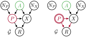
The image displays two side-by-side directed acyclic graphs (DAGs), labeled $\bar{\mathcal{G}}$ (left) and $\mathcal{G}$ (right). These diagrams represent probabilistic or causal models, showing variables (nodes) and their directed relationships (edges). The primary visual difference between the two graphs is the representation of node $P$.
### Components/Axes
The diagrams consist of circular nodes connected by directed arrows (edges). There are no traditional chart axes. The components are:
**Nodes (Variables):**
* $N_P$: A node present in both graphs.
* $A$: A node present in both graphs, colored green.
* $N_X$: A node present in both graphs.
* $P$: A node present in both graphs, colored red. In $\bar{\mathcal{G}}$ (left), it is a single circle. In $\mathcal{G}$ (right), it is a double circle.
* $X$: A node present in both graphs.
* $R$: A node present in both graphs.
**Edges (Relationships):**
* Arrows indicate directed influence or dependency from one node to another.
**Graph Labels:**
* $\bar{\mathcal{G}}$: Label positioned below the left graph.
* $\mathcal{G}$: Label positioned below the right graph.
### Detailed Analysis
**Graph $\bar{\mathcal{G}}$ (Left):**
* **Node Placement & Connections:**
* Top row (left to right): $N_P$ (black), $A$ (green), $N_X$ (black).
* Middle row: $P$ (red, single circle), $X$ (black).
* Bottom row: $R$ (black).
* **Edge Flow:**
1. $N_P \rightarrow P$
2. $A \rightarrow P$
3. $A \rightarrow X$
4. $N_X \rightarrow X$
5. $P \rightarrow X$
6. $P \rightarrow R$
7. $X \rightarrow R$
**Graph $\mathcal{G}$ (Right):**
* **Node Placement & Connections:**
* Top row (left to right): $N_P$ (black), $A$ (green), $N_X$ (black).
* Middle row: $P$ (red, **double circle**), $X$ (black).
* Bottom row: $R$ (black).
* **Edge Flow:**
1. $N_P \rightarrow P$
2. $A \rightarrow P$
3. $A \rightarrow X$
4. $N_X \rightarrow X$
5. $P \rightarrow X$
6. $P \rightarrow R$
7. $X \rightarrow R$
**Comparison:**
The structure and direction of all edges are identical between $\bar{\mathcal{G}}$ and $\mathcal{G}$. The sole difference is the visual representation of node $P$: a single circle in $\bar{\mathcal{G}}$ versus a double circle in $\mathcal{G}$.
### Key Observations
1. **Identical Topology:** The causal structure (which variables influence which) is preserved exactly between the two models.
2. **Color Coding:** Node $A$ is consistently green, and node $P$ is consistently red across both graphs. All other nodes ($N_P$, $N_X$, $X$, $R$) are black.
3. **Critical Visual Change:** The double circle around $P$ in $\mathcal{G}$ is the only differentiating feature. In graphical model notation, a double circle often signifies an **intervention** or a variable that has been set to a specific value (e.g., in the context of do-calculus).
4. **Common Structure:** Both graphs depict a model where $R$ is a downstream outcome influenced by both $P$ and $X$. $X$ itself is influenced by $P$, $A$, and $N_X$. $P$ is influenced by $N_P$ and $A$.
### Interpretation
These diagrams likely illustrate a foundational concept in causal inference: the difference between an **observational model** ($\bar{\mathcal{G}}$) and an **interventional model** ($\mathcal{G}$).
* **$\bar{\mathcal{G}}$ (Observational):** Represents the natural, unmanipulated system. All relationships are based on observed correlations. The single circle on $P$ indicates it is a random variable whose value is influenced by its parents ($N_P$ and $A$).
* **$\mathcal{G}$ (Interventional):** Represents the system after an external intervention has been applied to variable $P$. The double circle is a standard notation indicating that $P$ is no longer a random variable governed by its parents; instead, its value is fixed by the intervention (the "do-operator" in Pearl's notation, e.g., $do(P=p)$). The edges from $N_P$ and $A$ to $P$ are effectively "cut" by the intervention, though they remain drawn. The downstream effects on $X$ and $R$ are then studied under this forced condition.
**The core message** is that while the underlying causal mechanisms (the arrows) remain the same, the statistical properties of the system change fundamentally when a variable is intervened upon versus when it is merely observed. This distinction is crucial for determining causal effects from data.