## Diagram: Bayesian Network Comparison
### Overview
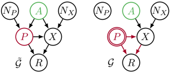
The image presents two Bayesian network diagrams side-by-side, illustrating different causal relationships between variables. The left diagram represents a network denoted as "~G", while the right diagram represents a network denoted as "G". The diagrams depict nodes representing variables and directed edges representing dependencies. The key difference lies in the treatment of variable "P" and its influence on other variables.
### Components/Axes
* **Nodes:** Each circle represents a variable. The variables are labeled as follows:
* `NP`: Node labeled "NP"
* `A`: Node labeled "A"
* `NX`: Node labeled "NX"
* `P`: Node labeled "P"
* `X`: Node labeled "X"
* `R`: Node labeled "R"
* **Edges:** Arrows indicate the direction of influence or dependency between variables.
* **Node Coloring:**
* `A`: Green
* `P`: Maroon/Red
* **Diagram Labels:**
* Left Diagram: "~G" (tilde G) located below the network.
* Right Diagram: "G" located below the network.
### Detailed Analysis
**Left Diagram (~G):**
* `NP` influences `P`.
* `A` influences `P`.
* `NX` influences `X`.
* `P` influences `X` and `R`.
* `X` influences `R`.
**Right Diagram (G):**
* `NP` influences `P`.
* `A` influences `P`.
* `NX` influences `X`.
* `P` influences `X` and `R`.
* `X` influences `R`.
* The node `P` has a double circle.
* The edges `P` -> `R` are red.
### Key Observations
* The primary difference between the two diagrams is the representation of variable `P`. In the right diagram (G), `P` has a double circle, and the edge from `P` to `R` is red, suggesting a specific intervention or manipulation of `P`'s influence on `R`.
* The left diagram (~G) represents the observational setting, while the right diagram (G) represents an interventional setting where `P` is being manipulated.
### Interpretation
The diagrams illustrate the concept of causal inference and the difference between observational and interventional distributions. The left diagram represents the natural dependencies between variables, while the right diagram represents the dependencies after an intervention on variable `P`. The double circle around `P` in the right diagram signifies that `P` is being set to a specific value, and the red edge from `P` to `R` indicates that the relationship between `P` and `R` is now determined by the intervention rather than the natural causal mechanism. This is a common representation in causal inference to distinguish between observing a variable and actively setting its value.