\n
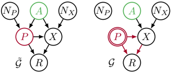
## Diagram: Graphical Model Comparison
### Overview
The image presents two graphical models, likely representing probabilistic relationships between variables. Both diagrams share the same set of variables but differ in the connections (edges) between them. The diagrams use nodes to represent variables and arrows to represent dependencies. The color of the nodes and arrows appears to indicate different types of variables or relationships.
### Components/Axes
The diagrams contain the following nodes:
* **N<sub>P</sub>**: Located at the top-left of each diagram.
* **A**: Located at the top-center of each diagram, colored green.
* **N<sub>X</sub>**: Located at the top-right of each diagram.
* **P**: Located below N<sub>P</sub>, colored red, with a double-circle outline in the right diagram.
* **X**: Located in the center of each diagram.
* **R**: Located at the bottom of each diagram.
* **g**: Located to the left of R.
The diagrams also contain directed edges (arrows) representing dependencies between the nodes.
### Detailed Analysis or Content Details
**Diagram 1 (Left):**
* N<sub>P</sub> → P (Black arrow)
* A → X (Green arrow)
* N<sub>X</sub> → X (Black arrow)
* P → X (Black arrow)
* X → R (Black arrow)
* g → R (Black arrow)
**Diagram 2 (Right):**
* N<sub>P</sub> → P (Black arrow)
* A → X (Green arrow)
* N<sub>X</sub> → X (Black arrow)
* P → X (Red arrow)
* P → R (Red arrow)
* X → R (Red arrow)
* g → R (Black arrow)
The key difference between the two diagrams is the color of the arrows originating from P and X in the right diagram, which are red, while in the left diagram they are black. The node P also has a double-circle outline in the right diagram.
### Key Observations
The diagrams illustrate two different models of relationships between the same variables. The change in arrow color and the double-circle around P in the second diagram suggest a change in the nature of the dependency or the importance of the variable P. The red arrows in the right diagram might indicate a stronger or more direct influence.
### Interpretation
These diagrams likely represent two different probabilistic models. The first diagram might represent a model where P influences X, and X then influences R. The second diagram suggests a more direct influence of P on both X and R, potentially indicating that P is a key causal factor. The double-circle around P in the second diagram could signify that P is a latent variable or a variable of particular interest. The green arrow from A to X in both diagrams suggests that A is a common cause or predictor of X. The diagrams are likely used to compare the fit of different models to observed data, or to illustrate the impact of different assumptions about the relationships between variables. The change in color and outline is a visual cue to highlight the difference in the models.