## Directed Acyclic Graphs (DAGs): Causal Diagram Structures
### Overview
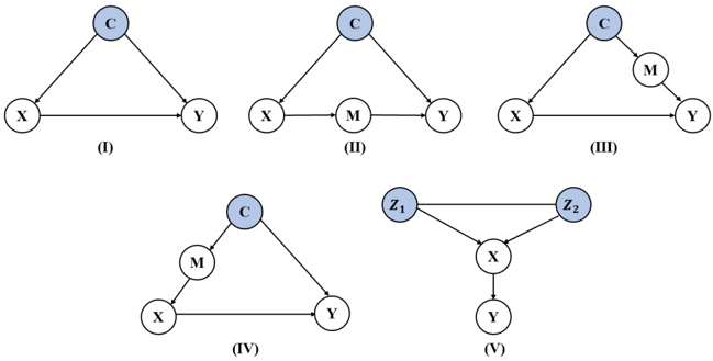
The image displays five distinct directed acyclic graphs (DAGs), labeled (I) through (V), illustrating different causal or probabilistic relationships between variables. These diagrams are commonly used in fields like statistics, epidemiology, and machine learning to represent structural causal models. Each diagram consists of nodes (circles) representing variables and directed edges (arrows) representing hypothesized causal pathways or dependencies.
### Components/Axes
* **Nodes (Variables):** Each node is a circle with a light blue fill and a black outline. They are labeled with uppercase letters.
* **Common Labels:** `X`, `Y`, `C`, `M`
* **Specific Labels in Diagram (V):** `Z₁`, `Z₂` (subscripts 1 and 2)
* **Edges (Relationships):** Directed arrows with black lines and arrowheads indicate the direction of influence or causation.
* **Diagram Labels:** Each graph is identified by a Roman numeral in parentheses `(I)`, `(II)`, `(III)`, `(IV)`, `(V)` placed directly below it.
* **Spatial Layout:**
* **Top Row (Left to Right):** Diagrams (I), (II), (III).
* **Bottom Row (Left to Right):** Diagrams (IV), (V).
* Within each diagram, nodes are arranged to minimize edge crossings and clearly show the flow of relationships.
### Detailed Analysis
**Diagram (I):**
* **Nodes:** `X`, `Y`, `C`.
* **Edges:** `X → Y`, `X → C`, `C → Y`.
* **Structure:** A triangle. `X` has a direct effect on `Y` and an indirect effect on `Y` through `C`. `C` is a mediator on the path from `X` to `Y`.
**Diagram (II):**
* **Nodes:** `X`, `Y`, `C`, `M`.
* **Edges:** `X → Y`, `X → M`, `M → Y`, `X → C`, `C → Y`.
* **Structure:** `X` has a direct effect on `Y`. Additionally, `X` influences `Y` through two separate intermediate variables: `M` and `C`. `M` and `C` are parallel mediators.
**Diagram (III):**
* **Nodes:** `X`, `Y`, `C`, `M`.
* **Edges:** `X → Y`, `X → C`, `C → M`, `M → Y`.
* **Structure:** `X` has a direct effect on `Y`. `X` also influences `Y` through a chain: `X → C → M → Y`. Here, `C` and `M` are sequential mediators.
**Diagram (IV):**
* **Nodes:** `X`, `Y`, `C`, `M`.
* **Edges:** `X → Y`, `X → M`, `M → C`, `C → Y`.
* **Structure:** `X` has a direct effect on `Y`. `X` also influences `Y` through a different chain: `X → M → C → Y`. The order of mediators `M` and `C` is reversed compared to Diagram (III).
**Diagram (V):**
* **Nodes:** `X`, `Y`, `Z₁`, `Z₂`.
* **Edges:** `Z₁ → Z₂`, `Z₁ → X`, `Z₂ → X`, `X → Y`.
* **Structure:** `X` has a direct effect on `Y`. The variables `Z₁` and `Z₂` both influence `X`. Furthermore, `Z₁` influences `Z₂`. `Z₁` and `Z₂` act as confounders for the relationship between `X` and `Y`, with an additional relationship between the confounders themselves.
### Key Observations
1. **Variable Roles:** `X` is consistently the "treatment" or independent variable, and `Y` is the "outcome" or dependent variable across all diagrams.
2. **Mediator vs. Confounder:** The diagrams systematically explore the placement of intermediate variables (`M`, `C`). In (I), (II), (III), and (IV), `C` and/or `M` are mediators (on the causal path from `X` to `Y`). In (V), `Z₁` and `Z₂` are confounders (common causes of `X` and potentially `Y`, though only `X→Y` is drawn).
3. **Structural Variations:** The core difference between diagrams (II), (III), and (IV) is the topological arrangement of the mediators `M` and `C` relative to `X` and `Y`.
4. **Complexity Increase:** Diagram (V) introduces a more complex confounding structure with two interrelated confounders (`Z₁ → Z₂`).
### Interpretation
These diagrams are foundational tools for illustrating concepts in causal inference, such as mediation, confounding, and collider bias. They serve as visual hypotheses about the data-generating process.
* **What the data suggests:** The set of diagrams demonstrates how the same set of variables (`X`, `Y`, and one or two others) can be connected in fundamentally different ways, leading to different statistical implications. For example, conditioning on `C` would have a different effect on the estimated `X→Y` relationship in diagram (I) (where it's a mediator) versus a diagram where `C` was a confounder (not shown here, but analogous to the role of `Z` in (V)).
* **How elements relate:** The arrows define the flow of causation. The absence of an arrow is as significant as its presence, implying no direct causal effect. The diagrams highlight that statistical association between `X` and `Y` can arise from direct causation (`X→Y`), indirect causation via mediators, or confounding.
* **Notable patterns:** The progression from (I) to (IV) shows a pedagogical exploration of mediation structures. Diagram (V) shifts focus to confounding, a separate core concept. The consistent use of `X` and `Y` anchors the comparison, allowing the viewer to focus on how the auxiliary variables (`C`, `M`, `Z₁`, `Z₂`) alter the causal landscape. This visual comparison is crucial for understanding why different statistical adjustment strategies (e.g., regression, stratification, instrumental variables) are needed for different underlying structures.