\n
## Diagram: Causal Diagrams
### Overview
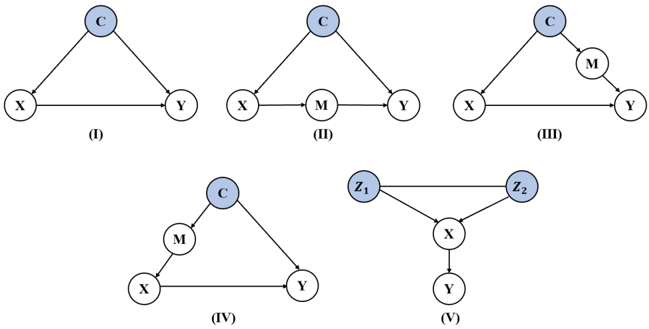
The image presents five directed acyclic graphs (DAGs), labeled (I) through (V). These diagrams likely represent causal relationships between variables. Each diagram consists of nodes (circles) representing variables and directed edges (arrows) indicating causal influence. The diagrams are arranged in a 2x3 grid.
### Components/Axes
The diagrams contain the following variables:
* **C**: Appears in diagrams (I), (II), (III), and (IV).
* **X**: Appears in diagrams (I), (II), (III), (IV), and (V).
* **Y**: Appears in diagrams (I), (II), (III), (IV), and (V).
* **M**: Appears in diagrams (II), (III), and (IV).
* **Z1**: Appears in diagram (V).
* **Z2**: Appears in diagram (V).
Each diagram is labeled with a Roman numeral (I, II, III, IV, V) positioned below the diagram.
### Detailed Analysis or Content Details
**Diagram (I):**
* X -> C
* X -> Y
* C -> Y
**Diagram (II):**
* X -> C
* X -> M
* C -> Y
* M -> Y
**Diagram (III):**
* X -> C
* C -> M
* M -> Y
**Diagram (IV):**
* X -> C
* X -> M
* C -> Y
* M -> Y
**Diagram (V):**
* Z1 -> X
* Z2 -> X
* X -> Y
### Key Observations
* Diagrams (I), (II), (III), and (IV) all involve the variables C, X, Y, and M (with varying connections).
* Diagram (V) is distinct, featuring Z1, Z2, X, and Y.
* The diagrams demonstrate different potential causal pathways between the variables.
* Diagrams (II) and (IV) are identical in structure.
### Interpretation
These diagrams likely represent different hypothesized causal models. They are used to visually represent assumptions about how variables influence each other. The absence of feedback loops (cycles) indicates that these are acyclic causal models.
* **Diagram (I)** suggests X directly influences both C and Y, and C influences Y.
* **Diagrams (II) and (IV)** suggest X influences both C and M, and both C and M influence Y. This implies a mediating effect of M or C.
* **Diagram (III)** suggests X influences C, C influences M, and M influences Y. This represents a chain of mediation.
* **Diagram (V)** suggests that both Z1 and Z2 influence X, and X influences Y. This could represent multiple causes of X.
The purpose of presenting these diagrams together is likely to compare and contrast different causal assumptions, potentially for model selection or sensitivity analysis. The diagrams are not providing numerical data, but rather structural information about hypothesized relationships. They are a visual tool for reasoning about causality.