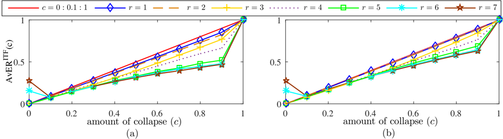
## Line Chart: AverITF(c) vs. Amount of Collapse (c)
### Overview
The image contains two line charts, labeled (a) and (b), that depict the relationship between AverITF(c) and the amount of collapse (c) for different values of 'r'. The charts share the same axes and legend, allowing for a direct comparison of the data.
### Components/Axes
* **Title (Y-axis):** AverITF(c)
* Scale: 0 to 1, with tick marks at 0, 0.5, and 1.
* **Title (X-axis):** amount of collapse (c)
* Scale: 0 to 1, with tick marks at 0, 0.2, 0.4, 0.6, 0.8, and 1.
* **Legend (Top):** Located above the charts, it identifies the lines by color and 'r' value.
* Red: c = 0 : 0.1 : 1
* Blue: r = 1
* Yellow: r = 2
* Dotted Black: r = 3
* Green: r = 4
* Cyan: r = 5
* Brown: r = 7
* **Chart Labels:** (a) and (b) are located below each chart.
### Detailed Analysis
**Chart (a):**
* **Red (c = 0 : 0.1 : 1):** Starts at approximately 0, increases linearly to 1 as 'c' goes to 1.
* **Blue (r = 1):** Starts at approximately 0, increases linearly to 1 as 'c' goes to 1.
* **Yellow (r = 2):** Starts at approximately 0, increases linearly to approximately 0.9 as 'c' goes to 0.8, then increases sharply to 1 as 'c' goes to 1.
* **Dotted Black (r = 3):** Starts at approximately 0, increases linearly to approximately 0.7 as 'c' goes to 0.8, then increases sharply to 1 as 'c' goes to 1.
* **Green (r = 4):** Starts at approximately 0, increases linearly to approximately 0.6 as 'c' goes to 0.8, then increases sharply to 1 as 'c' goes to 1.
* **Cyan (r = 5):** Starts at approximately 0.05, decreases to approximately 0.02 at c=0.1, then increases linearly to approximately 0.6 as 'c' goes to 0.8, then increases sharply to 1 as 'c' goes to 1.
* **Brown (r = 7):** Starts at approximately 0.2, decreases to approximately 0.05 at c=0.1, then increases linearly to approximately 0.55 as 'c' goes to 0.8, then increases sharply to 1 as 'c' goes to 1.
**Chart (b):**
* **Red (c = 0 : 0.1 : 1):** Starts at approximately 0, increases linearly to 1 as 'c' goes to 1.
* **Blue (r = 1):** Starts at approximately 0, increases linearly to 1 as 'c' goes to 1.
* **Yellow (r = 2):** Starts at approximately 0, increases linearly to approximately 0.9 as 'c' goes to 0.8, then increases sharply to 1 as 'c' goes to 1.
* **Dotted Black (r = 3):** Starts at approximately 0, increases linearly to approximately 0.7 as 'c' goes to 0.8, then increases sharply to 1 as 'c' goes to 1.
* **Green (r = 4):** Starts at approximately 0, increases linearly to approximately 0.6 as 'c' goes to 0.8, then increases sharply to 1 as 'c' goes to 1.
* **Cyan (r = 5):** Starts at approximately 0.15, decreases to approximately 0.05 at c=0.1, then increases linearly to approximately 0.6 as 'c' goes to 0.8, then increases sharply to 1 as 'c' goes to 1.
* **Brown (r = 7):** Starts at approximately 0.3, decreases to approximately 0.1 at c=0.1, then increases linearly to approximately 0.55 as 'c' goes to 0.8, then increases sharply to 1 as 'c' goes to 1.
### Key Observations
* For both charts, the red and blue lines (c = 0 : 0.1 : 1 and r = 1) show a consistent linear increase from 0 to 1 as the amount of collapse increases.
* The yellow, dotted black, and green lines (r = 2, r = 3, and r = 4) also increase with the amount of collapse, but their rate of increase changes as 'c' approaches 1.
* The cyan and brown lines (r = 5 and r = 7) initially decrease slightly before increasing with the amount of collapse.
* The primary difference between chart (a) and chart (b) lies in the initial values of the cyan and brown lines.
### Interpretation
The charts illustrate how the AverITF(c) changes with the amount of collapse (c) for different values of 'r'. The linear increase observed in the red and blue lines suggests a direct proportional relationship between AverITF(c) and the amount of collapse. The other lines show a more complex relationship, where the rate of increase changes as 'c' approaches 1. The initial decrease in the cyan and brown lines suggests that for certain values of 'r', a small amount of collapse initially reduces the AverITF(c) before it starts to increase. The difference in initial values between chart (a) and chart (b) for the cyan and brown lines suggests that the initial impact of collapse on AverITF(c) may vary depending on other factors not explicitly represented in the chart.