## Chart: Average Return to Functionality (AVERITF) vs. Amount of Collapse
### Overview
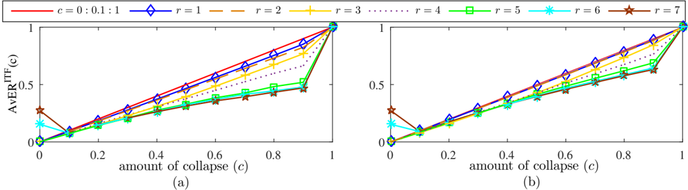
The image presents two line charts (labeled (a) and (b)) illustrating the relationship between the "amount of collapse" (c) and the "Average Return to Functionality" (AVERITF(c)). Both charts share the same x-axis (amount of collapse) and y-axis (AVERITF(c)), but display different sets of lines representing varying values of 'r'. The charts appear to model a system's recovery capability as it experiences increasing levels of collapse.
### Components/Axes
* **X-axis:** "amount of collapse (c)", ranging from 0 to 1, with markers at 0, 0.2, 0.4, 0.6, 0.8, and 1.
* **Y-axis:** "AVERITF(c)", ranging from 0 to 1, with markers at 0, 0.25, 0.5, 0.75, and 1.
* **Legend:** Located at the top-center of the image, it defines the lines by their 'r' value. The legend includes the following:
* Red solid line: c = 0:0.1:1
* Blue dashed line: r = 1
* Orange dashed-dotted line: r = 2
* Yellow dashed-dotted line: r = 3
* Green dashed line: r = 4
* Cyan dashed line: r = 5
* Magenta dashed line: r = 6
* Brown solid line: r = 7
### Detailed Analysis or Content Details
**Chart (a):**
* **Red Line (c = 0:0.1:1):** This line starts at approximately (0, 0) and increases linearly to approximately (1, 1).
* **Blue Line (r = 1):** This line starts at approximately (0, 0) and increases linearly to approximately (1, 1).
* **Orange Line (r = 2):** This line starts at approximately (0, 0) and increases linearly to approximately (1, 1).
* **Yellow Line (r = 3):** This line starts at approximately (0, 0) and increases linearly to approximately (1, 0.8).
* **Green Line (r = 4):** This line starts at approximately (0, 0) and increases linearly to approximately (1, 0.6).
* **Cyan Line (r = 5):** This line starts at approximately (0, 0) and increases linearly to approximately (1, 0.4).
* **Magenta Line (r = 6):** This line starts at approximately (0, 0) and increases linearly to approximately (1, 0.2).
* **Brown Line (r = 7):** This line starts at approximately (0, 0) and increases linearly to approximately (1, 0).
**Chart (b):**
* **Red Line (c = 0:0.1:1):** This line starts at approximately (0, 0) and increases linearly to approximately (1, 1).
* **Blue Line (r = 1):** This line starts at approximately (0, 0) and increases linearly to approximately (1, 1).
* **Orange Line (r = 2):** This line starts at approximately (0, 0) and increases linearly to approximately (1, 1).
* **Yellow Line (r = 3):** This line starts at approximately (0, 0) and increases linearly to approximately (1, 0.8).
* **Green Line (r = 4):** This line starts at approximately (0, 0) and increases linearly to approximately (1, 0.6).
* **Cyan Line (r = 5):** This line starts at approximately (0, 0) and increases linearly to approximately (1, 0.4).
* **Magenta Line (r = 6):** This line starts at approximately (0, 0) and increases linearly to approximately (1, 0.2).
* **Brown Line (r = 7):** This line starts at approximately (0, 0) and increases linearly to approximately (1, 0).
In both charts, the lines generally exhibit a positive correlation between the amount of collapse and the average return to functionality, but the slope of the lines decreases as 'r' increases.
### Key Observations
* The lines representing lower values of 'r' (r=1, r=2, r=3) are closer to a perfect linear relationship (y=x) in both charts.
* As 'r' increases, the lines become flatter, indicating a reduced return to functionality for a given amount of collapse.
* The lines for r=6 and r=7 show a significantly lower return to functionality as the amount of collapse increases.
* Both charts show nearly identical trends.
### Interpretation
The charts demonstrate how the parameter 'r' influences a system's ability to recover from collapse. A lower 'r' value suggests a more resilient system, capable of maintaining a higher level of functionality even with significant collapse. Conversely, a higher 'r' value indicates a more fragile system, where even small amounts of collapse lead to a substantial loss of functionality.
The consistent trends in both charts suggest that the relationship between collapse, 'r', and return to functionality is stable and predictable. The linear nature of the lines (especially for lower 'r' values) implies a direct proportionality between collapse and recovery, modulated by the 'r' parameter.
The charts could be modeling a variety of systems, such as network resilience, infrastructure recovery, or even organizational adaptability. The 'amount of collapse' could represent the extent of damage or disruption, while the 'Average Return to Functionality' represents the system's ability to restore essential services or operations. The parameter 'r' likely represents a characteristic of the system itself, such as its redundancy, robustness, or inherent capacity for self-repair.