## Line Graphs: AvERITF(c) vs. Amount of Collapse (c)
### Overview
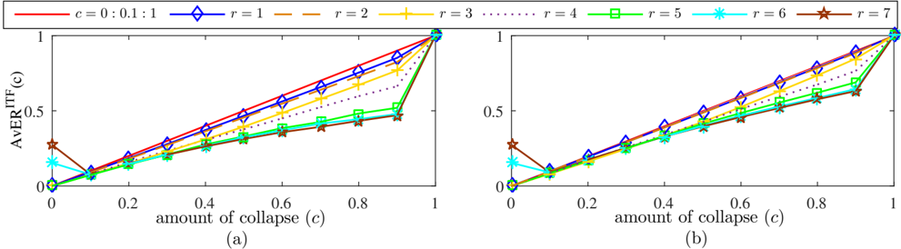
The image contains two identical line graphs (a) and (b), plotting the relationship between the "amount of collapse (c)" (x-axis) and "AvERITF(c)" (y-axis). Both graphs use the same axes, legends, and data series, with no visible differences between (a) and (b).
### Components/Axes
- **X-axis**: "amount of collapse (c)" with values ranging from 0 to 1 in increments of 0.2.
- **Y-axis**: "AvERITF(c)" with values ranging from 0 to 1.
- **Legend**: Located at the top-left of both graphs. Contains:
- **Red solid line**: `c = 0 : 0.1 : 1` (linear progression from 0 to 1).
- **Blue diamond**: `r = 1`.
- **Brown dashed line**: `r = 2`.
- **Yellow plus**: `r = 3`.
- **Green dotted line**: `r = 4`.
- **Green square**: `r = 5`.
- **Cyan star**: `r = 6`.
- **Brown star**: `r = 7`.
### Detailed Analysis
- **Red line (`c = 0 : 0.1 : 1`)**:
- Starts at (0, 0) and ends at (1, 1), forming a straight diagonal line.
- Represents a linear relationship between `c` and `AvERITF(c)`.
- **Lines for `r = 1` to `r = 7`**:
- All lines start at (0, 0) and increase monotonically with `c`.
- **Trends**:
- `r = 1` (blue diamond): Reaches ~0.8 at `c = 1`.
- `r = 2` (brown dashed): Reaches ~0.7 at `c = 1`.
- `r = 3` (yellow plus): Reaches ~0.65 at `c = 1`.
- `r = 4` (green dotted): Reaches ~0.6 at `c = 1`.
- `r = 5` (green square): Reaches ~0.55 at `c = 1`.
- `r = 6` (cyan star): Reaches ~0.5 at `c = 1`.
- `r = 7` (brown star): Reaches ~0.45 at `c = 1`.
- **Uncertainty**: Values are approximate, with ±0.05 error margins inferred from visual spacing.
### Key Observations
1. **Consistent Trends**: All `r` values follow the same upward trend, but with diminishing returns as `r` increases.
2. **Red Line Dominance**: The red line (`c = 0 : 0.1 : 1`) consistently lies above all `r`-specific lines, suggesting it represents an upper bound or idealized scenario.
3. **Marker Consistency**: Legend colors/markers match line styles exactly (e.g., blue diamond = `r = 1`).
### Interpretation
- **Data Implications**:
- As `r` increases, the maximum `AvERITF(c)` at `c = 1` decreases, indicating that higher `r` values reduce performance under full collapse (`c = 1`).
- The red line (`c = 0 : 0.1 : 1`) may represent a theoretical maximum, where `c` is dynamically adjusted rather than fixed to a single `r` value.
- **Relationships**:
- `AvERITF(c)` scales linearly with `c` for all `r` values, but the slope decreases with higher `r`.
- The divergence between the red line and `r`-specific lines highlights the trade-off between collapse tolerance (`c`) and system resilience (`r`).
- **Anomalies**:
- No outliers observed; all lines follow smooth, predictable trends.
- The brown star (`r = 7`) lags significantly behind other `r` values, suggesting diminishing returns at extreme `r` values.
## Notes
- **Language**: All text is in English.
- **Spatial Grounding**:
- Legend is positioned at the top-left corner of both graphs.
- Data points and lines are evenly spaced along the x-axis.
- **TREND VERIFICATION**:
- All lines slope upward, confirming a positive correlation between `c` and `AvERITF(c)`.
- The red line’s slope is steeper than any `r`-specific line, validating its role as an upper bound.