## Line Chart: Classification Accuracy vs. Number of Samples
### Overview
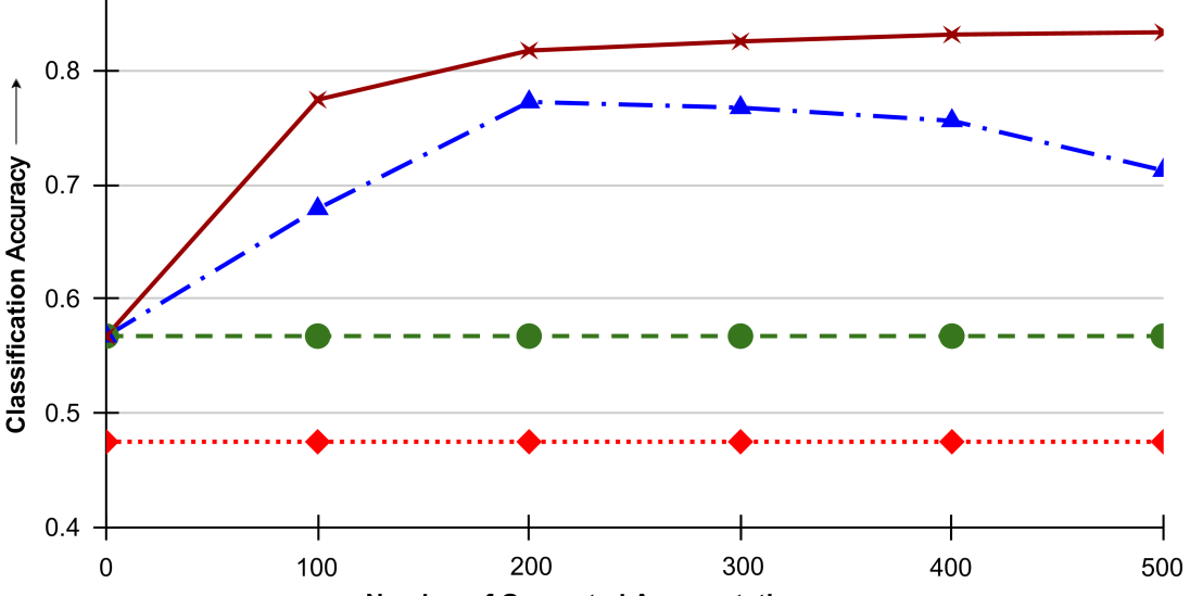
The chart displays four classification accuracy trends across varying numbers of samples (0 to 500). Four distinct data series are plotted with different line styles and markers, showing divergent performance patterns as sample size increases.
### Components/Axes
- **X-axis**: "Number of Samples" (0 to 500, linear scale)
- **Y-axis**: "Classification Accuracy" (0.4 to 0.8, linear scale)
- **Legend**: Located in the top-right corner, with four entries:
- Solid Red (Star marker)
- Dashed Blue (Triangle marker)
- Dashed Green (Circle marker)
- Dotted Red (Diamond marker)
### Detailed Analysis
1. **Solid Red (Star) Line**:
- Starts at 0.55 (0 samples)
- Increases steadily to 0.83 (500 samples)
- Key points: 0.72 (100 samples), 0.81 (200 samples), 0.82 (300 samples), 0.83 (500 samples)
2. **Dashed Blue (Triangle) Line**:
- Starts at 0.55 (0 samples)
- Peaks at 0.78 (200 samples)
- Declines to 0.71 (500 samples)
- Key points: 0.68 (100 samples), 0.78 (200 samples), 0.76 (300 samples), 0.71 (500 samples)
3. **Dashed Green (Circle) Line**:
- Remains flat at 0.57 across all sample counts
4. **Dotted Red (Diamond) Line**:
- Remains flat at 0.48 across all sample counts
### Key Observations
- The Solid Red line demonstrates the most significant improvement, increasing by 53% (0.55 → 0.83)
- The Dashed Blue line shows a bell-curve pattern, peaking at 200 samples before declining
- The Dashed Green and Dotted Red lines exhibit no improvement with increased samples
- All lines start at the same 0-sample accuracy (0.55 for Solid Red/Dashed Blue; 0.57/0.48 for others)
### Interpretation
The data suggests:
1. **Model Scalability**: The Solid Red model (star markers) benefits significantly from additional training data, showing consistent improvement up to 500 samples.
2. **Overfitting Risk**: The Dashed Blue model (triangle markers) peaks at 200 samples, suggesting potential overfitting or diminishing returns beyond this point.
3. **Baseline Performance**: The flat lines (Green and Red) likely represent control groups or non-learning baselines, with the Green line showing marginally better performance than the Red.
4. **Threshold Effects**: The 200-sample mark appears critical, separating models that improve with scale from those that plateau or degrade.
This pattern highlights the importance of data quantity in model training, while cautioning against over-reliance on sample size alone for performance gains.