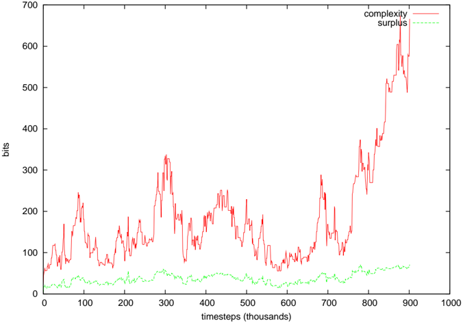
## Line Chart: Complexity and Surplus Over Timesteps
### Overview
The image is a 2D line chart plotting two variables, "complexity" and "surplus," against time. The chart demonstrates a clear divergence between the two metrics over the observed period, with complexity exhibiting high volatility and a strong late-stage increase, while surplus remains relatively stable and low.
### Components/Axes
* **Chart Type:** Line chart with two data series.
* **X-Axis:**
* **Label:** `timesteps (thousands)`
* **Scale:** Linear, ranging from 0 to 1000.
* **Major Tick Marks:** Every 100 units (0, 100, 200, ..., 1000).
* **Y-Axis:**
* **Label:** `bits`
* **Scale:** Linear, ranging from 0 to 700.
* **Major Tick Marks:** Every 100 units (0, 100, 200, ..., 700).
* **Legend:**
* **Position:** Top-right corner of the plot area.
* **Series 1:** `complexity` - Represented by a solid red line.
* **Series 2:** `surplus` - Represented by a dashed green line.
### Detailed Analysis
**1. Complexity (Red Line):**
* **Visual Trend:** The line is highly volatile with frequent peaks and troughs. It shows a general, but non-monotonic, upward trend over the full range, with a dramatic acceleration in the final quarter of the timeline.
* **Key Data Points (Approximate):**
* **Start (0k timesteps):** ~50 bits.
* **First Major Peak (~100k):** ~250 bits.
* **Second Major Peak (~300k):** ~330 bits.
* **Period of Decline (~500k-600k):** Fluctuates between ~50 and ~150 bits.
* **Final Surge (~700k-900k):** Rises sharply from ~100 bits to a peak of approximately **600 bits** at ~880k timesteps, ending near ~580 bits at 900k.
**2. Surplus (Green Line):**
* **Visual Trend:** The line is much smoother and exhibits low volatility. It maintains a relatively flat, slightly positive trend throughout, staying within a narrow band.
* **Key Data Points (Approximate):**
* **Start (0k timesteps):** ~0 bits.
* **General Range:** Fluctuates primarily between **~20 and ~70 bits** for the entire duration.
* **End (900k timesteps):** ~60 bits.
### Key Observations
1. **Magnitude Divergence:** The value of "complexity" is consistently greater than "surplus" after the initial timesteps. The gap between them widens significantly after ~700k timesteps.
2. **Volatility Contrast:** Complexity is characterized by high-frequency, high-amplitude noise, while surplus shows low-frequency, low-amplitude variation.
3. **Correlation:** There is no obvious visual correlation between the short-term fluctuations of the two lines. Their long-term trends are both positive but at vastly different rates.
4. **Notable Outlier Event:** The period between 700k and 900k timesteps represents a regime change for the complexity metric, where it breaks from its previous oscillatory pattern and enters a steep, sustained climb.
### Interpretation
The chart suggests a system where the measured "complexity" (in bits) is dynamic and can undergo phases of rapid growth, while the "surplus" (also in bits) represents a more stable, slowly accruing resource or buffer.
* **What the Data Suggests:** The system may be undergoing a process where increasing complexity does not generate a proportional increase in surplus. The late-stage surge in complexity could indicate a phase transition, a runaway process, or the system reaching a new, more complex state of operation. The stable surplus might represent a fundamental capacity limit or a baseline resource that is largely independent of the system's operational complexity.
* **Relationship Between Elements:** The two metrics appear to be decoupled in the short term. The surplus does not react to the wild swings in complexity, implying it is governed by different underlying mechanisms or constraints.
* **Anomalies and Trends:** The most significant anomaly is the exponential-looking rise in complexity after 700k timesteps. This is the dominant feature of the chart and would be the primary focus for any technical investigation. The consistent, low-level nature of the surplus is the secondary key finding.