## Bar Chart: Distribution over valid graph colorings (sorted)
### Overview
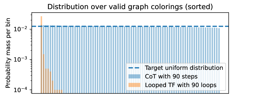
The image is a bar chart comparing the probability distributions of two methods for generating valid graph colorings against a target uniform distribution. The chart uses a logarithmic scale on the y-axis to display probability mass per bin. The data is sorted, and the two methods are "CoT with 90 steps" and "Looped TF with 90 loops."
### Components/Axes
* **Title:** "Distribution over valid graph colorings (sorted)"
* **Y-Axis:**
* **Label:** "Probability mass per bin"
* **Scale:** Logarithmic, with major tick marks at 10⁻⁴, 10⁻³, and 10⁻².
* **X-Axis:** Not explicitly labeled. Represents discrete bins for the sorted graph colorings. The axis is categorical, with each bar representing a unique coloring or a group of colorings.
* **Legend:** Located in the bottom-right quadrant of the chart area.
* **Item 1:** A dashed blue line labeled "Target uniform distribution."
* **Item 2:** A light blue bar labeled "CoT with 90 steps."
* **Item 3:** An orange bar labeled "Looped TF with 90 loops."
### Detailed Analysis
The chart displays two distinct data series as vertical bars, plotted against the same set of bins on the x-axis.
1. **Target Uniform Distribution (Dashed Blue Line):**
* **Trend:** A perfectly horizontal line.
* **Value:** Positioned at approximately 1.2 x 10⁻² on the y-axis. This represents the ideal probability mass if every valid graph coloring were equally likely.
2. **CoT with 90 steps (Light Blue Bars):**
* **Trend:** The bars are of nearly uniform height across the entire x-axis. There is very slight variation, but no strong upward or downward slope is visible.
* **Values:** The height of the vast majority of blue bars is very close to the "Target uniform distribution" line, clustering around 10⁻². A few bars on the far right may be marginally shorter, but they remain within the same order of magnitude.
3. **Looped TF with 90 loops (Orange Bars):**
* **Trend:** A sharply decreasing trend from left to right. The distribution is highly skewed.
* **Values:**
* The first (leftmost) orange bar is the tallest, reaching approximately 3 x 10⁻², which is significantly *above* the target uniform line.
* The second bar drops to roughly 1.5 x 10⁻³.
* The third bar is near 5 x 10⁻⁴.
* The fourth and fifth bars are at or below 10⁻⁴.
* No orange bars are visible beyond the fifth bin, indicating their probability mass is negligible (< 10⁻⁴).
### Key Observations
* **Spatial Grounding:** The legend is placed in the bottom-right, overlapping the area where the orange bars diminish to zero. The blue bars span the entire width of the chart, while the orange bars are confined to the first five bins on the far left.
* **Contrast in Performance:** There is a stark contrast between the two methods. "CoT with 90 steps" produces a distribution that closely approximates the target uniform distribution. "Looped TF with 90 loops" produces a highly non-uniform, peaked distribution.
* **Outlier:** The first orange bar is a significant outlier, being the only data point (from either series) that clearly exceeds the target uniform probability.
* **Scale:** The use of a logarithmic y-axis is crucial, as it allows the visualization of the orange series' rapid decay across multiple orders of magnitude, which would be impossible on a linear scale.
### Interpretation
This chart demonstrates a comparative evaluation of two algorithmic approaches—likely "Chain-of-Thought" (CoT) and a "Looped TensorFlow" (TF) method—for the task of sampling valid graph colorings.
* **What the data suggests:** The "CoT with 90 steps" method is highly effective at generating a diverse and uniform set of solutions. Its output distribution is nearly indistinguishable from the ideal uniform distribution, meaning it explores the space of valid colorings evenly. In contrast, the "Looped TF with 90 loops" method is biased. It overwhelmingly favors a very small subset of possible colorings (the first few bins) and fails to explore the vast majority of the solution space.
* **How elements relate:** The dashed "Target" line serves as the benchmark. The proximity of the blue bars to this line indicates success. The deviation of the orange bars, especially the first one overshooting the target and the subsequent rapid drop-off, indicates failure to achieve uniform sampling.
* **Underlying Implication:** For applications requiring exploration of a combinatorial space (like graph colorings), the CoT approach appears superior. The Looped TF method, as configured here, suffers from a mode collapse or a strong prior that prevents it from sampling uniformly. The "sorted" nature of the x-axis likely orders colorings by some metric (e.g., lexicographical order), making the skewed distribution of the Looped TF method even more apparent.