\n
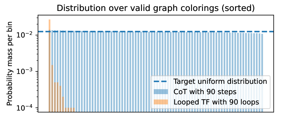
## Chart: Distribution over valid graph colorings (sorted)
### Overview
The image presents a bar chart visualizing the distribution of probability mass per bin for different graph coloring methods. The chart compares "CoT with 90 steps" and "Looped TF with 90 loops" against a "Target uniform distribution". The y-axis is on a logarithmic scale.
### Components/Axes
* **Title:** "Distribution over valid graph colorings (sorted)" - positioned at the top-center.
* **X-axis:** Not explicitly labeled, but represents the sorted graph colorings. The scale is not visible.
* **Y-axis:** "Probability mass per bin" - positioned on the left side. The scale is logarithmic, ranging from approximately 10<sup>-4</sup> to 10<sup>-2</sup>.
* **Legend:** Located in the bottom-right corner.
* "Target uniform distribution" - represented by a dashed blue line.
* "CoT with 90 steps" - represented by a light blue bar.
* "Looped TF with 90 loops" - represented by a light orange bar.
### Detailed Analysis
The chart displays three data series:
1. **Target uniform distribution:** A horizontal dashed blue line at approximately 10<sup>-2</sup>. This represents the desired uniform distribution.
2. **CoT with 90 steps:** A series of light blue vertical bars. The bars are relatively consistent in height, fluctuating around the 10<sup>-2</sup> level. The first bar is significantly higher, at approximately 5 x 10<sup>-2</sup>. The remaining bars range from approximately 5 x 10<sup>-3</sup> to 2 x 10<sup>-2</sup>.
3. **Looped TF with 90 loops:** A single light orange bar at the far left. This bar has a height of approximately 2 x 10<sup>-1</sup>, significantly higher than the other data series.
### Key Observations
* The "Looped TF with 90 loops" method exhibits a significantly higher probability mass in the first bin compared to the other methods and the target uniform distribution.
* The "CoT with 90 steps" method generally aligns with the target uniform distribution, although with some fluctuations.
* The y-axis is logarithmic, which compresses the differences in probability mass.
### Interpretation
The chart suggests that the "Looped TF with 90 loops" method produces a highly non-uniform distribution of graph colorings, concentrating probability mass in the initial bins. This indicates a potential bias or limitation in this method. The "CoT with 90 steps" method appears to generate a more uniform distribution, closer to the target, but still exhibits some variability. The target uniform distribution serves as a benchmark for evaluating the quality of the coloring methods. The large difference in the initial bin for "Looped TF" suggests it may be getting stuck in local optima or exhibiting a strong preference for certain colorings. The logarithmic scale highlights the relative differences in probability mass, emphasizing the significant deviation of the "Looped TF" method.