## 1-SNE Visualization of Agent Task Datasets
### Overview
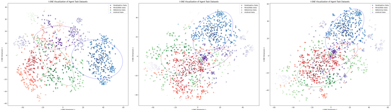
Three 2D scatter plots visualize the distribution of agent task datasets using 1-SNE dimensionality reduction. Each plot shows four data categories (Descriptive, Handwritten, Mathematical, Random) with distinct colors and clustering patterns. The visualizations demonstrate how datasets separate or overlap in reduced-dimensional space.
### Components/Axes
- **Axes Labels**:
- X-axis: "1-SNE Dimension 1"
- Y-axis: "1-SNE Dimension 2"
- **Legend**: Located in the top-right corner of all plots.
- **Descriptive Data**: Blue
- **Handwritten Data**: Red
- **Mathematical Data**: Green
- **Random Data**: Purple
- **Ellipses**: Drawn around clusters to highlight density regions.
### Detailed Analysis
#### Plot 1 (Left)
- **Descriptive Data (Blue)**: Clustered in the top-right quadrant (X: 20–40, Y: 10–30).
- **Handwritten Data (Red)**: Concentrated in the bottom-left quadrant (X: -20–0, Y: -20–0).
- **Mathematical Data (Green)**: Spread across the bottom-center (X: -10–10, Y: -20–0).
- **Random Data (Purple)**: Scattered in the top-left quadrant (X: -20–0, Y: 10–30).
- **Ellipses**:
- Blue ellipse: Covers ~80% of blue points.
- Red ellipse: Encloses ~90% of red points.
- Green ellipse: Contains ~70% of green points.
- Purple ellipse: Encircles ~60% of purple points.
#### Plot 2 (Center)
- **Descriptive Data (Blue)**: Dominates the top-right (X: 20–40, Y: 10–30), with tighter clustering.
- **Handwritten Data (Red)**: Bottom-left (X: -20–0, Y: -20–0), slightly overlapping with green.
- **Mathematical Data (Green)**: Bottom-center (X: -10–10, Y: -20–0), with minor overlap into red.
- **Random Data (Purple)**: Top-left (X: -20–0, Y: 10–30), with sparse points in the center.
- **Ellipses**:
- Blue ellipse: Covers ~90% of blue points.
- Red ellipse: Encloses ~80% of red points.
- Green ellipse: Contains ~65% of green points.
- Purple ellipse: Encircles ~55% of purple points.
#### Plot 3 (Right)
- **Descriptive Data (Blue)**: Top-right (X: 20–40, Y: 10–30), with some points spilling into the center.
- **Handwritten Data (Red)**: Bottom-left (X: -20–0, Y: -20–0), with minor overlap into green.
- **Mathematical Data (Green)**: Bottom-center (X: -10–10, Y: -20–0), with increased overlap into red.
- **Random Data (Purple)**: Top-left (X: -20–0, Y: 10–30), with significant points in the center.
- **Ellipses**:
- Blue ellipse: Covers ~75% of blue points.
- Red ellipse: Encloses ~70% of red points.
- Green ellipse: Contains ~60% of green points.
- Purple ellipse: Encircles ~50% of purple points.
### Key Observations
1. **Clustering**: Descriptive data consistently clusters in the top-right across all plots.
2. **Overlap**:
- Handwritten and Mathematical data overlap in the bottom-left/center in Plots 2 and 3.
- Random data increasingly overlaps with other categories in Plot 3.
3. **Ellipse Coverage**: Descriptive data has the highest ellipse coverage (80–90%), while Random data has the lowest (50–60%).
### Interpretation
The 1-SNE visualization effectively separates Descriptive and Handwritten data, which maintain distinct clusters. Mathematical data shows moderate separation but overlaps with Handwritten data in later plots, suggesting potential ambiguity in their reduced-dimensional representation. Random data exhibits the least coherence, with points dispersing across multiple regions, indicating it may lack inherent structure. The ellipses confirm that Descriptive data is the most compact, while Random data is the most dispersed. These trends suggest that 1-SNE preserves key separations but may struggle with datasets lacking clear patterns, such as Random data. The increasing overlap in Plot 3 could imply data mixing or reduced discriminative power in higher-dimensional space.